Acknowledgements – Thanks to Daanish Mulla for his help with data processing, and Patsy Sonne for her helping hand.
Introduction
Muscle fatigue is a process that results in decreased force generating capacity, and impaired performance [1]. Reduced force due to muscle fatigue may result in less stable joints, which can increase the risk of injury [2]. Furthermore, muscle fatigue is known to reduce joint proprioception [3]–[6], which can result in further compromised joint stability and increased injury risk. Baseball pitchers have been shown to alter their kinematics (joint angles) when fatigued, which may strain different tissues when compared to pitching without fatigue [7]. Repetitive strain on these tissues can result in injury, and in baseball pitchers, injuries such as Ulnar Collateral Ligament tear.
Fatigue has been named the number one cause of injuries in baseball pitchers, leading to a 500% increase in injury likelihood [8]. Handgrip strength has decreased by up to 5% after simulated baseball games [9], and pitch velocity decreases over the the course of a game [10]. Pitcher kinematics also change with fatigue, with the elbow dropping lower, and the stride getting shorter.
The PITCHf/x system was created by Sportvision, and installed in every MLB stadium since 2006. The system allows for tracking of pitch movement, velocity and release point for every pitch thrown at the major league level. Two cameras are mounted in each stadium, and are used to track each pitch and display data during live broadcasts and websites. With the use of free software, like the programming package R, and database software MySQL, anyone can download gigabytes of data within hours, allowing for detailed analyses of pitching and hitting. With this detailed data, it would theoretically be possible to track changes associated with muscle fatigue. The purpose of this study was to examine how pitch velocity and release point changed in starting pitchers during the 2015 season.
Methods
Data Acquisition
I queried the pitchFX data from the 2015 season, grouping pitches by pitch type, pitcher, and inning. A pitch had to be thrown 20 times in an inning to be included for further analysis. The pitchers included in this analysis were those who pitched a minimum of 100 innings as a starting pitcher. The main focus of this analysis was to examine peak velocity changes, so only fastball type pitches were included in the analysis (four-seam, two-seam, split finger, sinking, cut, and general fastball).
I calculated the average velocity for each pitcher during their first inning of pitching. I then calculated the minimum average velocity for these pitches during either the 5th, or 6th inning – which ever value was the lowest.
For release point, I calculated the resultant distance of the release point (at z0, x0), from 0.0 (Figure 1). I also examined the change in vertical release point (z0) between the first inning, and the minimum of the 5th and 6th innings. Using the horizontal release point, and the vertical release point, I also calculated the absolute release angle (normalizing for left-handed and right-handed pitchers).
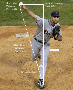
Figure 1. Demonstration of how calculations were made for the vertical release point, resultant release distance, and release angle.
Statistics
For this analysis, the independent variable was inning (first inning, minimum of 5th/6th inning).
To examine the effect of inning, I performed a dependent samples t-test on variables of peak velocity, resultant release point, vertical release point, and release angle, with p < 0.05. I also calculated Cohen’s D to determine the effect size of the inning.
Results
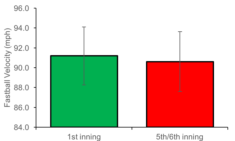
Peak velocity significantly decreased between the first inning (91.19 ± 2.91 mph) and 5th/6th inning of the start (90.61 ± 3.01 mph, p< 0.05; d=0.20) (Figure 2). Vertical release point significantly decreased from 5.9 ± 0.35 feet to 5.84 ± 0.36 feet (p < 0.05, d=0.17)(Figure 3a). Resultant release point also decreased from 6.15 ± 0.35 feet to 6.09 ± 0.35 feet (p < 0.05, d=0.18) (Figure 3b). All of these changes were statistically significant, however, represented small effect sizes.
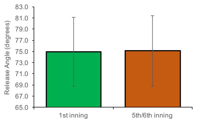
Release angle was significantly different between the first and final inning, moving from 74.9 ± 6.17 degrees to 75.1 ± 6.31 degrees. This represents a release angle that is closer to the vertical plane, or, closer to the midline of the body. While this change was statistically significant, the effect size was negligible (d=-0.04) (figure 4).

Figure 2. Fastball velocity significantly decreased between the first inning (91.19 ± 2.91 mph) and the minimum between the 5th and 6th inning (90.61 ± 3.01 mph) (p < 0.05). This represented a small effect size, of 0.20.
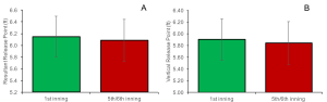
Figure 3. Both vertical release point, and resultant release distance decreased between the first inning and the 6th inning, representing a possible change in pitcher kinematics. This represented a small effect size, of 0.18 and 0.17, respectively.
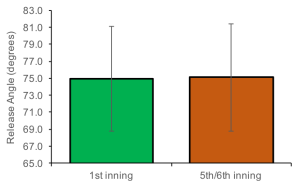
Figure 4. Release angle increased (representing a release point closer to the midline of the body) between the first and final inning, though the effect size for this relationship was negligible.
Discussion
In line with previous research on baseball pitching and fatigue, fastball velocity decreased between the beginning and the end of the average game. A decrease in release point distance and height also indicates that kinematics have changed during the course of a baseball game.
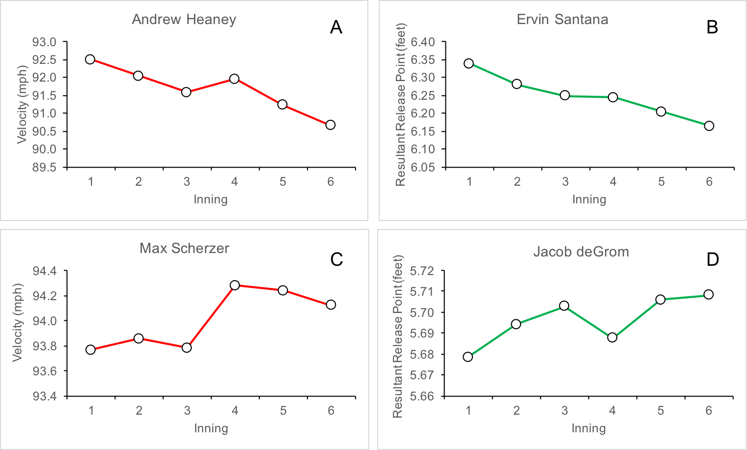
The following examples are from pitchers in the top ten for fatigue related changes between innings. Andrew Heaney has a nearly 2mph decline between the 1st and the 6th inning (Figure 5a), and Ervin Santana has his resultant release point decrease by 2.21% (Figure 5b). In both cases, it could be expected that performance would be impaired by these fatigue related changes. Conversely, Jacob deGrom actually increases his release point by 0.58% (Figure 5d), and Max Scherzer increases fastball velocity by 0.38% between the first and 6th inning (figure 5c). In general, 70% of pitchers experience a decreased velocity between the first and final inning, 85% of pitchers have a decrease in their resultant release point, and 83% of pitchers have a decrease in their vertical release point.

Figure 4. Release angle increased (representing a release point closer to the midline of the body) between the first and final inning, though the effect size for this relationship was negligible.
The velocity change demonstrated in this analysis represents a decrease of only 0.5 mph from the first to the 6th inning. This represents approximately a 1% change in velocity. Previous research has shown up to a 5mph decrease in velocity, decreasing from 90 mph to 85 mph during spring training games [10]. This greater decrease in velocity may represent decreased conditioning from the pitchers at this time of the season. Crotin, et al., [11] found that fastball velocity increased during a season, as a result of conditioning and improved strength. These factors may wash out some of the differences that could be seen throughout the course of a game, when average velocities are calculated over the course of an entire season and by inning, like in this analysis.
The pitchers included in this analysis represent a highly elite subset of the population. Previous research that has examined fatigue in baseball pitchers has included pitchers in spring training [10], college [9], or even Japanese high school players [12]. The fatigue effects for the elite population may not be as severe, as elite athletes are able to moderate the detrimental effects of fatigue when performing their sport specific task [13].
Limitations
Despite the easy access to PitchFX data, there are concerns with the accuracy and reliability of the system. For one, the release point displayed by the PitchFX system is at a distance of 50 feet from the plate. Typically, pitchers release the ball at 54-55 feet from the plate, so the true release point is not exactly known [14] Additionally, inter-stadium differences may also contribute to inaccurate PitchFX data – as cameras are not always in the exact same place in all stadiums.
Conclusions
Examining PitchFX data for fastball velocities and release points, averaged by inning for qualifying starters in the 2015 season, have produced results comparable to more controlled, lab based studies, on fatigue during pitching. However, limitations with the PitchFX system, and averaging data throughout the entire season can possibly remove some of the differences that could possible be seen as a pitcher fatigues. Additional research should be performed to examine in-game changes in velocity for both good, and bad starts, to see if fatigue effects are more prominent as a pitcher becomes less effective.
References
[1] R. M. Enoka and J. Duchateau, “Muscle fatigue: what, why and how it influences muscle function.,” J. Physiol., vol. 586, no. 1, pp. 11–23, Jan. 2008.
[2] G. S. Fleisig, J. R. Andrews, C. J. Dillman, and R. F. Escamilla, “Kinetics of baseball pitching with implications about injury mechanisms,” Am. J. Sports Med., vol. 23, no. 2, 1995.
[3] L. A. Hiemstra, I. K. Lo, and P. J. Fowler, “Effect of fatigue on knee proprioception: implications for dynamic stabilization.,” J. Orthop. Sports Phys. Ther., vol. 31, no. 10, pp. 598–605, Oct. 2001.
[4] F. Ribeiro, J. Mota, and J. Oliveira, “Effect of exercise-induced fatigue on position sense of the knee in the elderly,” Eur. J. Appl. Physiol., vol. 99, no. 4, pp. 379–385, 2007.
[5] M. Sharpe and T. Miles, “Position sense at the elbow after fatiguing contractions,” Exp. Brain Res., vol. 94, no. 1, May 1993.
[6] H. B. Skinner, M. P. Wyatt, J. A. Hodgdon, D. W. Conrad, and R. . Barrack, “Effect of fatigue on joint position sense of the knee,” J. Orthop. Res., vol. 4, no. 1, pp. 112 – 118, 1986.
[7] R. F. Escamilla, S. W. Barrentine, G. S. Fleisig, N. Zheng, Y. Takada, D. Kingsley, and J. R. Andrews, “Pitching biomechanics as a pitcher approaches muscular fatigue during a simulated baseball game.,” Am. J. Sports Med., vol. 35, no. 1, pp. 23–33, Jan. 2007.
[8] J. Lemire, “Preventing Athlete Injuries With Data-Driven Tech – Athletic Business,” Athletic Business, 2015. [Online]. Available: http://www.athleticbusiness.com/athlete-safety/preventing-athlete-injuries-with-data-driven-tech.html. [Accessed: 21-Dec-2015].
[9] M. J. Mullaney, “Upper and Lower Extremity Muscle Fatigue After a Baseball Pitching Performance,” Am. J. Sports Med., vol. 33, no. 1, pp. 108–113, Jan. 2005.
[10] T. a Murray, T. D. Cook, S. L. Werner, T. F. Schlegel, and R. J. Hawkins, “The effects of extended play on professional baseball pitchers.,” Am. J. Sports Med., vol. 29, no. 2, pp. 137–42, 2001.
[11] R. L. Crotin, S. Bhan, T. Karakolis, and D. K. Ramsey, “Fastball velocity trends in short-season minor league baseball.,” J. Strength Cond. Res., vol. 27, no. 8, pp. 2206–12, Aug. 2013.
[12] L.-H. Wang, K.-C. Lo, I.-M. Jou, L.-C. Kuo, T.-W. Tai, and F.-C. Su, “The effects of forearm fatigue on baseball fastball pitching, with implications about elbow injury.,” J. Sports Sci., pp. 1–8, Oct. 2015.
[13] M. Lyons, Y. Al-Nakeeb, and A. Nevill, “The impact of moderate and high intensity total body fatigue on passing accuracy in expert and novice basketball players.,” J. Sports Sci. Med., vol. 5, no. 2, pp. 215–27, Jan. 2006.
[14] M. Fast, “The Internet cried a little when you wrote that on it – The Hardball Times,” The Hardball Times, 2010. [Online]. Available: http://www.hardballtimes.com/the-internet-cried-a-little-when-you-wrote-that-on-it/. [Accessed: 21-Dec-2015].


Recent Comments