Science and Baseball

Month: August 2016

Giving a big FU to workload metrics in pitchers: Part 1 – Fatigue Modelling

This is a three part series on the development and evaluation of a new workload metric in baseball pitchers.

So, back in the day – my friend and mentor Dr. Jim Potvin and I came up with a model that predicted muscle fatigue (Sonne & Potvin, 2016). This model outputs a value which represents the amount of force generating capacity that a muscle has lost. Relating this back to baseball – Dr. Fleisig has stated that muscle fatigue could lead to joint laxity, and as a result, increase the amount of strain on the ligaments of the arm during throwing (Fleisig et al., 1995).

To put it simply, there are two ways that you can influence the amount of fatigue your muscles have. The first – you can increase or decrease your fatigue level by either increasing, or decreasing how active your muscle is. If you have your muscle on at 50% of its maximum for 5 seconds, compared to a contraction of the same duration at 30% of its maximum – the 50% contraction will be more fatiguing. The second way to change fatigue levels is the amount of rest you receive. If you have more time to rest, you will reduce your fatigue level. This is the principle that was expressed in the paper I wrote arguing against the use of pitch clocks in MLB from an injury prevention perspective.

Now, currently – the fatigue model runs in MATLAB, which is definitely not software we’d expect to appear on most pitching coachs’ computers. In fact, it’s usually so expensive that only academics or engineering companies will have access to it. I wanted to come up with a way of helping people determine the fatigue levels in their pitchers without a lot of cumbersome technology.

I used the same subset of data from the paper on pitch clocks – 75 American League starting pitchers from the 2014 season, with their average pace, pitches thrown, and innings per start reported from the FanGraphs website.

Included these values as the inputs from the fatigue model which I ran in Matlab, and generated regression equations from the outputs. These inputs were:

  • Fastballs thrown per inning
  • Other pitches thrown per inning
  • Innings pitched in a game
  • Pace between pitches (from FanGraphs).

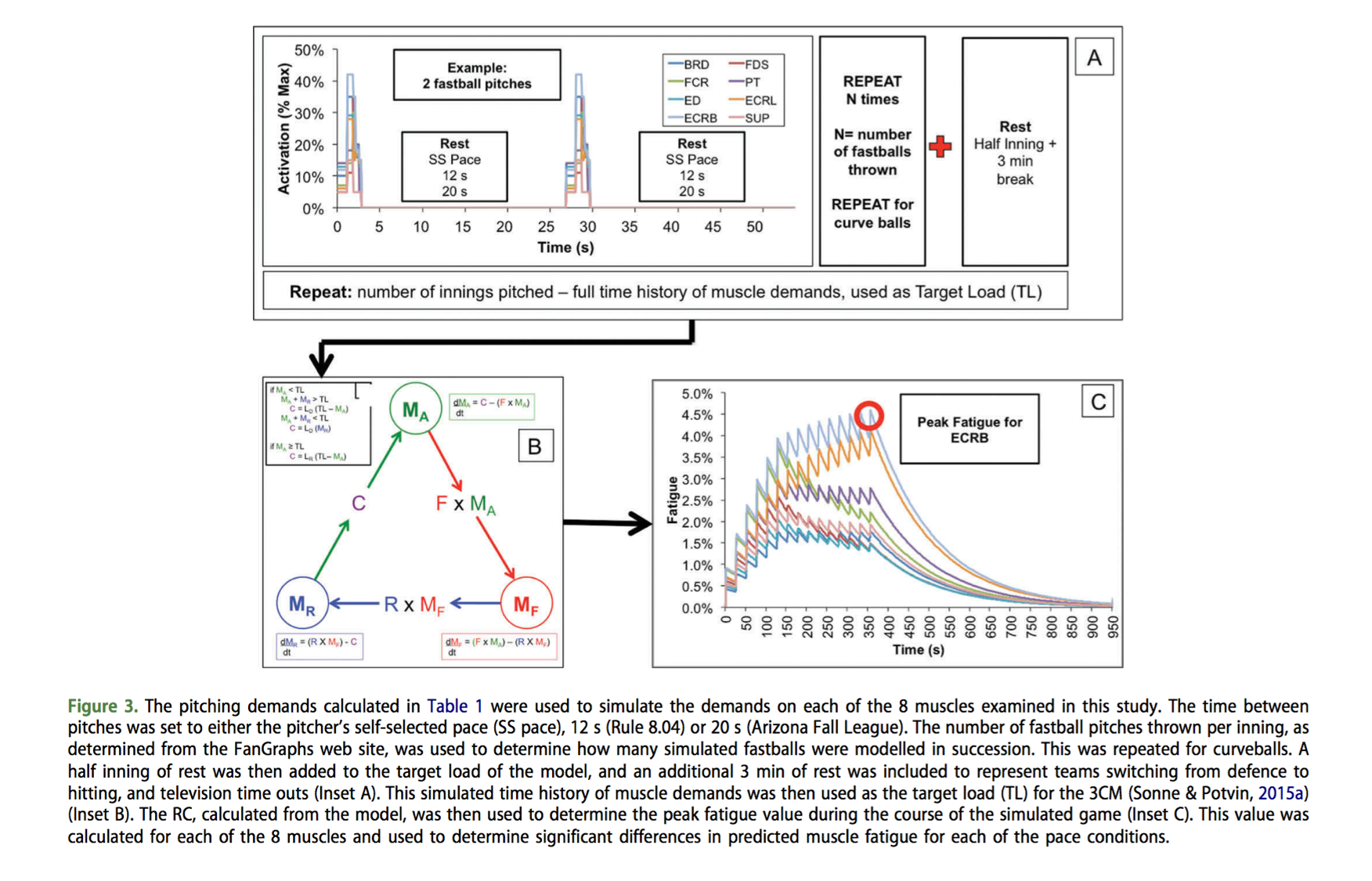
This model output a predicted maximum fatigue level for 8 different forearm muscles (Brachioradialis, Flexor Digitorum Superficialis, Flexor Carpi Radialis, Pronator Teres, Extensor Digitorum, Extensor Carpi Radialis Longus and Brevis, and Supinator), but for the sake of this application – I’m just going to look at the average fatigue of these 8 muscles as the dependent variables for the fatigue model. Here is a figure from my pitch clock paper to explain how the fatigue modelling process worked (Sonne & Keir, 2016).

from pitch clock paper

Results

Of the four included predictor variables, only fastballs per inning, and pace between pitches emerged as significant predictors of fatigue level. These predictors were highly significant though, with an R2 of 0.95. Keep in mind – this is from already modelled data, so the amount of variability is low – this is just an easier way to access the fatigue level for this type of work (pitching).

The predictive equation for average forearm muscle fatigue is:

fatigue equation

For example, pitcher A threw 15 fastballs in an inning, pitching the ball every 21 seconds. As a result, he has a predicted average forearm fatigue level of 11.06%. To examine the contribution of the individual components to this prediction, I looked at the correlation between fatigue and each independent variable. The number of fastballs thrown predicted 81.7% of variance in fatigue, with number of other/breaking pitches, # innings, and pace explaining 6.0%, 15.1%, and 24% of the variance in fatigue, respectively.

For the final model which only included # of fastballs thrown, and pace, this is how things shaped up. For every 1 second increase in pace, there was a 0.23% decrease in the amount of predicted fatigue (when # of pitches was held constant at 15 per inning). For every one fastball increase, there was a 0.32% increase in fatigue (when pace was held constant at 18 seconds per inning).

Fatigue Pitchers

Predicted average forearm fatigue while pace was held constant (18 seconds between pitches) for an increasing number of fastballs per inning pitched (red). Predicted average forearm fatigue while # of pitches per inning was held constant (15 pitches per inning) and pace was gradually increased from 8 second between pitches, to 30 seconds between pitches (green).

So, when brainstorming ideas for how to use the fatigue model as a workload metric, I bounced a few ideas off of some colleagues as to how I should name this fatigue based workload metric. There were some great ideas that emerged, but ultimately the best one was Fatigue Units – or, FU’s (Thanks, Jenn!).

So, that’s it for now – this is an example for quantifying forearm muscle fatigue in pitchers without needing to know how to program or use Matlab. In part 2, I’m going to propose a method for tracking FU’s over the course of a season, and in part 3 – I’m going to finish this off by providing some spreadsheets to help you track FUs in your pitchers.

References

Fleisig, G. S., Andrews, J. R., Dillman, C. J., & Escamilla, R. F. (1995). Kinetics of baseball pitching with implications about injury mechanisms. The American journal of sports medicine23(2), 233-239.

Sonne, M. W., & Potvin, J. R. (2016). A modified version of the three-compartment model to predict fatigue during submaximal tasks with complex force-time histories. Ergonomics59(1), 85-98.

Sonne, M. W., & Keir, P. J. (2016). Major League Baseball pace-of-play rules and their influence on predicted muscle fatigue during simulated baseball games. Journal of sports sciences, 1-9.


Who has the Best Stuff in Baseball? Volume 7

The Stuff report gets back on track! Let’s figure out who has the best Stuff in Major League Baseball.

In case you’ve forgotten, the Stuff metric was designed to help our friends in colour commentary with their commonly used cliche’s about what pitchers have great “stuff”. The metric looks at a pitcher’s ability to generate velocity, change in velocity, and break distance between their arsenal of pitches. The exact math can be found in the first stuff article, or throughout the rest of the Stuff reports on this site.

Let’s get into it.

Starting Pitchers


The leader of the pack remains Jake Arrieta, followed by Noah Syndergaard. However, all of the drama this week has centered around the ever climbing Aaron Sanchez – who is now up to #7 on the Stuff list. Aaron is being moved into the Blue Jays bullpen – where, his stuff will likely get better (his velocity increased from 95 to 97 last year when he was in the bullpen), but who knows about the long term implications for injury prevention. I’ve argued that moving to the bullpen probably doesn’t decrease stress on the arm. Leaving the rotation doesn’t help the Jays with their overall starting Stuff, that’s for sure – but take a look who is at the top of the list. Now, let’s look at relievers.

Relief Pitchers


There’s no surprise that Aroldis Chapman is leading the league in Stuff – he’s thrown the hardest pitch ever recorded.

However, a new challenger to the StatCast throne makes his first Stuff Report appearance – Mauricio Cabrera, with his 100mph average fastball falls in line just behind Chapman with Stuff of 2.24.

I mentioned earlier to look at the top of the team Stuff rankings – the Cubs sit number 1 for the starters. Well, they sit # 1 for the relievers. The Chicago Cubs are unequivocally, the kings of Stuff. They have a preeeeetty good team over there on the North Side.

Learning more about Stuff

A metric is only good if it is both reliable (it measures the same thing, over and over again), and valid (what it claims to be measuring is actually being measured). I’m sure there are a lot of people who have their own thoughts over how Stuff should be quantified – BUT THEY DIDN’T MAKE A WEBSITE ABOUT IT, SO HAH. I wanted to check out just how well the Stuff metric has performed this season.

Stability

My initial thoughts were that I had needed an entire season of data to make sure we got a reliable measure of Stuff – but then this season, I’ve been trying to write Stuff reports every 2 weeks (that hasn’t always worked out on www.mikesonne.ca, but you can find my Stuff reports on the Blue Jays over at Baseball Prospectus Toronto. In total, there have been 8 stuff reports since the start of the year, so let’s look at all of the starters and relievers who have appeared in each of them.

Overall, there were 110 Starting Pitchers who have registered stuff values in the 8 Volumes of the Stuff Report. There were 135 relief pitchers. The average (SE) Stuff for these starting pitchers was 0.50 +/- 0.08, and 0.51 +/- 0.08 for relievers. Over the course of those 8 reports, There has been a general decline in Stuff – with Stuff peaking for both starters and relievers in Volume 2, and gradually declining since.

Picture1

Figure 1. Average (SE) Stuff for Starters and Relievers over the biweekly stuff reports since the start of the season.

With respect to the reliability of the metric – how much did a pitcher’s stuff change on a biweekly basis? I looked at all of the Starting and Relief pitchers who qualified, and I calculated the coefficient of variation of their Stuff (Standard Deviation / Average). For starting pitchers, the CV was 30%, and for relief pitchers, the CV was 22%. That was pretty shocking! I thought with the fewer number of pitches that a reliever throws, they would be much more variable – but that isn’t the case.

Now, how does the stuff metric continue to hold up against performance metrics – primarily, K/9 and bb/9. I looked at the average Stuff over the course of the season (calculated by taking the average of each of the 8 volumes – not the overall season average), and also, the average absolute coefficient of variation, and correlated these with K/9 and BB/9. Similar to previous evaluations of the metric, there was a moderate, positive correlation between stuff and K/9 for both starters and relievers (r = 0.35 for starters, and 0.30 for relievers). Looking at the variability of Stuff in starting pitchers – there’s a significant positive correlation between BB/9 and variability (r = 0.16), and a negative correlation between K/9 and variability (r = -0.26). The moral of that story? It appears if what is coming out of your hand is consistent, you may have an edge for striking people out, and you may have better control. Now, when looking at these variability measure in relief pitchers – the relationship disappears (an r of 0.02 for both BB/9 and K/9).

Starters - Stuff k:9 Relievers - Stuff k:9

Figure 2 – Stuff vs. K/9 for Starters (Blue) and Relievers (Red).

I haven’t had a chance to look at it yet, but the next step is to see how Stuff changes as a response to injury. Here’s a graph of Brett Cecil’s stuff – he went on the DL a few months ago with a Lat tear. Also included is Marco Estrada – a starter who has had a bad back injury, and is likely fighting a trip to the DL. Finally, Aaron Sanchez – someone who has dominated and remained healthy all year.

Case Studies

Figure 3 – How does Stuff change for pitchers who are healthy, pitchers fighting a stint on the DL, and pitchers who have missed time with an injury?

The Stuff metric was originally developed to quantify anecdotal claims about a pitcher’s repertoire, but I believe it has a lot more utility than that. Identifying workload and injury is the next step in Stuff.

© 2024 Mike Sonne

Theme by Anders NorenUp ↑