Category: Baseball (Page 1 of 4)
Whenever I write something that trumpets the importance of velocity for pitchers, someone jumps in and says “velocity isn’t everything. Gregg Maddux exists”. You’re damn right he exists. You know who else exists? Vesna Vulović. She’s the Serbian flight attendant that fell 33,000 feet from an exploding airplane and lived. Yes, she lived, but I don’t see many people lining up to see if they can replicate her landing strategy.
The moral of the story is, if you throw 89 mph – the chances are – you are a bigger freak than the pitcher that throws 97 mph. Throwing with pin point control is a much more difficult task than throwing hard – for example, the AL Cy Young winner in 2015 missed his spot by 12″ on average according to CommandFX data (and Astros MiLB pitching coach, Drew French)
@drivelinebases The AL cy young winner in 2015 missed his intended location on average by 12 inches
— Drew French (@Drew_French) May 28, 2016
How do you teach command? Look at the moments immediate before ball release in this paper by Matso et al., (2017). I’m am highly interested in the training techniques that can be developed to increase precision in this type of movement – but we do know, if you make your pitchers strong, there’s a relationship with them throwing harder.
So, let’s look at the relationships between velocity, command, and control, with outcome metrics, for the final time.
I have been mildly obsessed with the command and control metrics produced by baseball prospectus, because they tell a far more representative story about what a pitcher is trying to do than walk rates. You can have exceptional command and control, but if a hitter lays off that full count slider that you located perfectly outside the zone, that’s still a walk. The called strikes above average metric gives us an idea of a pitcher’s command – when they throw a pitch on the black, how do they compare to the rest of the MLB in getting it called a strike. The strike probability statistic gives us an idea of the likelihood of a pitch being in the zone. This is indicative of the control a pitcher has – can he throw his fastball for a strike – regardless of how pin point accurate that pitch is – when he needs to. I’m going to use these as the metrics for command and control in this article.
So, on an island, how does pitch velocity, command, and control relate to a pitcher’s performance? I’ve gone with a gigantic sample for this study – anyone who has thrown 50 innings since the 2008 season. Each pitcher-season represents one entry – so there could theoretically be multiple entries for one pitcher. This resulted in a sample of 2782 data points. Here are the correlation coefficients for all of those metrics. A negative value means that with an increase in one metric, there is a decrease in the other (for example, a -0.36 between velocity and xFIP means that as velocity increases, xFIP decreases). The r2 value represents how much variability in one metric can be accounted for with the variability of another metric.
| Correlation Coefficient (r) | |||||||
| xFIP | DRA | ERA | BB/9 | K/9 | GB% | SwStr% | |
| FB Velocity | -0.36 | -0.34 | -0.24 | 0.14 | 0.47 | 0.09 | 0.42 |
| Command | -0.06 | -0.11 | -0.07 | -0.23 | -0.04 | -0.11 | -0.07 |
| Control | -0.14 | -0.05 | -0.05 | -0.44 | -0.01 | -0.15 | -0.12 |
| r2 | |||||||
| xFIP | DRA | ERA | BB/9 | K/9 | GB% | SwStr% | |
| FB Velocity | 13% | 12% | 6% | 2% | 22% | 1% | 18% |
| Command | 0% | 1% | 0% | 5% | 0% | 1% | 1% |
| Control | 2% | 0% | 0% | 19% | 0% | 2% | 1% |
So, our take home point here, is that while no individual metric accounts for a huge amount of variance in output metrics, fastball velocity is by far the best predictor of success when compared to command or control.
But, there are pitchers who survive without having great fastball velocity. Remember? Greg Maddux? HOW CAN YOU FORGET.
So, let’s compare the top 25%ile velocity pitchers against the bottom 25%ile pitchers. Clearly, those who operate in the lowest quartile of fastball velocity (less than 90 mph) are just as successful as those who throw extremely hard (over 93.4 mph). Just ask Twitter.
| Velocity | xFIP | DRA | ERA | BB/9 | |
| High Velocity (n = 722) | 94.75 ± 1.14 | 3.61 ± 0.69 | 3.61 ± 1.06 | 3.43 ± 1.1 | 3.29 ± 1.04 |
| Low Velocity (n = 702) | 88.38 ± 1.47 | 4.24 ± 0.6 | 4.71 ± 1.22 | 4.17 ± 1.13 | 2.93 ± 0.95 |
| K/9 | GB% | Swinging Strike % | Command | Control | |
| High Velocity (n = 722) | 8.96 ± 2.09 | 0.46 ± 0.08 | 0.11 ± 0.02 | -0.25 ± 0.7 | 0.47 ± 0.03 |
| Low Velocity (n = 702) | 6.51 ± 1.55 | 0.44 ± 0.09 | 0.08 ± 0.02 | 0.51 ± 0.86 | 0.46 ± 0.03 |
The metrics that jump out to the first, are the fact that high velocity pitchers have more than a half run of ERA and xFIP advantage over the low velocity pitchers, and OVER a 1 RUN DIFFERENCE IN DRA. More than 1 full run! There is an advantage for the low velocity pitchers in walking fewer batters – by 0.3 walks per game. Compare this to the strike out rates, where high velocity pitchers strike out over 2 more batters per 9 innings than the low velocity pitchers. This means that the low velocity pitchers gain their effectiveness through bad contact, right? That is also not true – there was no statistical difference between the high velocity and low velocity groups for ground ball rates. Also, the low velocity group had better command – they got more called strikes on the edge of the strike zone compared to the high velocity group, but they didn’t have a better chance of throwing a ball in the strike zone.
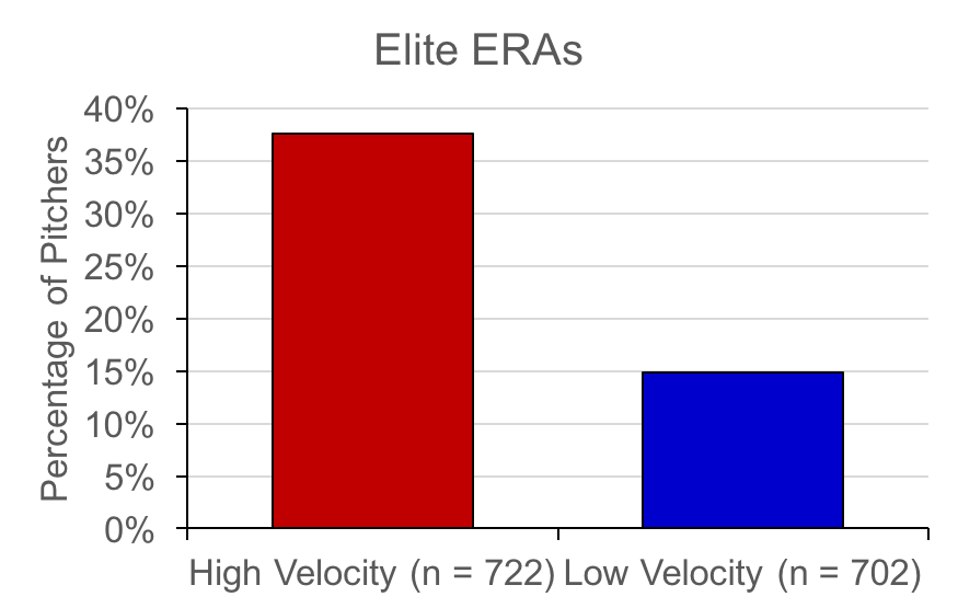
Finally, I just looked at the proportion of pitchers in the high and low velocity group that had “elite” ERAs (in the top quartile) during a season. This value represented an ERA of less than 3.00 in a season. There were 38% of pitchers in the high velocity group (271 of 722 pitchers) that had elite ERAs. The low velocity group? Only 15% of pitchers (104 of 702 pitchers).
Even further – look at the proportion of pitchers who have elite ERAs in each percentile of pitchers, ranging from 87 mph to 95+ mph fastball velocities.
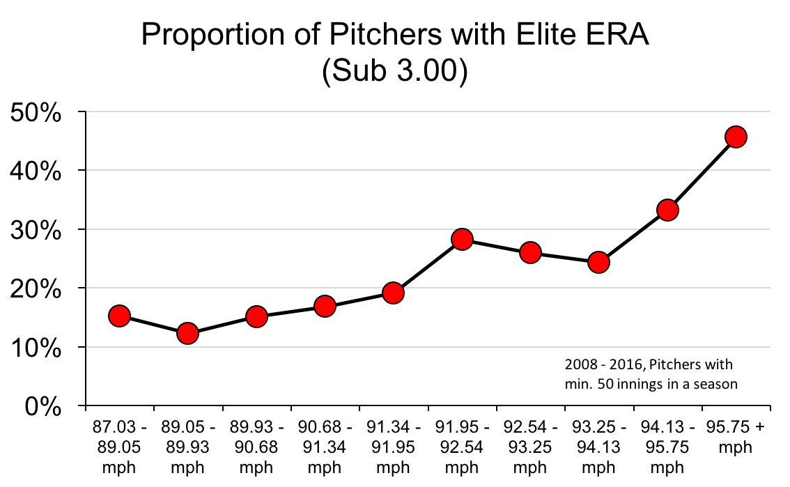
It’s tough to argue that velocity doesn’t rule.
I know this blog has become a bit redundant with this topic recently, but I want to highlight why I feel this is an important topic. There is extensive debate about how to develop effective pitchers. Broadly, this comes down to two camps in pitching twitter – those who try to say that velocity isn’t everything, and you should teach kids to throw with better command, and one that says throw as hard as you possibly can. This debate is over. Velocity wins. There is countless evidence to suggest that giving a batter less reaction time, limits their ability to effectively execute a movement pattern and hit the ball.
The challenge is no longer whether or not it is important to develop pitchers who throw hard. Those who make it to the major league level without a plus fastball are the exception to the rule, and not the alternative to throwing hard. If you want to make a difference – figure out how to help pitchers get stronger and keep their strength throughout a season (Toby et al., 2015), reduce their fatigue, and keep them healthy.
References
Matsuo, T., Jinji, T., Hirayama, D., Nasu, D., Ozaki, H., & Kumagawa, D. (2017). Middle finger and ball movements around ball release during baseball fastball pitching. Sports Biomechanics, 1-12.
Toby, B., Glidewell, E., Morris, B., Key, V. H., Nelson, J. D., Schroeppel, J. P., … & McIff, T. (2015). Strength of Dynamic Stabilizers of the Elbow in Professional Baseball Pitchers Decreases during Baseball Season. Orthopaedic Journal of Sports Medicine, 3(2 suppl), 2325967115S00163.
The hits just keep on coming from the Motus Sleeve and Driveline! Last week, the brains at driveline posted their data from 70 pitchers throwing 5 pitch, fastball bullpen sessions, and the Motus and velocity data to go along with them.
For those of you who don’t know what the Motus Baseball Sleeve is, it is a device that fits neatly into a compression sleeve, which can be worn by baseball pitchers to get the predicted ulnar collateral ligament (UCL) stress that occurs during throwing. It also provides pitchers and coaches with data on the arm slot (with respect to horizontal), the arm speed (in RPM), and the maximum predicted external rotation of the shoulder.
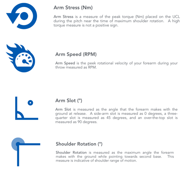
Figure 1. A description of the key metrics from the Motus Throw app – found at http://msupport.motusglobal.com/hc/en-us/articles/207295137-Key-Metrics.
I have explored the relationship between pitch velocity and elbow stress on this site before, and the driveline team has done the same thing for both fastballs, and breaking pitches. Currently, pitch velocity appears to explain about 17% of the variance in elbow stress. That means – before you look at anything else – pitcher height, mechanics, fastball type – you have 17% of your elbow stress already accounted for. While this doesn’t seem like much, you can see there is a positive, significant relationship between velocity and elbow stress.
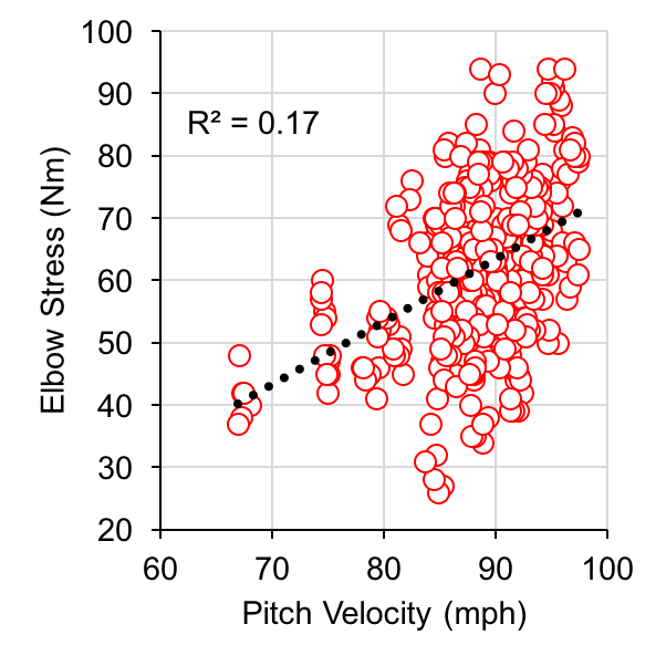
Figure 2. Velocity vs. Elbow Stress. You know this one already, though!
So, if 17 % of the elbow stress is accounted for by the pitch velocity, where are the other 83%? And, if two people throw at the same speed, but one has higher elbow stress than the other – what’s going on there?
I broke the driveline data down by velocity percentiles – just to help normalize things. I then broke this down into 5 % ile windows. At each 5%ile window for velocity, I looked at what the average predicted UCL stress was. I then determined if the pitch had greater than, or less than average stress at a given velocity range. Finally, I examined the average arm slot, arm speed, and shoulder rotation for those who had less than average, or more than average elbow stress, at a given velocity.
Results
When examining the data by pitch, there were 420 samples (nice). Comparing the higher than average stress, and the lower than average stress groups at standardized pitch velocities, there were some interesting findings. To determine statistical significance between the low and high stress groups, a t-test was used with significance set to p < 0.05. Cohen’s d was calculated for significant effects.

Figure 3. Average Arm Speed, Arm Slot, and Shoulder rotation for pitches that were over average stress levels at a set velocity level.
Higher stress pitches at a given velocity had significantly lower arm speeds (figure 3A), and significantly higher arm slots (p < 0.05, d = 0.26, and 0.21, respectively). There was no statistically significant difference between maximum shoulder rotation angles in either group (p < 0.05). This is particularly interesting, as Whiteside and colleagues (2016), found there was a significantly higher risk of UCL reconstruction surgery in pitchers with less pronounced horizontal release points. These data seem to support their findings.
The next step is to include anthropometric measures of height and weight into these calculations, and see how those improve the prediction of elbow stress alongside the key motus metrics.
References
O’Connell, M., and Boddy, K. (2017). Bullpens, Tracking Elbow Torque, and mStress. Retrieved from https://www.drivelinebaseball.com/2017/03/bullpens-tracking-elbow-torque-and-mstress/, March 4, 2017.
Whiteside, D., Martini, D. N., Lepley, A. S., Zernicke, R. F., & Goulet, G. C. (2016). Predictors of ulnar collateral ligament reconstruction in Major League Baseball pitchers. The American journal of sports medicine, 44(9), 2202-2209.
If you follow me on Twitter, you’ve likely noted that I get quite upset about the idea of pitch clocks. Why would I hate the supposed silver bullet that will end all pace of play concerns, bring new fans to the game, cause all fans to lose 25 lbs instantly, and make McDonald’s a health alternative to vegetables? Despite what you’re hearing about the benefits of pitch clocks, there are some concerns related to the health of pitchers. Let me explain why I have taken such a strong stance against them.
Muscle fatigue is a very specific process that decreases the amount of force that a muscle can generate. It is NOT just an expression of how tired a person feels. If a muscle is active, small amounts of muscle force generating capacity are lost at the smallest function level of the muscle – the motor unit. Overall muscle force at a joint level can be maintained by switching between which muscles are active, or recruiting additional motor units, but you cannot escape muscle fatigue. So let’s be clear on that – muscle fatigue is a decrease in muscle force at the muscle fiber level. The other type of fatigue that we study as researchers, is central fatigue. This is related to decreased output from the system prior to the muscle – so that means, a reduction of the available oxygen in the bloodstream, an inhibition in neural drive from the brain (such as pain, or decreased motivation), or inability to remove metabolites from the blood stream. These factors can occur, or not be occurring at the same time as muscle fatigue.
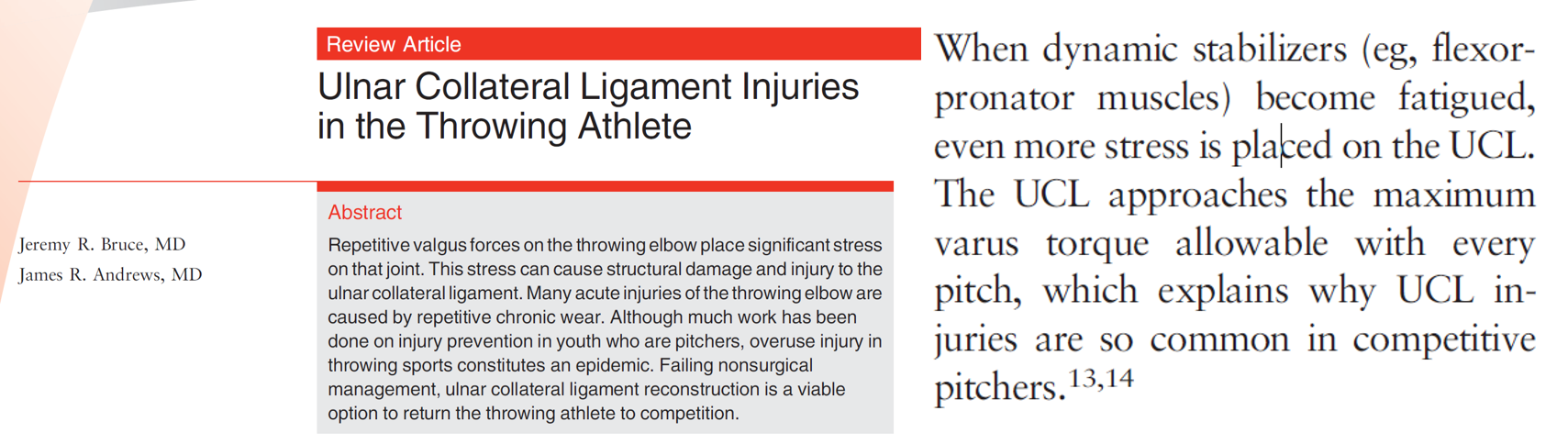
Dr. Jeremy Bruce, and Dr. James Andrews wrote a review article on Ulnar Collateral Ligament injuries (Figure 1), and one of their primary findings centered around the role of muscle fatigue on UCL ruptures. The findings boil down to this: when you throw a baseball as hard as you can, the stress on the elbow is theoretically more than enough to tear your UCL. What protects the UCL, is the activation of the muscles of the flexor pronator mass. If those muscles become fatigued, they will not be able to exert as much force, and as a result, the UCL becomes at risk of rupture.
So, how do you get away from this evil fatigue monster? Once again, its complicated (it depends on the types of efforts you’ve performed, how long you’ve been working for, etc), but in its simplest form, the prescription is: Stop! Recovery is ultimately dictated by the time you can rest. The time between pitches, or the time between innings, is when pitchers have time to recover from muscle fatigue. This is where my disdain for pitch clocks comes from.
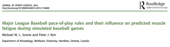
Last year, I published a paper in the Journal of Sports Sciences 2 on the implications of pitch clocks on the accumulation of muscle fatigue. Compared to the self selected paces pitchers had (from FanGraphs), forcing pitchers to throw every 20 seconds increased fatigue levels for starting pitchers (Figure 2).
Technically, the rules (Rule 8.04) state that the pitcher has 12 seconds to throw a pitch once receiving the ball from the catcher – this is obviously not enforced. If this was actually enforced, there would be even more fatigue in pitchers.
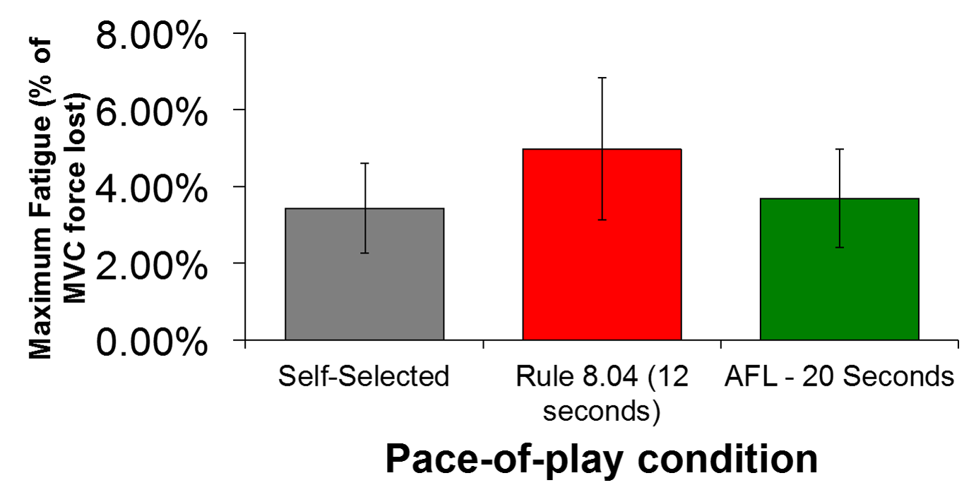
Shortening the amount of rest between pitches will increase the amount of muscle fatigue in pitchers. If you had 24 seconds of recovery, and now you only have 20 seconds of recovery – you will be more fatigued. How would this look in a typical major league baseball game? Not too long ago, I described a method to make some interesting graphs showing predicted fatigue levels in baseball games, using my fatigue model, and MLB’s GameDay data. As a Blue Jays fan, one of the most exciting moments I can remember as an adult, was when my favourite pitcher – David Price – was traded to my favourite team. In one of his first games as a Blue Jay, Price went 8 innings, and struck out 11 Minnesota Twins. Price has routinely been regarded as one of the slowest pitchers in the MLB – his pace often ranks in the top 3 of all starting pitchers. I replaced his long stretches during his games with the 20 second pitch clock limit, and this is what we’re left with:
Predicted forearm muscle fatigue, with (Red), and without (Blue) the implementation of a pitch clock (20 seconds).
In this situation, (and without assuming a significant influence in the other team’s pace), we see a reduction in time of 8.38% – going from 167 minutes, to 153 minutes – keep in mind, this doesn’t factor in the bullpen visits, or the time spent celebrating the victory afterwards. In this case, this was the time of the first 8 innings for the home team – so there would be an other inning and a half to come. At the same time, you can see in red (the condition where there is a pitch clock), that there is a lot more fatigue with the pitch clock – particularly in the 4th, and the 8th innings. Peak fatigue levels are more than 18% higher when the pitch clock is implemented.
As I have argued in the past – it’s not just injury to worry about. It is assumed that pitchers will perform at the same level when the pitch clocks are in place, when in reality – pitchers who are fatigued are shown to have less command, and less velocity. This would in turn result in more base runners, further extending the game. I hypothesize pitch clocks would have a minimal effect in reducing the time of games, all things considered.
Will the MLB eventually go with Pitch Clocks? I wouldn’t be surprised – it seems like Rob Manfred is hell bent on his crusade to speed up baseball games, turning them into NFL Blitz/ NBA Jam versions of themselves. Are these changes needed? Time will tell – but right now, it seems like those who like baseball, are fine with it in the current state.
References
Bruce, J. R., & Andrews, J. R. (2014). Ulnar collateral ligament injuries in the throwing athlete. Journal of the American Academy of Orthopaedic Surgeons, 22(5), 315-325.
Sonne, M. W., & Keir, P. J. (2016). Major League Baseball pace-of-play rules and their influence on predicted muscle fatigue during simulated baseball games. Journal of sports sciences, 34(21), 2054-2062.
When you watch football, it’s very clear by body type, what position a player likely plays. Are you 6’5 and 320lbs? That’s more than likely a lineman. 5’9 and 210 lbs? Chances are, you’re a running back. Baseball is a lot different – Marcus Stroman (5’8, 180lbs) and Chris Young (6’10, 255lbs) play the exact same position. Chris Sale (6’6, 180lbs) and Bartolo Colon (5’11, 285 lbs (sure… I believe you)) also play the same position. There aren’t too many times on the gridiron where a 100lb weight difference will line up against each other!
The point I’m trying to make, is with such huge variances in body shapes and sizes, there are many different ways to skin a cat. Marco Estrada (of 89 mph fastball fame) was massively more successful than Joe Kelly (punching a fastball in the high 90s, and over 100 mph). Pitchers of all shapes and sizes (of body and fastball) find ways to succeed. The question is – when you don’t have the clearly obvious advantage of that big fastball, how do you get major league hitters out?
Last week was pitching week over at Baseball Prospectus, and they revealed two new awesome statistics. The first one was Called Strikes Above Average: an attempt to quantify command (Long et al., 2017a). It reflects the ability for a pitcher to hit his spots and get strike calls. The second one was tunneling – a concept I tried to include in the Stuff metric by calculating the resultant distances in pitch breaks, but done in a way that is much more reflective of the demands on a hitter’s executive functioning (Long et al., 2017b). If you have studied Kinesiology, their description of tunneling, and the break:tunnel ratio is a great example of why hitting is so damned hard from a motor control perspective.
It’s pretty easy for someone to look at a pitcher, and say that they have great Stuff. Originally, I created the Stuff metric to try and win bar arguments about pitchers – it’s not necessarily shocking when you see the list of people with great Stuff. Of course Clayton Kershaw has better Stuff than Kyle Hendricks. I felt that combining the Stuff metric with these tunneling and command metrics would help better understand how pitchers of different Stuff levels ended up succeeding or failing at pitching.
Step 1
The first step was to correlate Stuff, CSAA, and Break:Tunnel with one another. I wanted to see what each metric said about the others – what did the relationship look like?
Table 1. Stuff, Command, and Tunnels (r)
| Stuff | CSAA | Break:Tunnel | |
|---|---|---|---|
| Stuff | — | -0.41 | 0.29 |
| CSAA | -0.41 | — | -0.03 |
| Break:Tunnel | 0.29 | -0.03 | — |
SOURCE: Baseball Prospectus
From this correlation table, you can see that typically those who had better stuff had less command, but a bigger break:tunnel ratio. There weren’t really any significant relationships between command and tunnels, which is great – they’re telling us two different things.
Step 2
To look at the relationship between outcome measures and Stuff, Command, and Tunnelling, I used the same process as in the last stuff article – just as simple correlation between the three pitching variables, and the outcome metrics of Deserved Run Average, Strikeouts per 9 (K/9), Earned Run Average, xFIP, Ground Ball Rate, and Swinging Strike Rate. To keep it simple at first, I just looked at qualified starting pitchers.
Table 2. Stuff, Command, and Tunnels (r2)
| DRA | K/9 | ERA | xFIP | GB% | SwStr% | |
|---|---|---|---|---|---|---|
| Stuff | 9.7% | 18.4% | 3.6% | 9.9% | 0.3% | 11.9% |
| CSAA | 1.2% | 0.1% | 0.4% | 0.4% | 0.6% | 0.5% |
| Break:Tunnel | 0.1% | 2.0% | 0.1% | 0.2% | 2.5% | 0.1% |
SOURCE: Baseball Prospectus
Interestingly enough, Stuff was more highly correlated than command or tunnelling, for all outcome measures. Better Stuff produced a lower DRA and ERA, and a higher K/9, and swinging strike rate. There were negligible relationships with GB% and Stuff. For command and tunnels, there were very few significant relationships with the outcome measures – with there being a slightly elevated relationship between Break:tunnel ratio and K/9. So, from the simple conclusions chapter, I have the following advice for pitchers. Throw hard, and be nasty. There’s no greater individual predictor for success than blasting a ball at 97 mph past a hitter. Go and watch the movie Fastball, and look at the science behind hitting a 100 mph pitch. But then again, we all knew that, right?
So, how do the guys who don’t throw absolute gas survive in the MLB? I think these three metrics provide some really interesting insight into those survival skills.
Step 3
To put things on the same scale, I divided each metric’s range into thirds. The top third represents the most desired values (higher K/9 and Stuff, lower DRA and ERA). I then calculated the average CSAA and break:tunnel ratio by each third, which resulted in a 3×3 square. I performed this analysis with Stuff along the horizontal axis, and DRA, ERA, and K/9 along the vertical axis. I repeated this for CSAA and Break:tunnel, resulting in 6 squares. To expand this analysis to more pitchers, I set a threshold of 38.1 innings pitched in a season (and included pitchers from 2008 to 2016). The 38.1 innings limit represents the 75th %ile value for innings pitched in a season – 75% of all pitchers pitched at least this many innings in the season.
Table 3. Average Break:Tunnel Ratio, and Command metrics for Stuff, DRA, K/9, and ERA.
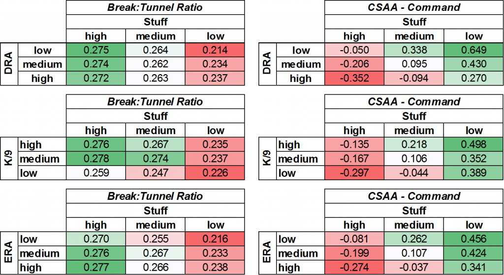
I’ll start with the tunneling story. This one doesn’t necessarily cast a whole lot of light on the situation. The best Stuff, and the best tunneling resulted in the lowest DRAs, and the highest k/9’s. The ERA section was even muddled, with the best stuff, and best tunneling resulting in the highest ERAs. That being said, the difference between the lowest tunneling value and the highest average break:tunnel ratio was only 22%.
The Stuff relationship with command is a lot more interesting. For those pitchers who had the least Stuff, but the best ERA, their average CSAA was 160% better than those who had great stuff, and a high ERA. On the flip side, check out what happens when pitchers have great Stuff. In general, those with great stuff don’t have great command – and those who are successful just keep that filth in the zone and let the hitter worry about making contact. This works out the same for K/9, and DRA – those who had the least amount of Stuff and the best results all had much better command. Once again, I don’t think this necessarily is ground breaking information (particularly for me, a known admirer of Marco Estrada, and all of his glory). However, I think this is a great validation of Baseball Prospectus’ command metric – and it has some great insight into pitchers who may age better than others. As players get older, their stuff drops off linearly. At the exact same time, the command values increase. Theoretically, a pitcher with great command would be able to overcome their lack of Stuff as they age.

Figure 1. Stuff (red) vs Command (CSAA – in Blue) as pitchers age.

Figure 2. Average ERA and DRA as Pitchers Age.
A great example of this is Felix Hernandez. Felix started his career throwing as hard as anyone in baseball, but has had his stuff drop off over the past years. Aside from one season where things looked a bit different, the trends for Stuff and Command look very similar to the population graph – a sign that Felix has adapted what he does as a pitcher to continue to be successful.

Figure 3. Stuff and Command as Felix Hernandez ages
So, now that we have established a loose relationship between all of these metrics, let’s look at a few lists to help better understand the arms behind the numbers.
These are the pitchers who have it all together. Zack Britton had elite Stuff, elite command, and parlayed this into one of the league’s best ERAs of all time. Kenta Maeda had a breakout rookie season, and Justin Verlander reinforced the theory that he has discovered the fountain of youth.
2016 Pitchers – Great Stuff, Great Command, and Low ERA
| Name | Stuff | CSAA | Break:Tunnel | DRA |
|---|---|---|---|---|
| Brad Brach | 1.66 | 0.50 | 0.28 | 3.16 |
| Cam Bedrosian | 1.96 | 0.50 | 0.33 | 2.55 |
| Carlos Carrasco | 1.58 | 0.30 | 0.24 | 2.69 |
| Chris Sale | 1.29 | 0.70 | 0.25 | 2.69 |
| Cody Allen | 1.57 | 0.70 | 0.37 | 2.50 |
| Cole Hamels | 0.76 | 1.00 | 0.27 | 2.65 |
| Hector Rondon | 2.27 | 1.20 | 0.21 | 2.71 |
| Jacob deGrom | 1.50 | 0.80 | 0.24 | 3.48 |
| Jim Johnson | 1.30 | 0.60 | 0.36 | 2.90 |
| Jose Fernandez | 1.61 | 1.40 | 0.27 | 2.23 |
| Justin Verlander | 1.94 | 1.40 | 0.30 | 2.75 |
| Kenta Maeda | 1.31 | 1.10 | 0.37 | 3.41 |
| Kyle Barraclough | 1.76 | 0.30 | 0.29 | 2.35 |
| Madison Bumgarner | 0.95 | 1.10 | 0.31 | 3.25 |
| Matt Bush | 3.41 | 0.90 | 0.34 | 3.05 |
| Rick Porcello | 1.22 | 0.80 | 0.31 | 3.45 |
| Roberto Osuna | 2.15 | 0.90 | 0.24 | 3.52 |
| Sammy Solis | 1.13 | 0.50 | 0.28 | 3.87 |
| Sean Doolittle | 1.31 | 0.30 | 0.18 | 3.25 |
| Tanner Roark | 0.86 | 0.40 | 0.27 | 4.45 |
| Tony Barnette | 1.00 | 0.40 | 0.26 | 3.60 |
| Tyler Thornburg | 1.92 | 0.40 | 0.44 | 2.89 |
| Will Smith | 0.96 | 1.00 | 0.40 | 3.58 |
| Zach Britton | 2.17 | 1.00 | 0.11 | 2.17 |
SOURCE: Baseball Prospectus
These guys had great Stuff and great ERA, but they didn’t have elite command metrics. In a sense, these guys offered up a “try and hit this” mentality, and usually ended up blowing hitters away. I’m looking at you, Noah Syndergaard and Aaron Sanchez (oh, what a rotation that would have been in Toronto).
2016 Pitchers – Great Stuff, Low Command, and Low ERA
| Name | Stuff | CSAA | Break:Tunnel | DRA |
|---|---|---|---|---|
| Aaron Sanchez | 2.32 | -0.70 | 0.31 | 3.77 |
| Andrew Miller | 1.24 | -0.40 | 0.36 | 1.22 |
| Aroldis Chapman | 4.99 | -2.10 | 0.15 | 2.04 |
| Blake Treinen | 1.94 | -2.10 | 0.17 | 3.51 |
| Brad Hand | 0.93 | -1.10 | 0.26 | 2.70 |
| Bryan Shaw | 0.81 | -1.70 | 0.21 | 3.71 |
| Carlos Martinez | 2.39 | -1.10 | 0.22 | 3.73 |
| David Phelps | 1.25 | -0.40 | 0.25 | 2.85 |
| Dellin Betances | 2.41 | -0.50 | 0.35 | 1.57 |
| Dustin McGowan | 1.76 | -1.40 | 0.23 | 3.85 |
| Fernando Rodney | 0.75 | -1.30 | 0.22 | 3.49 |
| Heath Hembree | 1.01 | -0.40 | 0.28 | 4.97 |
| Hector Neris | 1.17 | -1.40 | 0.22 | 3.43 |
| Hunter Strickland | 2.93 | -0.90 | 0.29 | 3.88 |
| Jake Arrieta | 2.03 | -1.40 | 0.27 | 4.02 |
| Jeremy Jeffress | 2.29 | -1.30 | 0.26 | 4.11 |
| Jeurys Familia | 2.91 | -1.60 | 0.19 | 3.60 |
| Joaquin Benoit | 1.36 | -0.80 | 0.18 | 3.82 |
| Joseph Biagini | 2.14 | -0.70 | 0.37 | 3.86 |
| Lance McCullers | 1.31 | -0.40 | 0.32 | 2.80 |
| Mauricio Cabrera | 4.38 | -1.00 | 0.21 | 4.76 |
| Max Scherzer | 1.23 | -1.60 | 0.28 | 3.01 |
| Michael Lorenzen | 2.31 | -0.60 | 0.23 | 3.05 |
| Mike Montgomery | 1.26 | -1.20 | 0.35 | 3.89 |
| Mychal Givens | 1.01 | -1.30 | 0.21 | 3.63 |
| Noah Syndergaard | 3.22 | -1.00 | 0.26 | 2.71 |
| Pedro Baez | 2.74 | -0.70 | 0.18 | 3.65 |
| Raisel Iglesias | 1.27 | -1.20 | 0.22 | 3.47 |
| Rich Hill | 0.94 | -0.40 | 0.43 | 2.56 |
| Robbie Ross Jr. | 0.92 | -0.50 | 0.22 | 3.79 |
| Sam Dyson | 1.35 | -0.90 | 0.18 | 4.05 |
| Seth Lugo | 1.63 | -0.40 | 0.36 | 5.06 |
| Wade Davis | 1.95 | -0.40 | 0.37 | 3.73 |
SOURCE: Baseball Prospectus
These are the pitchers that didn’t have great Stuff, but had elite command and used that to have great seasons. It isn’t surprising to see Kyle Hendricks on this list, but to see Masahiro Tanaka here is a bit shocking. His low Stuff in the 2016 season is a far departure to what it was when he broke into the league, but is a testament to his ability to adjust and find new ways to be successful.
2016 Pitchers – Low Stuff, Great Command, and Low ERA
| Name | Stuff | CSAA | Break:Tunnel | DRA |
|---|---|---|---|---|
| Alex Claudio | -1.67 | 0.90 | 0.24 | 3.73 |
| Brad Ziegler | -2.81 | 2.90 | 0.15 | 2.99 |
| Dan Otero | -1.21 | 0.30 | 0.17 | 3.06 |
| Fernando Salas | -0.48 | 0.60 | 0.25 | 4.05 |
| Kyle Hendricks | -2.46 | 2.50 | 0.21 | 3.34 |
| Masahiro Tanaka | -0.77 | 1.20 | 0.20 | 3.55 |
| Ryan Dull | -0.69 | 0.70 | 0.25 | 3.71 |
| Tommy Layne | -0.51 | 0.60 | 0.15 | 4.34 |
| Travis Wood | -1.08 | 0.70 | 0.22 | 5.75 |
SOURCE: Baseball Prospectus
In this final list, you see pitchers that put everything together: Stuff, and Command, but didn’t parlay it into great results on the field. For Tigers fans, seeing Jordan Zimmerman on this list is encouraging – perhaps that wasn’t an albatros contract, and he will be back to his previous form in 2017. Sonny Gray battled injury, but if his health returns, he could be back to his old dominant self. Michael “420 Blazek” – shout out to the guys at Brew Crew Baseball who were the first non-Jays fans to ever read something that I wrote – had great stuff and command, but didn’t get great results. Next season, he could be a key piece in the Brewers bullpen.
2016 Pitchers – Great Stuff, Great Command, and High ERA
| Name | Stuff | CSAA | Break:Tunnel | DRA |
|---|---|---|---|---|
| Adam Warren | 1.10 | 0.40 | 0.31 | 5.09 |
| Andrew Cashner | 1.21 | 0.70 | 0.24 | 4.55 |
| Chad Bettis | 0.76 | 1.10 | 0.28 | 4.23 |
| Daniel Hudson | 1.73 | 0.50 | 0.19 | 4.20 |
| Drew Storen | 1.02 | 1.00 | 0.30 | 4.05 |
| John Gant | 1.26 | 1.50 | 0.40 | 3.93 |
| Jordan Zimmermann | 0.75 | 0.40 | 0.27 | 4.94 |
| Juan Nicasio | 0.91 | 0.80 | 0.18 | 3.34 |
| Kevin Jepsen | 1.23 | 1.00 | 0.33 | 6.79 |
| Keyvius Sampson | 1.54 | 1.70 | 0.32 | 4.94 |
| Michael Blazek | 1.90 | 0.60 | 0.30 | 4.94 |
| Sonny Gray | 1.18 | 1.40 | 0.31 | 3.92 |
| Taijuan Walker | 1.58 | 0.60 | 0.31 | 3.84 |
| Trevor May | 1.75 | 0.30 | 0.41 | 3.14 |
| Wily Peralta | 1.35 | 2.00 | 0.17 | 4.47 |
| Zack Greinke | 1.31 | 2.10 | 0.40 | 3.51 |
SOURCE: Baseball Prospectus
So, in summary – combining the Stuff Metric with BP’s Command and Tunnels provides some insight into how pitchers get hitters out. These new metrics can be used to help look at how pitchers age and change their strategies to forge long careers.
References
Long, J., Judge, J., & Pavlidis, H., (2017a). Prospectus Feature: Introducing Pitch Tunnels. Retrieved from: http://www.baseballprospectus.com/article.php?articleid=31030, published January 24, 2017.
Long, J., Judge, J., & Pavlidis, H., (2017b). Prospectus Feature: Introducing Pitch Tunnels. Retrieved from: http://www.baseballprospectus.com/article.php?articleid=31022, published January 23, 2017.
I wanted to start this (the final post of 2016) off on a sappy note. This has been the first year that I’ve been involved in writing about baseball from a scientific perspective. When I started my PhD at McMaster, there was a department seminar meeting, which focused on science and knowledge translation. The speaker, who was a world leader in her field, told us that on average – research takes 14 years to make it from the lab to the field. I made it my focus to try and reduce those numbers. While my PhD had an ergonomics application, I have really enjoyed trying to tie the worlds of baseball and ergonomics together. Fatigue Units, and the fancy fatigue graphs, and the paper arguing against pitch clocks, all use the model I developed for my PhD thesis. If you have read anything I have written this year, I am eternally thankful! Interacting with people through Twitter, email, and this blog, has been one of the most fun and rewarding experiences I’ve had as a scientist. I really want to thank Dr. Stephen Osterer, Dr. Michael Chivers, Tavis Bruce, Kyle Boddy, Michael O’Connell, Trip Somers, Kevin Kennedy, and Eno Sarris for helping me get my ideas out there. You guys know so much more than me about baseball, but thanks for listening to me anyway!
Alright, enough of that – time for nerd stuff.
I’ve had a chance to look at Fleisig’s most recent paper 1 on arm forces during weighted ball training. This paper is a very important step towards determining the safety of a very effective method for pitcher development. If pitchers are getting better, but increasing their risk of injury – what’s the point in throwing harder? At the same time, maybe throwing these weighted implements serves as a unique stimulus for muscle growth and arm health. A lot of questions are still out there waiting to be answered, but this is an important first step.
So, let’s look at things as simply as we can. One of the first equations you learn in physics, or in the application of physics to the human body – biomechanics – is that force is equal to mass times acceleration.
F = M*A
One of the main findings of this study, was overweight baseball throwing produced lower forces on the arm, primarily, lower varus torques when compared to normal weight baseballs. With respect to injury prevention, and specifically, Ulnar Collateral Ligament tears, this is a good thing! Lower varus torques mean less strain on the ligament, and a reduced risk of tearing when compared to the normal weight baseballs.
How does throwing something heavier result in less force in a joint? It all comes back to F = M*A. If we keep acceleration constant, and want to decrease force, we’d need to decrease the mass of the segment (and implement) being rotated. Similarly, if we wanted force to be lower, but increased the mass, we’d need to significantly reduce the acceleration of the segment. From table 1 in the Fleisig paper, we can see that the accelerations of the shoulder, elbow, and pelvis are all lower in the heavier ball conditions when compared to the underweight, and overweight baseballs.

However, the overall varus torque on the elbow, and the directly transmitted torque to the ligament may not be the same thing.
Werner et al., (1993) 2, illustrated that torques incurred at the elbow during the pitching motion are greater than the known torsional torques required to rupture the UCL. Muscle activation is used to transmit these forces off of the ligaments, and prevent damage to the UCL. This is why it is dangerous for the flexor-pronator muscles to become fatigued, and lose their ability to produce muscle force during pitching (Bruce & Andrews, 2014) 3.
Joint rotational stiffness refers to how rigid a joint is while it is moved 4. In the human body, stiffness is controlled by increasing the co-contraction of muscles spanning a joint. For example, activating the flexor muscles of the elbow (the biceps), as the elbow is rapidly extending (using the triceps). A stiffer joint (with more muscle activation) theoretically protects the ligaments by transmitting rotational torques from “passive” tissues (those tissues which are not contracting), to the “active” tissues (the muscles which are contracting). However, by increasing stiffness of a joint, the body loses the ability to produce high rotational accelerations and velocities.
Think about it as a whip – a thicker piece of rope can not rotate as quickly, and snap as violently as a thinner piece of rope. At the same time, the thinner rope is at a higher risk of fraying and breaking than a thicker rope. In the body, a joint with less stiffness can move faster, and more smoothly than a joint with more stiffness.
When throwing a heavier implement as hard as you can, there has to be more joint rotational stiffness in place to protect the ligaments. However, as the motion becomes more natural, and more familiar to the thrower, stiffness will decrease. This will result in a ball velocity increase, and possibly, a re-mapping of muscle activation patterns for throwing the ball when returning to a normal weight ball. If you want to get deeper into this, and the concept of stability, stiffness, and joint rotational impedance, check out the work from some really smart guys – Mike Holmes, and Joshua Cashaback.
Does throwing a weighted ball decrease the total varus force at the elbow, but increase the amount of force that is actually transmitted to the ligament? For the sake of arguments, let’s say this is true. How do pitchers manage to stay healthy, while throwing harder? One of the possible ways to protect the UCL is to make sure that muscles are able to contract, and reduce the amount of force transmitted to the ligament. Putting in work in the weight room, and specifically, training the forearm muscles, could serve to cause hypertrophy, increasing the physiological cross sectional area of the muscle and allowing the muscle to pull with the same amount of absolute force, but at a lower effort level (associated with less muscle activation).
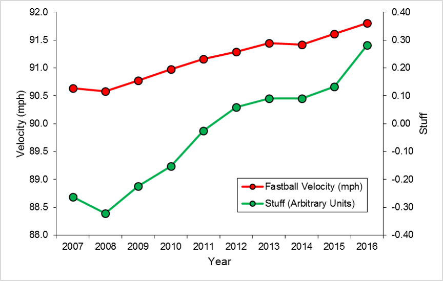
Research has shown there is very little effectiveness in restricting innings in pitchers with respect to preventing injury (Karakolis et al., 2016 5 ). Other research has shown that pitching velocity (and “Stuff” – sorry, shameless self-promotion) has increased linearly, year after year.
At the same time, the number of Tommy John Surgeries has also increased every year (particularly in younger pitchers) (Keri, 2015 6). Some people out there, who get their jollies on hoping people get hurt, so they can be proved right, even call this an epidemic.

(Figure from Keri, 2015).
So, let’s bring my crazy, mad scientist, aluminum foil hat-wearing hypothesis full circle. Back to this theory on stiffness – pitchers are finding ways to shut off their muscles through different training regimes – yes, even maximizing your throwing intent to throw as hard as humanly possible, could play a role in reducing co-contraction and joint stiffness. Over the long term, could this be causing a re-mapping of the muscle firing patterns, reducing stiffness in game-thrown pitches, exposing the UCL to greater stress? Furthermore, do strict innings limits, like the ones that Matt Harvey and Stephen Strasburg faced, lead to a de-training effect? Pitching is a unique motion – one that is difficult to replicate in a gym. As a result, could there be atrophy occurring in the forearm musculature due to reductions in throwing? Fleisig’s paper hypothesized that the “holds” drill, and throwing of weighted baseballs, could be an effective resistance training strategy. Now imagine, hypertrophy occurs, allowing for protection of the UCL during high velocity throws. This happens in the offseason, when pitchers are preparing for their next year of competitive baseball. They throw frequently, with the intent of getting better. Now, they enter the MLB season, and arbitrary limits are placed on their pitching. To stay in the major leagues, they have to keep their velocity high – but now, they have lost some of that muscle mass they grew during their training. When they return to throwing – the velocity remains the same, but the protective mechanisms are now reduced.
This isn’t meant to be a stance for or against weighted balls. I don’t coach baseball – I’m a fan of the game, and truly enjoy applying what I know about how people move to the game I passionately watch. Keep in mind, this post is a perspective – it is not tested, or even extensively researched. Selfishly, I like writing these things, because there are people out there who have the access to pitchers, equipment, and can answer these types of questions. Consider this – a challenge point to unlock more information about how the body works. If you are using this as some form of gospel to take a stand against weighted balls – don’t do that. Don’t be a dick.
So, that’s my theory on how using weighted baseballs for training, and pairing it with workload restrictions in season, could lead to an increase in UCL injuries.
It’s either that, or it’s aliens.

1.
Fleisig G, Diffendaffer A, Aune K, Ivey B, Laughlin W. Biomechanical Analysis of Weighted-Ball Exercises for Baseball Pitchers. Sports Health. November 2016. [PubMed]
2.
Werner S, Fleisig G, Dillman C, Andrews J. Biomechanics of the elbow during baseball pitching. J Orthop Sports Phys Ther. 1993;17(6):274-278. [PubMed]
3.
Bruce J, Andrews J. Ulnar collateral ligament injuries in the throwing athlete. J Am Acad Orthop Surg. 2014;22(5):315-325. [PubMed]
4.
Holmes M, Keir P. Posture and hand load alter muscular response to sudden elbow perturbations. J Electromyogr Kinesiol. 2012;22(2):191-198. [PubMed]
5.
Karakolis T, Bhan S, Crotin R. Injuries to young professional baseball pitchers cannot be prevented solely by restricting number of innings pitched. J Sports Med Phys Fitness. 2016;56(5):554-559. [PubMed]
6.
Keri J. The Tommy John Epidemic: Whatâs Behind the Rapid Increase of Pitchers Undergoing Elbow Surgery? Grantland. http://grantland.com/the-triangle/tommy-john-epidemic-elbow-surgery-glenn-fleisig-yu-darvish/. Published March 10, 2015. Accessed December 22, 2016.
I’ve done a bunch of work modelling fatigue in pitchers, including the study used to suggest Pitch Clocks would lead to increased fatigue 1 , how pitches per inning influences fatigue levels 2 , and a new workload metric based on fatigue 3 . For a lot of these simulations, I used average pitch counts and paces from FanGraphs. This provides an overall picture of the estimated fatigue in a pitcher, but doesn’t really account for the individual variability associated with a game. I was originally trying to get a bigger picture idea of how fatigue accumulated during pitching – so this was appropriate. However, I missed out on some pretty cool looking graphs – which depending on who you talk to, is the entire point of science.
Last week, I tweeted out a few graphs that looked at predicted forearm fatigue in pitchers from games during the 2014, and 2015 season. Here was the first one:
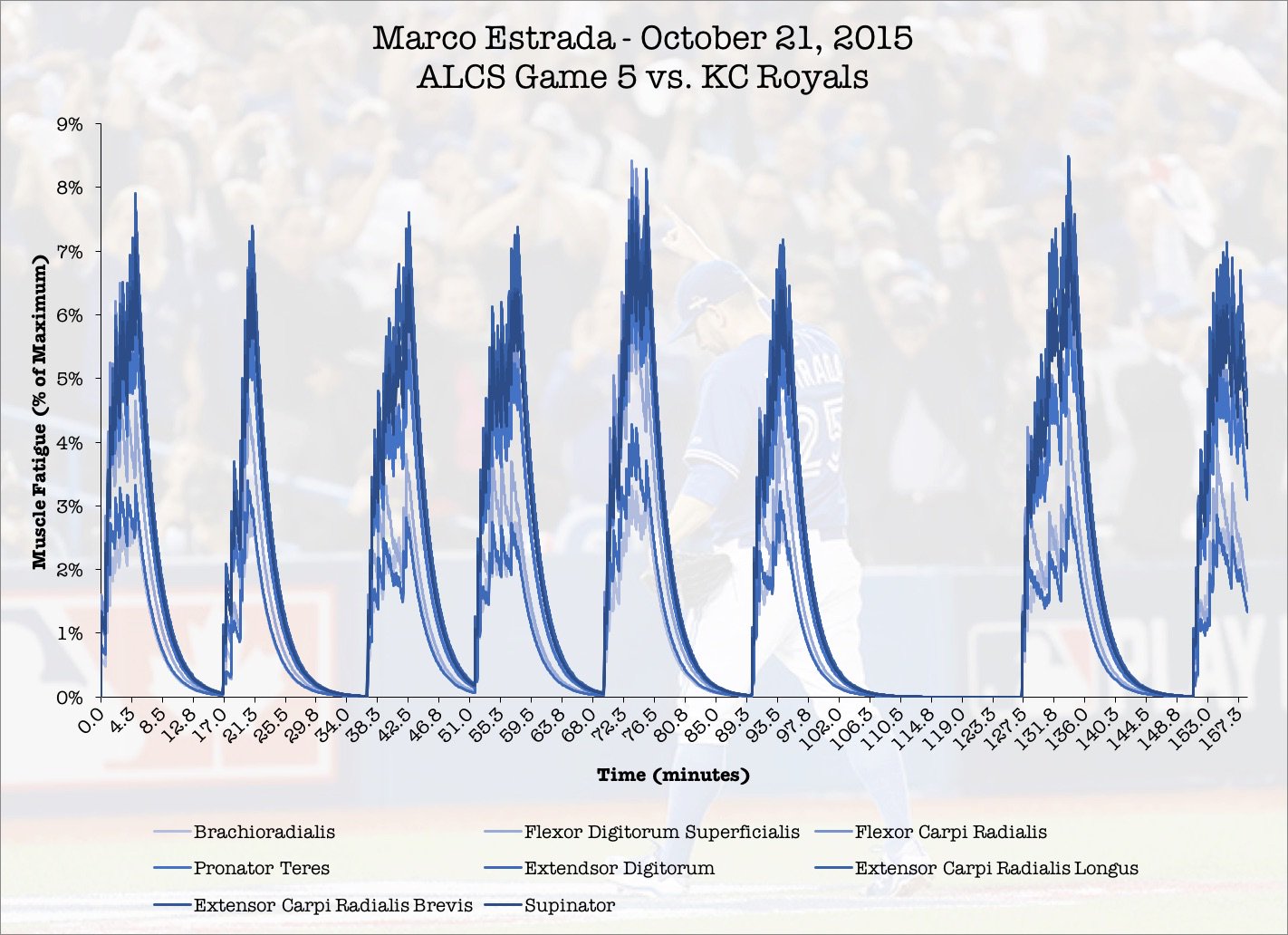
Playing around with data visualization – Marco Estrada’s predicted forearm muscle fatigue during his game 5 gem from the 2015 ALCS. pic.twitter.com/fWqH0JaqWm
— Mike Sonne (@DrMikeSonne) December 2, 2016
In game 5 of the ALCS in 2015, Marco Estrada went 7 and 2/3 innings, staving off elimination and sending the series back to Kansas City. Estrada started out fast, and never gave up a run until the 7th inning. It was a sign of things to come – absolute clutch pitching performances that buoyed the Blue Jays pitching staff in the 2016 season. Here’s how I was able to get these simulations.
Methods
The first step in this method was to get the pitch types, sequence, and time of each pitch during an outing. From the MLB’s gameday data, I was able to pull this sequence out by querying the database by pitcher and game. Here’s the MySQL Query I used for that purpose:
select pitches.sv_id, atbats.inning, atbats.outs, pitches.pitch_type, atbats.des, atbats.pitcher from atbats, pitches, games where pitches.ab_id = atbats.ab_id and atbats.game_id = games.game_id and games.game_id = ‘23910’ and atbats.pitcher = 462136 order by atbats.inning, atbats.outs ASC
This produced a result that looked like this:
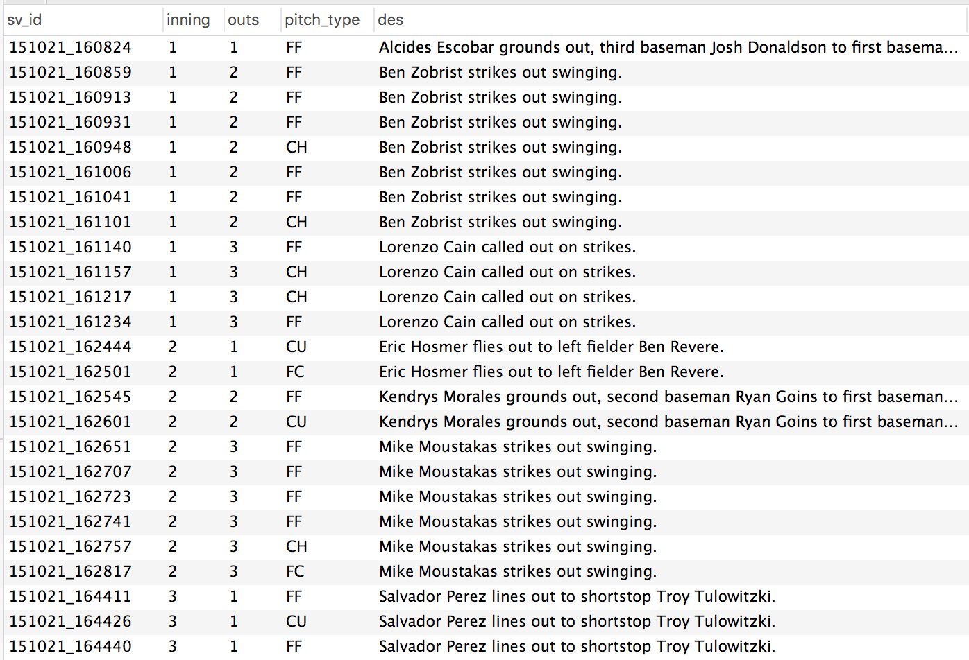
Figure 1. Sample output from the MySQL query posted in the snippet above.
Every pitch, organized by inning and sequence, for an individual pitcher in an individual game. That value on the left – the sv_id from the gameday atbats table, contained the date (YYMMDD_HHMMSS). Everything I needed to calculate the amount of time between each pitch.
From the paper on pitch clocks and fatigue, I had created a time history of muscle demands for a series of forearm muscles. These were defined as either fastball type pitches, or breaking type pitches. In the graphs, figure A are the demands for fastballs, and figure B are the demands of curve balls / breaking pitches. These time histories are from a series of studies, summarized in the pitch clock papers.

So, back to the Gameday database. I exported the demands from the query into Matlab. I coded each pitch as being either a fastball or a breaking ball, then attached the appropriate amount of rest after each pitch. Here’s an example from Marco Estrada’s ALCS game:

Figure 3. Pitch selection and rest time from Estrada’s game 5 of the 2015 ALCS. All pitches coded as a 1 were fastballs. All pitches coded as 2 were breaking pitches. These were used to simulate the time histories of demands for Estrada, and then determine the predicted fatigue level.

Figure 4. Muscle demands by pitch during a 12 pitch first inning. The first pitch of the game lead to a ground ball out. The next 7 pitches resulted in a strike out, followed by a 4 pitch strike out. You can see the larger gaps between pitches as being reflective the time between batters.
The largest numbers in this time history represented the time between innings. What I have learned from this is, is just how fatiguing it can be for a pitcher to have a long inning, followed by a short half inning where his team goes three up three down.
At this point, I had everything I needed to predict fatigue in a pitcher. Using the EMG demands from figure 4, the three compartment fatigue model was able to generate an example of how much muscle force would be lost at a given time based on the previous history of muscle demands. For Estrada, his peak fatigue came during the 5th and 7th innings of the game. During these innings, he threw 14 and 17 pitches – the highest per inning in the game. In the 5th inning, he threw more fastballs than breaking pitches, which resulted in higher fatigue levels.
Interestingly. innings where pitchers throw more fastballs have higher fatigue levels. Greater homogeneity in pitch selection has been identified as a risk factor for UCL reconstruction by Whiteside and colleagues (2016) 4 have higher fatigue levels occur when pitchers throw more fastballs.
Conclusions
This methodology could now allow for examination of fatigue during starts where a pitcher was hurt, or from a series of starts where a pitcher became hurt. If at the start of the season, a pitcher had his EMG activation levels recorded during a bullpen session, these accurate demands could be substituted into the model for a more accurate fatigue prediction. For now – this is a fun new way to look at a pitching performance.
If you have any requests for simulations, let me know!
1.
Sonne M, Keir P. Major League Baseball pace-of-play rules and their influence on predicted muscle fatigue during simulated baseball games. J Sports Sci. 2016;34(21):2054-2062. [PubMed]
2.
Sonne M. Fatigue inferences on a 100 pitch limit – Mike Sonne. Science and Baseball. http://www.mikesonne.ca/baseball/fatigue-inferences-on-a-100-pitch-limit/. Accessed December 5, 2016.
3.
Sonne M. Giving a big FU to workload metrics in pitchers: Part 2 – Cumulative FUs – Mike Sonne. Science and Baseball. http://www.mikesonne.ca/uncategorized/giving-a-big-fu-to-workload-metrics-in-pitchers-part-2-cumulative-fus/. Accessed December 5, 2016.
4.
Whiteside D, Martini D, Lepley A, Zernicke R, Goulet G. Predictors of Ulnar Collateral Ligament Reconstruction in Major League Baseball Pitchers. Am J Sports Med. 2016;44(9):2202-2209. [PubMed]
A lot was made of the heavy workloads that elite relievers performed in the 2016 post season. Aroldis Chapman, Andrew Miller, and Roberto Osuna had extended appearances of 2+ innings, when they had only thrown an inning at a time in the regular season. With everything on the line, teams were willing to push these elite arms to their limits. For the most part (save for one scary moment in the AL Wild Card game with Osuna), they all emerged unscathed, and probably went a long way to raising reliever salaries for future seasons.
By now, you have probably learned that my Fatigue Unit metric heavily favours relief pitchers. A study by Whiteside and colleagues (2016) 1, and my analysis of Driveline’s publically available data 2,3, have indicated that throwing on consecutive days, and throwing harder, are risk factors for Ulnar Collateral Ligament reconstruction. Relief pitchers are throwing more and more innings, and their rate of injury appears to be much greater than those of starting pitchers 4. These are the hard facts of relief pitching – see examples from Aaron Sanchez (94-95 mph as a starter, and 97-100 as a reliever).

Relief Innings pitched, and number of relief pitchers used through the 1965 to 2015 season (Keri & Neil, 2014). Relief pitchers are throwing more and more innings – and pitching in the bullpen may not be saving arms.
Using Fatigue Units5, I wanted to look at the top workloads in the past post season, and furthermore, explore how those workloads compared to regular season workloads.
Methods
I was able to analyze the 2016 MLB regular season thanks to Michael Copeland (@jelloslinger). He pulled in pitch counts, by inning and game, for every game since the start of the 2015 season. For simplicity’s sake, I looked at the peak velocity and the average pace for all pitchers, downloaded from the Fangraphs website. Those were the data required to calculate FU’s for each pitcher. I then broke these data down by regular season games and post-season games.
Once cumulative fatigue units were calculated for each pitcher, I also calculated the average workload per game. The rest of the analysis was performed on pitchers who only pitched in both the regular season and the post season. I compared the average workload between regular season and post season performances. For an example, I also looked at how workloads changed throughout the season, and I’m going to present the data on how workloads changed throughout course of the season for a few select pitchers.
Results and Conclusions
Not surprisingly, the highest workload of the 2016 playoff season belonged to Andrew Miller and Corey Kluber. For Andrew Miller, the biggest change in his workload between the regular season and the post season, was his multi-inning appearances. In the playoffs, he averaged 0.8 FU’s per game, and in the regular season, he average 0.4 FU’s per game. His workload per game was doubled in the playoffs when compared to his regular season numbers. Andrew Miller’s playoff workload represented 25.2% of his entire regular season workload – during 10 games (compared to 70 games in the regular season).
As for Corey Kluber, his high workload was driven by short rest. Kluber pitched game 1, 4 and 7 of the World Series in 2016. In the regular season, Kluber pitched 100% of his starts on regular rest (a 5 day separation, minimum, between starts). During the playoffs, 50% of his appearances came on less than 5 days of rest. Kluber averaged 1.23 FU’s per appearance in the 2016 playoffs, compared to 0.74 FU’s per appearance in the regular season.
Going to game 7 of the World Series, the Cubs had the greatest sum of fatigue units of all 2016 playoff teams. However, when looking at sum of fatigue units for every playoff teams, the Cubs accumulated 147% more fatigue units than the second highest team (the Toronto Blue Jays). When looking further into these findings – what drove these really high FU accumulations in the Cubs and Blue Jays, were a very high number of back to back relief appearances for both teams. The Cubs had 35% of all of their pitching appearances in the post season occur on back to back nights, a total of 26 pitcher appearances in the 2016 post season. Comparatively, Cleveland only had 11% of all of their pitching appearances occur on back to back nights.
I’m not one for hot takes, but I feel that I have to say something here. If workload has any sort of relationship to injury, Terry Francona’s management of his pitching staff, from a workload management perspective, is one of the most impressive baseball strategy events to occur in my recent memory. While the Cubs emerged the eventual World Series Champions, Joe Maddon had to repeatedly rely on the same pitchers (primarily, Aroldis Chapman) in high leverage situations, which lead to high usage during back to back games. If extreme workloads to lead to injury, the work done by Francona in the playoffs does appear to be a great template for managers in the future. If we’re being realistic though – flags fly forever, and when they haven’t flown in 108 years, it’s hard to say that there were any errors in workload management.
I still have to look further into the utility of FU’s as an injury prediction model. Currently, I believe it is a metric that more accurately represents physiological demands on the body, and more importantly, the musculature responsible for predicting the UCL.
References
1.
Whiteside D, Martini D, Lepley A, Zernicke R, Goulet G. Predictors of Ulnar Collateral Ligament Reconstruction in Major League Baseball Pitchers. Am J Sports Med. 2016;44(9):2202-2209. [PubMed]
2.
Sonne M. Pitch Velocity and UCL Stress using the Motus Sleeve: Further interpretation from Driveline data – Mike Sonne. Science and Baseball. http://www.mikesonne.ca/baseball/pitch-velocity-and-ucl-stress-using-the-motus-sleeve-further-interpretation-from-driveline-data/. Accessed November 30, 2016.
3.
O’Connell M, Boddy K. Elbow Stress, Motus Sleeve, and Velocity. Home – Driveline Baseball. https://www.drivelinebaseball.com/elbow-stress-motus-sleeve-velocity/. Published October 28, 2016. Accessed November 30, 2016.
4.
Keri J, Paine N. How Bullpens Took Over Modern Baseball. FiveThirtyEight. http://fivethirtyeight.com/features/how-bullpens-took-over-modern-baseball/. Published August 15, 2014. Accessed November 30, 2016.
5.
Sonne M. Giving a big FU to workload metrics in pitchers: Part 2 – Cumulative FUs – Mike Sonne. Science and Baseball. http://www.mikesonne.ca/uncategorized/giving-a-big-fu-to-workload-metrics-in-pitchers-part-2-cumulative-fus/. Published September 1, 2016. Accessed November 30, 2016.
As previously mentioned, there really isn’t anything better than getting your hands on new data. That new data smell, the excitement of telling someone that the singular of data is datum. I was really excited to see a follow up study (O’Connell, Hart & Boddy, 2016) to the Bauerfeind study that examined the influence of pitch velocity on arm stress (O’Connell & Boddy, 2016). After reading the article, there were some really surprising findings that I wanted to look into further. More specifically – the claim this study replicated the findings of Post et al (2015), and found a non-significant relationship between elbow valgus torque, and ball velocity.
The study can be found here:
https://www.drivelinebaseball.com/elbow-stress-motus-sleeve-velocity/
But, here are some of the key findings.
- A “very small” relationship between the stress metric, and pitch velocity of r2 = 0.21
- “This contradicts a commonly believed hypothesis that when comparing pitchers across a population the ones who throw the hardest also experience the greatest stress. We are only looking at elbow stress, this may not hold up when looking at both elbow and shoulder stress. But this is a very interesting finding nonetheless!”
First of all, I wanted to look at simply the interpretation of these data. The r2 statistic infers how much of variable A can we infer from variable B. For example, if our r2 value is 0.5, that represents that variable B accounts for 50% of the variation in variable A. When studying human movement, Vincent and Weir (2012) proposed threshold values of r2 = 0.25 to 0.49 as low, 0.49 to 0.64 as moderate, and greater than 0.81 as strong. However, they included this caveat:
“Values lower than (0.25), if they are statistically significant, can be useful for identifying nonchance relationships among variables, but they are probably not large enough to be useful in predicting individual scores. However, in conjunction with more than one predictor variable (multiple regression)… even individually modest predictors may be useful”
– Vincent & Weir, 2012, page 117.
The values reported in their text are r values, but I have adjusted them to be r2 values.
So, let’s look at these results – a “very small” relationship, and “similar to the findings of Post et al., 2015”. Post et al (2015) found
“very small r2 values, indicated that very little of the variance in joint kinetics can be explained by ball velocity… the correlations between ball velocity and both elbow-valgus torque and shoulder external-rotation torque were not significant”
The values reported by Post et al (2015) were an r2 of 0.04, and p=0.053, or, 4% of elbow valgus torque could be explained by ball velocity, and this relationship was not statistically significant. This is where I have some concerns with the interpretations of the newest study from O’Connell and Boddy (2016). Their study reveals a statistically significant relationship between ball velocity and arm stress, in the low range of correlational strength (r2 = 0.21). Interpreting these results in their current form, these findings indicate that 21% of arm stress can be predicted using ball velocity alone. So, ignoring any differences in mechanics between pitchers, fatigued state, or pitcher body size, we already have a model that predicts 21% of our dependent variable. As someone who has spent a good amount of time wrestling with data, attempting to prove hypotheses about muscle fatigue, I would typically kill for a relationship with this strength! The findings of the O’Connell & Boddy study do not replicate those of Post et al., 2015 – they illustrate a link between arm stress and pitch velocity – and that is without moving on to some methodological concerns.
The beauty of blogging, and posting open source data to try and further science, is that you live in a state of constant, dynamic, peer review. In many ways, this is vastly superior to the traditional publication model, where studies are reviewed by academics, then go to sit on bookshelves and are never looked at again. When open data is published, it gives others a chance to chime in on the results.
Looking at the data that went in to calculating the r2 value of 0.21 between stress and velocity, a couple of things emerge. First of all, not all pitchers have the same contribution to the means. Two pitchers only threw 6 pitches, while one threw 19 pitches. If pitch velocity only indicates 21% of the variance in arm stress, there are clearly other factors at play. If we have an unequal number of pitches between our participants, we’re leaving room for error, by having someone with greater stress contributions from other variables swaying our correlation, one way, or the other. To try and accommodate for this, I removed the two pitchers from the analysis who only threw 6 pitches. I then took the average velocity, and stress, from the top 9 velocity throws from all other pitchers, and put them into the correlation with an n=15. The correlation between velocity and stress now goes up to r2 = 0.32, or 32% of the variance in arm stress is accounted for by ball speed. Including all of the pitches individually, and only using the top 9 pitches from each pitcher (an n=97), we end up with a correlation of r2 = 0.37 between velocity and arm stress.
When your model can account for 37% of the variance between one variable and another, you are definitely on to something. This is statistically significant, and when visualized (Figure 1), it becomes quite clear that a relationship exists. In fact, this number appears to be nearly an exact replica of another study, where Hurd et al., (2012), found a relationship of r2 = 0.37 between pitch velocity and elbow adduction moment.
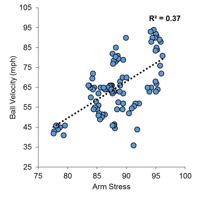
Figure 1 Correlation between Arm Stress and Ball Velocity, for top 9 velocity throws (n = 15 pitchers, 97 pitches)
So, what about the other variables that the Motus sleeve spits out? I can’t tell you with 100% certainty what arm slot, or shoulder rotation means from these data, but I included ball speed, arm speed, arm slot, and shoulder rotation, in a multiple linear regression model to predict Stress. Once again, I used the top 9 velocity pitches from 15 pitchers to do this analysis.
To put all of the variables on the same scale, I converted them all into z-scores – this will give us standardized coefficients that we can compare against one another in our regression output.
In summary, this model produced an r2 value of 0.55, with Arm Slot and Shoulder Rotation not being the weakest predictors of arm stress, and arm speed having a negative relationship with arm stress (Figure 2).
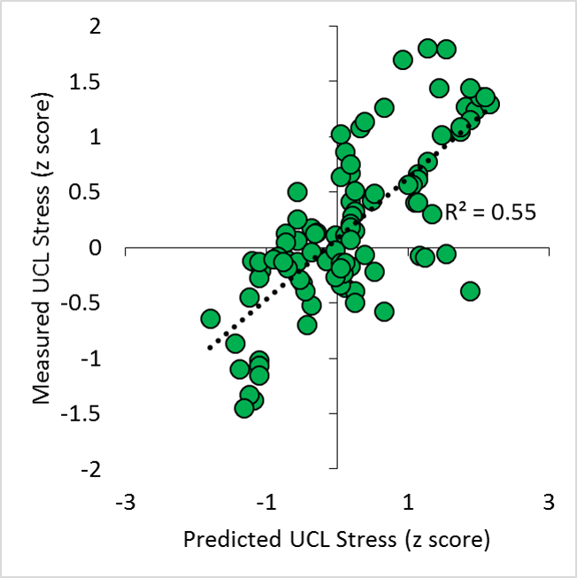
Figure 2. Predicted and actual UCL stress (z scores), from input variables of ball velocity, arm slot, arm speed, and shoulder rotation.
| SUMMARY OUTPUT | ||||||||
| Regression Statistics | ||||||||
| Multiple R | 0.74 | |||||||
| R Square | 0.55 | |||||||
| Adjusted R Square | 0.53 | |||||||
| Standard Error | 0.67 | |||||||
| Observations | 97 | |||||||
| ANOVA | ||||||||
| df | SS | MS | F | Sig. F | ||||
| Regression | 4 | 49.78 | 12.44 | 28.06 | 0.00 | |||
| Residual | 92 | 40.80 | 0.44 | |||||
| Total | 96 | 90.58 | ||||||
| Coefficients | Standard Error | t Stat | P-value | Lower 95% | Upper 95% | Lower 95.0% | Upper 95.0% | |
| Intercept | 0.01 | 0.07 | 0.17 | 0.86 | -0.13 | 0.15 | -0.13 | 0.15 |
| MPHz | 0.83 | 0.09 | 9.77 | 0.00 | 0.66 | 1.00 | 0.66 | 1.00 |
| ArmSpeedz | -0.47 | 0.08 | -5.90 | 0.00 | -0.62 | -0.31 | -0.62 | -0.31 |
| ArmSlotz | 0.16 | 0.08 | 1.97 | 0.05 | 0.00 | 0.32 | 0.00 | 0.32 |
| ShoulderRotationz | 0.11 | 0.05 | 2.10 | 0.04 | 0.01 | 0.22 | 0.01 | 0.22 |
It is quite clear that there are other variables not being measured that will help produce a better model of arm stress, but from the main predictor of arm stress right now remains ball velocity. These data collected using the Motus Sleeve, on one of the more advanced populations of pitchers that have been researched, echoes many of the findings that Hurd et al., (2012) produced in a lab setting. It is important to understand how statistics are interpreted, and what assumptions go in to calculating results.
This study goes deeper into understanding the stress on the arm during pitching (as this is tracked from actual bullpen sessions, and not flat ground throws like in the Bauerfeind study). Other studies that have examined the risk of UCL injury in youth pitchers, have identified fatigue, stature, and cumulative pitch effects as risk factors for injury (Chalmers et al., 2015).
Conclusion
In summary, pitch velocity shows a significant relationship with arm stress, using the Motus Sleeve. If you throw harder, chances are, you will have higher levels of stress on your UCL. It is important to properly condition and be strong, so you can withstand these stresses. There are many other factors that go in to determining just how much stress is on the UCL, but these must be further studied by hard working groups like Driveline, and researchers in other facilities.
Here are the data I used for the analyses above.
References
Chalmers, P. N., Sgroi, T., Riff, A. J., Lesniak, M., Sayegh, E. T., Verma, N. N., … & Romeo, A. A. (2015). Correlates with history of injury in youth and adolescent pitchers. Arthroscopy: The Journal of Arthroscopic & Related Surgery, 31(7), 1349-1357.
Hurd, W. J., Jazayeri, R., Mohr, K., Limpisvasti, O., ElAttrache, N. S., & Kaufman, K. R. (2012). Pitch velocity is a predictor of medial elbow distraction forces in the uninjured high school–aged baseball pitcher. Sports Health: A Multidisciplinary Approach, 4(5), 415-418.
O’Connell, M., Hart, S., & Boddy, K. (2016). Elbow Stress, Motus Sleeve, and Velocity. Retrieved from https://www.drivelinebaseball.com/elbow-stress-motus-sleeve-velocity/, November 4, 2016.
O’Connell, M., & Boddy, K. (2016). Can You Reduce Pitching Elbow Stress Using a Sleeve? Retrieved from https://www.drivelinebaseball.com/can-reduce-pitching-elbow-stress-using-sleeve/, November 4, 2016.
Post, E. G., Laudner, K. G., McLoda, T. A., Wong, R., & Meister, K. (2015). Correlation of shoulder and elbow kinetics with ball velocity in collegiate baseball pitchers. Journal of athletic training, 50(6), 629-633.
Sonne, M.W. (2016). UCL Stress and Velocity Increases. Retrieved from http://www.mikesonne.ca/baseball/ucl-stress-and-velocity-increases/, on November 4, 2016.
Vincent, W., & Weir, J. (1999). Statistics in kinesiology. Human Kinetics. Champagne, Illinois.
Believe it or not, the Arizona Fall League is a place where players other than Tim Tebow go, to refine their skills before making it to the bigs. When they aren’t faith healing fans who have fallen ill, AFL pitchers are throwing a repertoire of pitches that they hope will propel them to the next levels of their minor league careers. Luckily for us, MLB has put out the pitchf/x data from the past 2 seasons (with the 2016 data coming). This allows me to calculate pitcher’s Stuff from the AFL.
The Stuff metric has been closely related to a lot of performance metrics at the MLB level – but I have not had a chance to look at any minor league data, until this point. I wanted to see how Stuff in the AFL compared to MLB Stuff – and to see if this has any potential as a scouting metric in parks that have PitchF/X. Let’s compare.
Methods
I used the calculated Stuff metric from the 2016 as my MLB standard. The stuff list is the same one found on www.mikesonne.ca. I downloaded the PitchF/X outputs from Baseball Savant (for the 2014, and 2015 AFL seasons), and calculated Stuff in the same way mentioned here. To try and get some sort of consistency, I only calculated stuff for pitchers that threw 30 pitches in the AFL. Additionally, pitchers had to have thrown at least 10 innings in the MLB in 2016. For analysis, I compared the 2016 Stuff against the AFL stuff using a Pearson’s correlation coefficient.
Results
First off, from the 116 different pitchers that had PitchF/X data in the AFL, only 23 managed to fit both inclusion criteria. The average fastball velocity, offspeed velocity, change of speed, and break distances, as well as correlation coefficients can be found in table 1.
Table 1. Summary of variables from AFL and MLB.
| Stuff | FB Velocity | Offspeed Velocity | Change | Movement | |
| AFL | 0.31 ± 0.91 | 92.54 ± 3.07 | 81.38 ± 4.77 | 0.12 ± 0.04 | 9.65 ± 6.06 |
| MLB | 0.73 ± 0.84 | 93.37 ± 3.33 | 81.18 ± 3.65 | 0.13 ± 0.03 | 13.74 ± 4.12 |
| r | 0.59 | 0.85 | 0.67 | 0.5 | 0.33 |
| r2 | 0.35 | 0.72 | 0.44 | 0.25 | 0.11 |
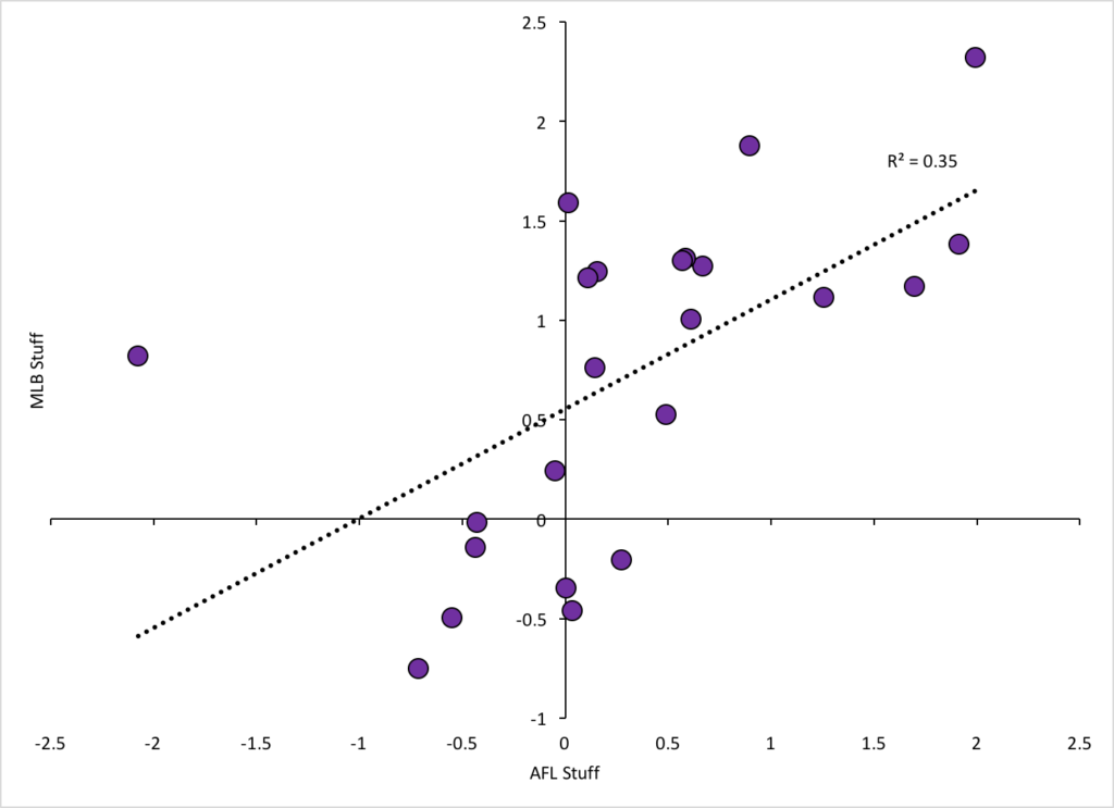
All components of the Stuff metric correlated well between AFL and MLB measures. Velocity had the strongest relationship (r = 0.85) between the measures at the AFL and MLB. Movement had the weakest relationship (r = 0.33). Overall, AFL stuff accounted for 35% of the variance in MLB stuff. Not great, but definitely a good start. This is really a small sample size, and if we omit the data from one outling pitcher (Adam Morgan), the r value goes up to 0.77.
The PitchF/X system can be a bit finicky, so there’s a chance that some of the movement data discrepancies are a factor of the different parks in the AFL. Maybe these cameras weren’t as sensitive to the pitch movement, or maybe, the pitchers at this time in their development, weren’t as good at generating movement.
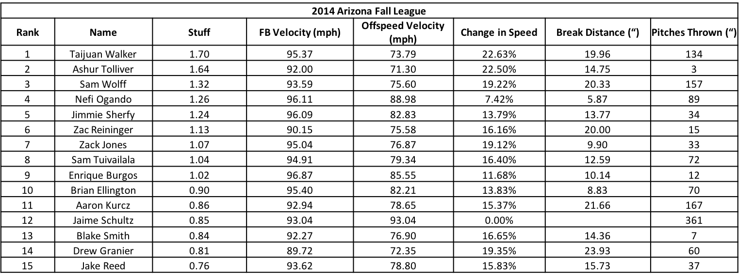
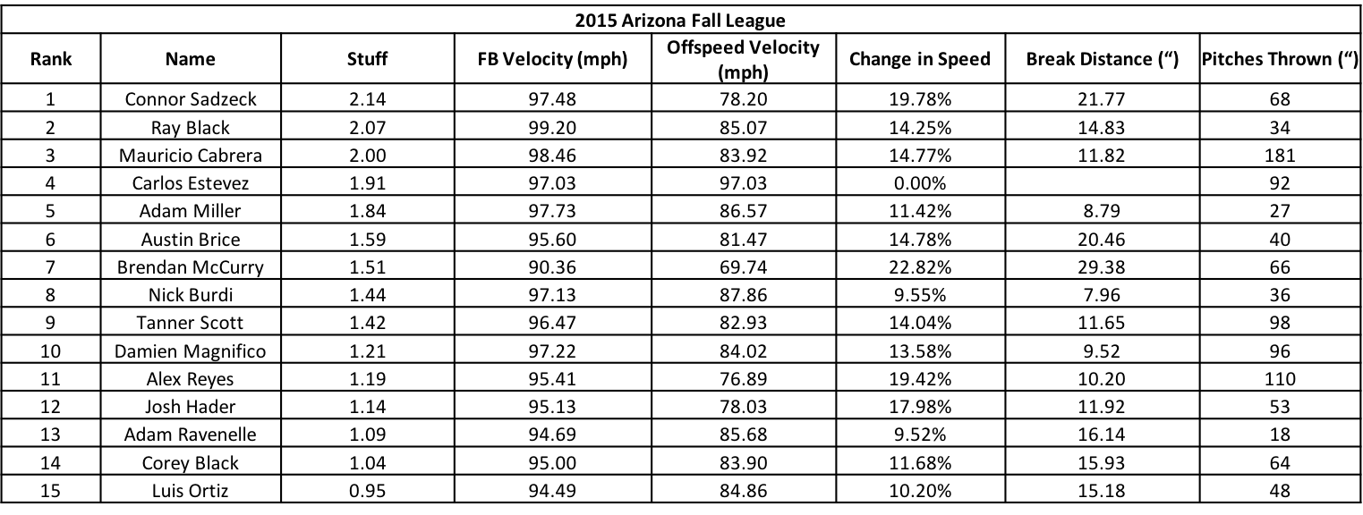
Here are the top 15’s for the 2014, and 2015 AFL’s
In summary – there is a decent relationship between AFL and MLB Stuff – it isn’t perfect, but this could be used as a possible way to track pitcher development, and another tool for evaluating Stuff prior to arriving in the MLB. Right now, there aren’t enough pitchers from the AFL who have made their way to the MLB to truly get an idea of how their Stuff develops – but this is an encouraging start.
Now, if we can just go back to watching more Tebow…
Recent Comments