Science and Baseball

Category: Science (Page 2 of 2)

Pitch Velocity and UCL Stress using the Motus Sleeve: Further interpretation from Driveline data

As previously mentioned, there really isn’t anything better than getting your hands on new data. That new data smell, the excitement of telling someone that the singular of data is datum. I was really excited to see a follow up study (O’Connell, Hart & Boddy, 2016) to the Bauerfeind study that examined the influence of pitch velocity on arm stress (O’Connell & Boddy, 2016). After reading the article, there were some really surprising findings that I wanted to look into further. More specifically – the claim this study replicated the findings of Post et al (2015), and found a non-significant relationship between elbow valgus torque, and ball velocity.

The study can be found here:

https://www.drivelinebaseball.com/elbow-stress-motus-sleeve-velocity/

But, here are some of the key findings.

  • A “very small” relationship between the stress metric, and pitch velocity of r2 = 0.21
  • “This contradicts a commonly believed hypothesis that when comparing pitchers across a population the ones who throw the hardest also experience the greatest stress. We are only looking at elbow stress, this may not hold up when looking at both elbow and shoulder stress. But this is a very interesting finding nonetheless!”

First of all, I wanted to look at simply the interpretation of these data. The r2 statistic infers how much of variable A can we infer from variable B. For example, if our r2 value is 0.5, that represents that variable B accounts for 50% of the variation in variable A. When studying human movement, Vincent and Weir (2012) proposed threshold values of r2 = 0.25 to 0.49 as low, 0.49 to 0.64 as moderate, and greater than 0.81 as strong. However, they included this caveat:

“Values lower than (0.25), if they are statistically significant, can be useful for identifying nonchance relationships among variables, but they are probably not large enough to be useful in predicting individual scores. However, in conjunction with more than one predictor variable (multiple regression)… even individually modest predictors may be useful”

– Vincent & Weir, 2012, page 117.

The values reported in their text are r values, but I have adjusted them to be r2 values.

So, let’s look at these results – a “very small” relationship, and “similar to the findings of Post et al., 2015”. Post et al (2015) found

“very small r2 values, indicated that very little of the variance in joint kinetics can be explained by ball velocity… the correlations between ball velocity and both elbow-valgus torque and shoulder external-rotation torque were not significant”

The values reported by Post et al (2015) were an r2 of 0.04, and p=0.053, or, 4% of elbow valgus torque could be explained by ball velocity, and this relationship was not statistically significant. This is where I have some concerns with the interpretations of the newest study from O’Connell and Boddy (2016). Their study reveals a statistically significant relationship between ball velocity and arm stress, in the low range of correlational strength (r2 = 0.21).  Interpreting these results in their current form, these findings indicate that 21% of arm stress can be predicted using ball velocity alone. So, ignoring any differences in mechanics between pitchers, fatigued state, or pitcher body size, we already have a model that predicts 21% of our dependent variable. As someone who has spent a good amount of time wrestling with data, attempting to prove hypotheses about muscle fatigue, I would typically kill for a relationship with this strength! The findings of the O’Connell & Boddy study do not replicate those of Post et al., 2015 – they illustrate a link between arm stress and pitch velocity – and that is without moving on to some methodological concerns.

The beauty of blogging, and posting open source data to try and further science, is that you live in a state of constant, dynamic, peer review. In many ways, this is vastly superior to the traditional publication model, where studies are reviewed by academics, then go to sit on bookshelves and are never looked at again. When open data is published, it gives others a chance to chime in on the results.

Looking at the data that went in to calculating the r2 value of 0.21 between stress and velocity, a couple of things emerge. First of all, not all pitchers have the same contribution to the means. Two pitchers only threw 6 pitches, while one threw 19 pitches. If pitch velocity only indicates 21% of the variance in arm stress, there are clearly other factors at play. If we have an unequal number of pitches between our participants, we’re leaving room for error, by having someone with greater stress contributions from other variables swaying our correlation, one way, or the other. To try and accommodate for this, I removed the two pitchers from the analysis who only threw 6 pitches. I then took the average velocity, and stress, from the top 9 velocity throws from all other pitchers, and put them into the correlation with an n=15. The correlation between velocity and stress now goes up to r2 = 0.32, or 32% of the variance in arm stress is accounted for by ball speed. Including all of the pitches individually, and only using the top 9 pitches from each pitcher (an n=97), we end up with a correlation of r2 = 0.37 between velocity and arm stress.

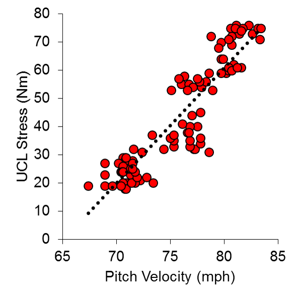
When your model can account for 37% of the variance between one variable and another, you are definitely on to something. This is statistically significant, and when visualized (Figure 1), it becomes quite clear that a relationship exists. In fact, this number appears to be nearly an exact replica of another study, where Hurd et al., (2012), found a relationship of r2 = 0.37 between pitch velocity and elbow adduction moment.

final-simple-model-correlation

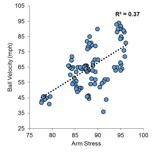
Figure 1 Correlation between Arm Stress and Ball Velocity, for top 9 velocity throws (n = 15 pitchers, 97 pitches)

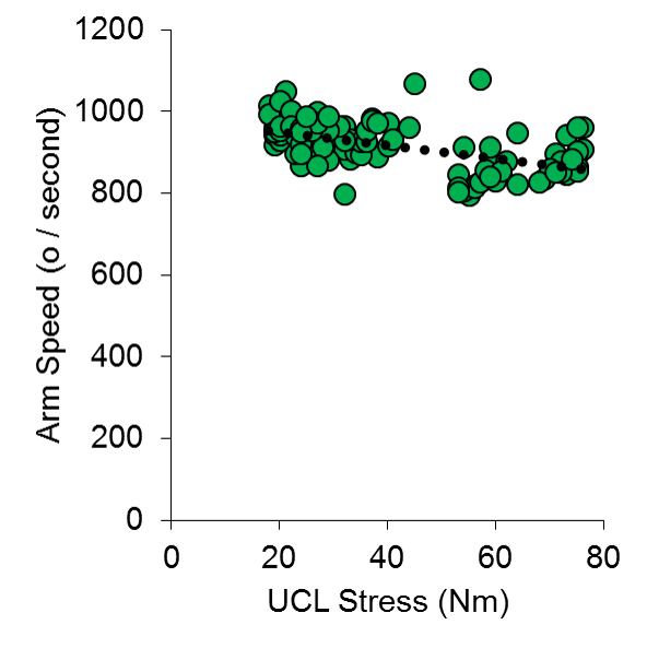
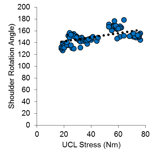
So, what about the other variables that the Motus sleeve spits out? I can’t tell you with 100% certainty what arm slot, or shoulder rotation means from these data, but I included ball speed, arm speed, arm slot, and shoulder rotation, in a multiple linear regression model to predict Stress. Once again, I used the top 9 velocity pitches from 15 pitchers to do this analysis.

To put all of the variables on the same scale, I converted them all into z-scores – this will give us standardized coefficients that we can compare against one another in our regression output.

In summary, this model produced an r2 value of 0.55, with Arm Slot and Shoulder Rotation not being the weakest predictors of arm stress, and arm speed having a negative relationship with arm stress (Figure 2).

final-model-results-multiple

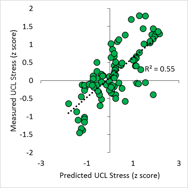
Figure 2. Predicted and actual UCL stress (z scores), from input variables of ball velocity, arm slot, arm speed, and shoulder rotation.

SUMMARY OUTPUT
Regression Statistics
Multiple R 0.74
R Square 0.55
Adjusted R Square 0.53
Standard Error 0.67
Observations 97
ANOVA
df SS MS F Sig. F
Regression 4 49.78 12.44 28.06 0.00
Residual 92 40.80 0.44
Total 96 90.58
Coefficients Standard Error t Stat P-value Lower 95% Upper 95% Lower 95.0% Upper 95.0%
Intercept 0.01 0.07 0.17 0.86 -0.13 0.15 -0.13 0.15
MPHz 0.83 0.09 9.77 0.00 0.66 1.00 0.66 1.00
ArmSpeedz -0.47 0.08 -5.90 0.00 -0.62 -0.31 -0.62 -0.31
ArmSlotz 0.16 0.08 1.97 0.05 0.00 0.32 0.00 0.32
ShoulderRotationz 0.11 0.05 2.10 0.04 0.01 0.22 0.01 0.22

It is quite clear that there are other variables not being measured that will help produce a better model of arm stress, but from the main predictor of arm stress right now remains ball velocity. These data collected using the Motus Sleeve, on one of the more advanced populations of pitchers that have been researched, echoes many of the findings that Hurd et al., (2012) produced in a lab setting. It is important to understand how statistics are interpreted, and what assumptions go in to calculating results.

This study goes deeper into understanding the stress on the arm during pitching (as this is tracked from actual bullpen sessions, and not flat ground throws like in the Bauerfeind study). Other studies that have examined the risk of UCL injury in youth pitchers, have identified fatigue, stature, and cumulative pitch effects as risk factors for injury (Chalmers et al., 2015).

Conclusion

In summary, pitch velocity shows a significant relationship with arm stress, using the Motus Sleeve. If you throw harder, chances are, you will have higher levels of stress on your UCL. It is important to properly condition and be strong, so you can withstand these stresses. There are many other factors that go in to determining just how much stress is on the UCL, but these must be further studied by hard working groups like Driveline, and researchers in other facilities.

Here are the data I used for the analyses above.

References

Chalmers, P. N., Sgroi, T., Riff, A. J., Lesniak, M., Sayegh, E. T., Verma, N. N., … & Romeo, A. A. (2015). Correlates with history of injury in youth and adolescent pitchers. Arthroscopy: The Journal of Arthroscopic & Related Surgery31(7), 1349-1357.

Hurd, W. J., Jazayeri, R., Mohr, K., Limpisvasti, O., ElAttrache, N. S., & Kaufman, K. R. (2012). Pitch velocity is a predictor of medial elbow distraction forces in the uninjured high school–aged baseball pitcher. Sports Health: A Multidisciplinary Approach4(5), 415-418.

O’Connell, M., Hart, S., & Boddy, K. (2016). Elbow Stress, Motus Sleeve, and Velocity. Retrieved from https://www.drivelinebaseball.com/elbow-stress-motus-sleeve-velocity/, November 4, 2016.

O’Connell, M., & Boddy, K. (2016). Can You Reduce Pitching Elbow Stress Using a Sleeve? Retrieved from https://www.drivelinebaseball.com/can-reduce-pitching-elbow-stress-using-sleeve/, November 4, 2016.

Post, E. G., Laudner, K. G., McLoda, T. A., Wong, R., & Meister, K. (2015). Correlation of shoulder and elbow kinetics with ball velocity in collegiate baseball pitchers. Journal of athletic training50(6), 629-633.

Sonne, M.W. (2016). UCL Stress and Velocity Increases. Retrieved from http://www.mikesonne.ca/baseball/ucl-stress-and-velocity-increases/, on November 4, 2016.


Vincent, W., & Weir, J. (1999). Statistics in kinesiology. Human Kinetics. Champagne, Illinois.

Back to the FUture – Workloads since 2007

Well, now that we know what Brandon Morrow’s stuff looked like with the Jays in 2010, let’s move on to understanding pitcher workloads since 2007.

First – a foray back into my thought process for the days of rest penalty in the metric. If you look back to the second article on Cumulative FU’s, I proposed that for consecutive day appearances, the FU’s be multiplied by 5. For 2 to 4 days of rest, the FU’s were multiplied by 2. For the standard, every 5th day – there was no multiplier for the FUs.

When I looked at the predicted FU’s for all pitchers (and as you’ll see shortly), the high use relievers – 80-100 innings in a season – had the highest workloads – significantly higher workloads than starters for the most part. I thought, I may have to make an adjustment to the metric – but I wanted to look at starter vs. reliever injury rates first.

I downloaded Jon Roegele’s Tommy John Surgery (TJS) list (@MLBPlayerAnalys), and then classified pitchers as relievers (if 80% of more of their innings came from relief innings), or starters. I compared numbers from the 2007 to 2016 seasons. Only pitchers who pitched 10 innings in a season were included in the analysis.

I looked at the sum of innings pitched and the number of TJS that occurred for all pitchers, and came up with a ratio of innings per TJS, for both starters, and relievers.

There were a total of 125092 innings pitched by Relievers during this time period, and 290401.1 innings pitched by starters. During that time, 151 relief pitchers required TJS, and 141 starters required surgery. This worked out to a ratio of 848.4 innings per TJS for Relievers, and 2059.6 innings per TJS. These data should likely be vetted a bit more carefully before they’re viewed as gospel – but this is a scary number. Aren’t reducing innings and pitches during the season supposed to protect relief pitchers’ arms?

I have argued that pitchers often throw harder when they move to the bullpen, and that this extra velocity places more stress on the UCL. In that same time period (2007, to 2016), relief pitchers threw their average fastball at a velocity of 91.5 +/- 3.35 mph, and starters threw their fastball at an average speed of 90.7 +/- 2.6 mph. Maybe, just maybe – those back to back to back appearances that relievers can make are worse for their bodies than the 6 innings pitched every 5 days?

Anyway – let’s move on to the workload metrics since 2007!

Starters

Team Workloads

The 2011 Rays take the cake for total workload for starting pitchers. Lead by David Price and Big Game James Shields, the Rays starters were not only good – they worked hard in the 2011 season. Overall, the highest average workload belonged to the tigers – particularly in 2014 and 2015 seasons.

Individual Workloads

The highest workload for a starting pitcher belongs to Justin Verlander in 2011. In fact, it is alarming to see just how many times Verlander and Sabathia’s names show up in the top 25 of this list. Those guys were horses in their prime – and it’s unknown how those huge workloads contributed to both of their recent injury problems. Conversely – how much of their durability during that time was because they worked so much, and had great pitching fitness?

Relief Pitchers

Bullpen Averages

The Rockies 2012 bullpen put in the most about of work during the past ten years. This was a direct result of a really bad starting rotation – only one pitcher cleared 100 innings pitched. The relief core was totally hung out to dry on this team. Overall, the Nationals had the highest yearly workload average for their bullpen (though this is driven by the late 2000’s when they were not very good).  There is a general trend for bullpen workloads to increase in the past 10 years – with 2015 having the highest workload for relievers in that time frame.

Individual Workloads

At first glance, I have to say – these numbers looked just… wrong. Then, I looked again – and they didn’t change.
krod-2010

Francisco Rodriguez put up an INSANE workload in 2010 – 62.84 – with nearly 1800 pitches, and over 100 innings. That’s a lot of exposure to high pressure situations, back to back days, and pitches per inning. The set up men, and the swing men – those who pitch more than an inning in relief, appear to have the highest workload levels. Something else that came up this weekend – was the topic of Dellin Bettances. After giving up a walk off in his third day of work in three days, people talked about his over use with the Yankees. In the past 3 years – no one has a higher workload than Bettances.


You are welcome to question the FU’s! Hit me up at michaelsonne@gmail.com, or on Twitter @DrMikeSonne if you want to debate these findings!

Giving a big FU to workload metrics in pitchers: Part 2b – Cumulative FUs from FanGraphs

To calculate individual game FU’s, you’ll have to download the pitchFx database. However, if you want to get an idea of how much fatigue a pitcher has accumulated during a season, there is an easier way.

I investigated how well Cumulative FU’s lined up with data I downloaded from FanGraphs from the 2015 season – particularly, the amount of Innings pitched, the pace of pitching, number of relief innings pitched, and total pitches thrown. Using a linear regression approach, I then figured out what the right coefficients would be to predict the cumulative FU’s. Here are the results:

table for regression

regression for cumulative FU's

Overall, the R2 value was 0.95, and the RMS error was 3.0 Cumulative FU’s. Not too bad. Looking a bit more specifically, relief innings pitched was the most significant individual predictor, at R2 = 0.43. The combined variables produce the most accurate replication of the Cumulative FU metric.

If you want to use this to estimate workload in pitchers, the formula is: Cumulative FU’s =-3.38 + 0.10 * IP + 0.43 * Relief IP + 0.12 * Pace + 0.004 * Pitches.

With all of this in mind – now, let’s take a look at some 2016 data.

I went on the FanGraphs site, and generated a custom report with IP, Pitches, Relief IP, and Pace included.

Once again, the list ends up being fairly reliever heavy. Erasmo Ramirez has the highest workload so far this season, with at total of 44.38 FU’s. The first starter that appears on the list is Christopher Devenski at number 2 – but he has started 25 out of his 93.1 innings have come as a starter. The first dedicated starter on this list is Trevor Bauer, all the way down at 62. Once again, he has pitched out of the bullpen at times this season. With only starting innings showing up, Justin Verlander is at 72, accumulating 32.3 FU’s on the season.

Catering to my Blue Jays friends, Roberto Osuna leads the team in FU’s, accumulating 34.5 on the season. He’s followed by Joe Biagini, with 33.6. Aaron Sanchez is at 26.7 on the season – which looks like it will be less than his 34.6 FU’s he accumulated during the 2015 season. Here are the Blue Jays cumulative FUs for the 2015, and 2016 seasons, respectively.

2015 jays

2016 jays

As with any metrics, tinkering will happen over time. Interesting to note between the 2015 season – while Sanchez has had a reduction in workload, look at the increase seen by Marcus Stroman. He made his miraculous return in September last year, only accumulating 7.53 FU’s in 2015. This year, he’s at 27.33 FUs.

Giving a big FU to workload metrics in pitchers: Part 2 – Cumulative FUs

Read Part 1 to see how FUs are calculated for pitchers during their appearances.

As we have learned in many different ways that are not a lot of fun, both relief pitchers and starting pitchers can succumb to the effects of pitching. This makes the Pitcher Abuse Point scale not appropriate for relief pitchers (see this article on Baseball Prospectus – (Jazayerli, 1998)). Other research has pointed to measures like innings pitched as being a poor determinant of workload in pitchers (Karakolis paper). Pitching on consecutive days, high velocities, and total pitches have been identified as risk factors for injury – let’s try and combine them all into one metric.

Starting with the FUs I described in part 1, I took a shot at modelling fatigue in every game in the 2015 MLB season. I downloaded the PitchFX database, and extracted the number of pitches, batters faced, innings pitched, and total time for each inning, for every game. I broke this down by pitcher, game, and inning, and was left with an FU for each inning during each game. To get a cumulative FU for each game, I just added these inning FUs up for each pitcher.

Velocity has also been indicated as a risk factor for injury, and the source of greater UCL stress (Whiteside et al., (2016), Sonne (2016)). To add in the effect of high velocity, a scaling factor was created using the average velocity of 92.16 mph. The peak velocity during each appearance was scaled to this, creating a factor that ranged between 0.614, and 1.124. This value was multiplied by the FU in each inning to create a velocity scaled FU.

Whiteside et al., (2016) showed reduced time between appearances was a significant predictor of UCL injury. Furthermore, the paper on heart rate variability in pitchers illustrated there weas less HRV the day after an appearance – which returned to baseline after 4 days. To include this in the cumulative FU, if a pitcher appeared in 2 games, back to back, they had a multiplier of 5. If their last appearance was between 2 and 4 days ago, they had a multiplier of 3. If their last appearance was 5 days or greater, the multiplier was 1. The velocity scaled FU was then multiplied by the rest multiplier, giving a cumulative FU for each game. These game cumulative FUs were then all added together, giving a season FU for each pitcher.

I’ve included an example of one pitcher from the 2015 season that I feel shows a good example of how this metric can be used (and how I feel moving a pitcher from the starting rotation to the bullpen doesn’t necessarily help their arm). Aaron Sanchez started the 2015 season as a starter for the Blue Jays, but injuries forced him to the disabled list after his June 6th start. When he returned on July 25th, Sanchez pitched out of the bullpen. To relate this back to the Whiteside article, which indicated higher velocities and fewer days’ rest were significant predictors of injury, Aaron averaged a peak fastball velocity of 95.5 mph as a starter in 2015, and 97.3 mph as a reliever. The average time between appearances was 5.5 days as a starter, but 2.4 days as a reliever.

I’ve compared his numbers against those of David Price – a known workhorse who remained in the starting rotation for multiple teams all year long.

figure 1 - price vs sanchez

Figure 1. Aaron Sanchez and David Price’s cumulative FU workloads during the 2015 season.

Despite Sanchez being moved to the bullpen, you can see that his cumulative FU’s still increase over the course of the season. Sanchez missed nearly two months in the 2015 season – and this can be seen in the plateau between May and July. When he returns from the bullpen, his workload begins to increase again, and matches the increasing trajectory of FUs generated by Price.

Given the research reported by Whiteside et al., (2016), and inferred from the Motus data collected at Driveline  – I do not believe that Bullpen work should be viewed as a “break” from the starting rotation. There are unique demands associated with this type of pitching, and the workloads that the pitchers are subjected to when pitching in relief are not accurately captured by traditional metrics such as pitches thrown, or innings pitched. Let’s take a look at how Cumulative FU’s can capture the workloads of all major league pitchers from the 2015 season, and compare them back to the traditional metrics.

First, I wanted to see if the Cumulative FU was just a surrogate for IPs or pitches thrown – if it was, there is no point in using this metric! To do this, a Pearson correlation was used, and the R2 was calculated. Just as a note – this is not “innings pitched”, it represents “innings appeared in”. My thought process was – if a pitcher is coming out for an appearance, they perform the same warm up pitches, and bullpen work, regardless of how many outs they record. If a pitcher throws 30 pitches, while getting shellacked and does not record an out – this should still count towards the cumulative innings total on the season.

Cumulative FU’s were significantly correlated with other workload metrics, but not enough to believe they’re just a replication. After all, if you throw a lot of innings, that does represent a higher workload… it just may not capture the whole story. Looking at IP and total pitches, these measures explained 36.5% and 29.5% of the variance in cumulative FU’s, respectively. The number of outings in a season explained 65.2 % of the variance in cumulative FU’s, and the average number of days between appearances explained 27.9% of the variance in cumulative FU’s.

I examined the top workload pitchers for each of these metrics as well. I broke these metrics down by month of the season, so the cumulative workloads could be analyzed over time.

figure 3 - cumulative pitches

Figure 2. Cumulative Pitches Thrown during the 2015 season – top 10 pitchers. 

figure 2 - cumulative innings

Figure 3. Cumulative Inning Appearances in the 2015 season, broken down by month.figure 4 - cumulative fatigue units

Figure 4. Cumulative FU’s for the 2015 season – top 10 pitcher workloads.

Once again, I don’t think it would surprise anyone to see Clayton Kershaw at the top of the innings pitched workload metric, or Jake Arrieta as the pitcher with the most total pitches thrown. These are both work horses for their respective teams. However, in both innings pitched, and total pitches, you will noticed that there are no relief pitchers.

Looking at cumulative FUs (Figure 4), Dellin Betances – he of 76 total game appearances, and Jeurys Familia (appearing in over 80 games for the Mets) appear at the top of the list. This is followed by Travis Wood (who appeared as both a reliever and a starter for the cubs), and finally, by Clayton Kershaw. Starters Price, Arrieta, Keuchel, Volquez and Cueto round out the list. This workload metric appears to show more favour for relievers, who appear on short rest schedules, often throw harder, appear in more games than starting pitchers.

Let’s look one step further, and see who has the highest workloads between the 2007 and 2015 seasons. First of all – who cumulatively had the highest workload during this time, and second – who had the highest average workloads during this time period.

Table 1. Top 10 for cumulative FU’s between 2007 and 2015 (in blue). Top 10 for average cumulative FU’s in a season between 2007 and 2015 (in red).

table 1 - cumulative fu's

Francisco Rodriguez has kind of run away with the cumulative FU crown – accumulating 366.19 FUs over the past 9 seasons. Serving as a closer – and surely, an elite closer, K-Rod has consistently averaged less than 3 days between appearances (on average, 2.7 days between appearances). Jonny Venters has the highest average season FU, at 49.64. His average days between appearances during those years with the Braves was 2.37. This is concerning, given his flame out of the major leagues due to injuries.

Depending on how you think about workload, these lists may surprise you. The overall cumulative workloads have half relievers, and half starters. The highest yearly averages all belong to relief pitchers, without a single starter in this list.

Even more concerning about the top seasonal workloads is the injury history of these pitchers – Venters and Manness needed Tommy John surgery after huge workload seasons, Trevor Rosenthal is down with a shoulder injury currently, and Belisaro flamed out of major league action. Carlos Marmol eventually lost all of his ability to throw strikes and is no longer on a major league roster. Even Francisco Rodriguez – who has remained relatively injury free (aside from a back injury) – is now throwing his fastball 5mph slower than he did in 2007. This is a legitimate concern for the number 3 pitcher on this list, the Blue Jays Roberto Osuna. As a teenager, Osuna had one Tommy John surgery – which is a risk factor for subsequent UCL reconstructions. Bear in mind – this list, and assessing workload with injuries, is completely anecdotal at this point. Much greater analysis is required to see if this workload metric is an indicator of injury potential.

The next step – making this method easy to use, and finding out where threshold values lie. As for now, I can say based on these numbers – this is what different workload levels look like:

Picture2

From a pool of 1869 pitchers, over the span of 9 seasons, this is the range we are seeing for cumulative FU’s. The average FU in a season is 18.35, and the maximum is 61.63 – from the 2011 season, which proved to be Chris Carpenter’s final season as a full time, major league pitcher. If someone gets to a level of 40, you can consider that a very high workload season.

Like all metrics, there is a long way to go for us to understand what exactly all of these numbers mean.

If you have any feedback, or questions about this method – shoot me an email (michaelsonne@gmail.com), or send me a tweet @DrMikeSonne.

If you’re curious, here are the data for different workload metrics.

References

Karakolis, T., Bhan, S., & Crotin, R. L. (2015). Injuries to young professional baseball pitchers cannot be prevented solely by restricting number of innings pitched. J Sports Med Phys Fitness.

Jazayeril, R. (1998). Pitcher Abuse Points – A New Way to Measure Pitcher Abuse. Baseball Prospectus, published June 19, 1998. http://www.baseballprospectus.com/article.php?articleid=148

Whiteside, D., Martini, D. N., Lepley, A. S., Zernicke, R. F., & Goulet, G. C. (2016). Predictors of Ulnar Collateral Ligament Reconstruction in Major League Baseball Pitchers. The American journal of sports medicine, 0363546516643812.

Sonne, M. (2016). Pitching Velocity and its Effect on UCLE stress using the Motus Sleeve. Driveline Baseball Blog, posted July 27, 2016.

https://www.drivelinebaseball.com/2016/07/27/pitching-velocity-and-its-effect-on-ucl-stress-using-the-motus-sleeve/

O’Connell, M., Boddy, K. (2016). Can You Reduce Pitching Elbow Stress Using a Sleeve? Driveline Baseball Blog, posted July 20, 2016. https://www.drivelinebaseball.com/2016/07/20/can-reduce-pitching-elbow-stress-using-sleeve/

Giving a big FU to workload metrics in pitchers: Part 1 – Fatigue Modelling

This is a three part series on the development and evaluation of a new workload metric in baseball pitchers.

So, back in the day – my friend and mentor Dr. Jim Potvin and I came up with a model that predicted muscle fatigue (Sonne & Potvin, 2016). This model outputs a value which represents the amount of force generating capacity that a muscle has lost. Relating this back to baseball – Dr. Fleisig has stated that muscle fatigue could lead to joint laxity, and as a result, increase the amount of strain on the ligaments of the arm during throwing (Fleisig et al., 1995).

To put it simply, there are two ways that you can influence the amount of fatigue your muscles have. The first – you can increase or decrease your fatigue level by either increasing, or decreasing how active your muscle is. If you have your muscle on at 50% of its maximum for 5 seconds, compared to a contraction of the same duration at 30% of its maximum – the 50% contraction will be more fatiguing. The second way to change fatigue levels is the amount of rest you receive. If you have more time to rest, you will reduce your fatigue level. This is the principle that was expressed in the paper I wrote arguing against the use of pitch clocks in MLB from an injury prevention perspective.

Now, currently – the fatigue model runs in MATLAB, which is definitely not software we’d expect to appear on most pitching coachs’ computers. In fact, it’s usually so expensive that only academics or engineering companies will have access to it. I wanted to come up with a way of helping people determine the fatigue levels in their pitchers without a lot of cumbersome technology.

I used the same subset of data from the paper on pitch clocks – 75 American League starting pitchers from the 2014 season, with their average pace, pitches thrown, and innings per start reported from the FanGraphs website.

Included these values as the inputs from the fatigue model which I ran in Matlab, and generated regression equations from the outputs. These inputs were:

  • Fastballs thrown per inning
  • Other pitches thrown per inning
  • Innings pitched in a game
  • Pace between pitches (from FanGraphs).

This model output a predicted maximum fatigue level for 8 different forearm muscles (Brachioradialis, Flexor Digitorum Superficialis, Flexor Carpi Radialis, Pronator Teres, Extensor Digitorum, Extensor Carpi Radialis Longus and Brevis, and Supinator), but for the sake of this application – I’m just going to look at the average fatigue of these 8 muscles as the dependent variables for the fatigue model. Here is a figure from my pitch clock paper to explain how the fatigue modelling process worked (Sonne & Keir, 2016).

from pitch clock paper

Results

Of the four included predictor variables, only fastballs per inning, and pace between pitches emerged as significant predictors of fatigue level. These predictors were highly significant though, with an R2 of 0.95. Keep in mind – this is from already modelled data, so the amount of variability is low – this is just an easier way to access the fatigue level for this type of work (pitching).

The predictive equation for average forearm muscle fatigue is:

fatigue equation

For example, pitcher A threw 15 fastballs in an inning, pitching the ball every 21 seconds. As a result, he has a predicted average forearm fatigue level of 11.06%. To examine the contribution of the individual components to this prediction, I looked at the correlation between fatigue and each independent variable. The number of fastballs thrown predicted 81.7% of variance in fatigue, with number of other/breaking pitches, # innings, and pace explaining 6.0%, 15.1%, and 24% of the variance in fatigue, respectively.

For the final model which only included # of fastballs thrown, and pace, this is how things shaped up. For every 1 second increase in pace, there was a 0.23% decrease in the amount of predicted fatigue (when # of pitches was held constant at 15 per inning). For every one fastball increase, there was a 0.32% increase in fatigue (when pace was held constant at 18 seconds per inning).

Fatigue Pitchers

Predicted average forearm fatigue while pace was held constant (18 seconds between pitches) for an increasing number of fastballs per inning pitched (red). Predicted average forearm fatigue while # of pitches per inning was held constant (15 pitches per inning) and pace was gradually increased from 8 second between pitches, to 30 seconds between pitches (green).

So, when brainstorming ideas for how to use the fatigue model as a workload metric, I bounced a few ideas off of some colleagues as to how I should name this fatigue based workload metric. There were some great ideas that emerged, but ultimately the best one was Fatigue Units – or, FU’s (Thanks, Jenn!).

So, that’s it for now – this is an example for quantifying forearm muscle fatigue in pitchers without needing to know how to program or use Matlab. In part 2, I’m going to propose a method for tracking FU’s over the course of a season, and in part 3 – I’m going to finish this off by providing some spreadsheets to help you track FUs in your pitchers.

References

Fleisig, G. S., Andrews, J. R., Dillman, C. J., & Escamilla, R. F. (1995). Kinetics of baseball pitching with implications about injury mechanisms. The American journal of sports medicine23(2), 233-239.

Sonne, M. W., & Potvin, J. R. (2016). A modified version of the three-compartment model to predict fatigue during submaximal tasks with complex force-time histories. Ergonomics59(1), 85-98.

Sonne, M. W., & Keir, P. J. (2016). Major League Baseball pace-of-play rules and their influence on predicted muscle fatigue during simulated baseball games. Journal of sports sciences, 1-9.


Who has the Best Stuff in Baseball? Volume 7

The Stuff report gets back on track! Let’s figure out who has the best Stuff in Major League Baseball.

In case you’ve forgotten, the Stuff metric was designed to help our friends in colour commentary with their commonly used cliche’s about what pitchers have great “stuff”. The metric looks at a pitcher’s ability to generate velocity, change in velocity, and break distance between their arsenal of pitches. The exact math can be found in the first stuff article, or throughout the rest of the Stuff reports on this site.

Let’s get into it.

Starting Pitchers


The leader of the pack remains Jake Arrieta, followed by Noah Syndergaard. However, all of the drama this week has centered around the ever climbing Aaron Sanchez – who is now up to #7 on the Stuff list. Aaron is being moved into the Blue Jays bullpen – where, his stuff will likely get better (his velocity increased from 95 to 97 last year when he was in the bullpen), but who knows about the long term implications for injury prevention. I’ve argued that moving to the bullpen probably doesn’t decrease stress on the arm. Leaving the rotation doesn’t help the Jays with their overall starting Stuff, that’s for sure – but take a look who is at the top of the list. Now, let’s look at relievers.

Relief Pitchers


There’s no surprise that Aroldis Chapman is leading the league in Stuff – he’s thrown the hardest pitch ever recorded.

However, a new challenger to the StatCast throne makes his first Stuff Report appearance – Mauricio Cabrera, with his 100mph average fastball falls in line just behind Chapman with Stuff of 2.24.

I mentioned earlier to look at the top of the team Stuff rankings – the Cubs sit number 1 for the starters. Well, they sit # 1 for the relievers. The Chicago Cubs are unequivocally, the kings of Stuff. They have a preeeeetty good team over there on the North Side.

Learning more about Stuff

A metric is only good if it is both reliable (it measures the same thing, over and over again), and valid (what it claims to be measuring is actually being measured). I’m sure there are a lot of people who have their own thoughts over how Stuff should be quantified – BUT THEY DIDN’T MAKE A WEBSITE ABOUT IT, SO HAH. I wanted to check out just how well the Stuff metric has performed this season.

Stability

My initial thoughts were that I had needed an entire season of data to make sure we got a reliable measure of Stuff – but then this season, I’ve been trying to write Stuff reports every 2 weeks (that hasn’t always worked out on www.mikesonne.ca, but you can find my Stuff reports on the Blue Jays over at Baseball Prospectus Toronto. In total, there have been 8 stuff reports since the start of the year, so let’s look at all of the starters and relievers who have appeared in each of them.

Overall, there were 110 Starting Pitchers who have registered stuff values in the 8 Volumes of the Stuff Report. There were 135 relief pitchers. The average (SE) Stuff for these starting pitchers was 0.50 +/- 0.08, and 0.51 +/- 0.08 for relievers. Over the course of those 8 reports, There has been a general decline in Stuff – with Stuff peaking for both starters and relievers in Volume 2, and gradually declining since.

Picture1

Figure 1. Average (SE) Stuff for Starters and Relievers over the biweekly stuff reports since the start of the season.

With respect to the reliability of the metric – how much did a pitcher’s stuff change on a biweekly basis? I looked at all of the Starting and Relief pitchers who qualified, and I calculated the coefficient of variation of their Stuff (Standard Deviation / Average). For starting pitchers, the CV was 30%, and for relief pitchers, the CV was 22%. That was pretty shocking! I thought with the fewer number of pitches that a reliever throws, they would be much more variable – but that isn’t the case.

Now, how does the stuff metric continue to hold up against performance metrics – primarily, K/9 and bb/9. I looked at the average Stuff over the course of the season (calculated by taking the average of each of the 8 volumes – not the overall season average), and also, the average absolute coefficient of variation, and correlated these with K/9 and BB/9. Similar to previous evaluations of the metric, there was a moderate, positive correlation between stuff and K/9 for both starters and relievers (r = 0.35 for starters, and 0.30 for relievers). Looking at the variability of Stuff in starting pitchers – there’s a significant positive correlation between BB/9 and variability (r = 0.16), and a negative correlation between K/9 and variability (r = -0.26). The moral of that story? It appears if what is coming out of your hand is consistent, you may have an edge for striking people out, and you may have better control. Now, when looking at these variability measure in relief pitchers – the relationship disappears (an r of 0.02 for both BB/9 and K/9).

Starters - Stuff k:9 Relievers - Stuff k:9

Figure 2 – Stuff vs. K/9 for Starters (Blue) and Relievers (Red).

I haven’t had a chance to look at it yet, but the next step is to see how Stuff changes as a response to injury. Here’s a graph of Brett Cecil’s stuff – he went on the DL a few months ago with a Lat tear. Also included is Marco Estrada – a starter who has had a bad back injury, and is likely fighting a trip to the DL. Finally, Aaron Sanchez – someone who has dominated and remained healthy all year.

Case Studies

Figure 3 – How does Stuff change for pitchers who are healthy, pitchers fighting a stint on the DL, and pitchers who have missed time with an injury?

The Stuff metric was originally developed to quantify anecdotal claims about a pitcher’s repertoire, but I believe it has a lot more utility than that. Identifying workload and injury is the next step in Stuff.

UCL stress and Velocity increases

The dudes over at Driveline gave us scientists the best present we could ever hope for – data. They tested out the new Bauerfeind EpiTrain Powerguard to see if it was effective in reducing elbow stress. To test out the device, they paired it with the Motus Throw Sensor – a device designed to measure stress on the elbow. This device has been tested in the field by Dr. Bryan Cole, and you can find the results over at Beyond the Box Score.

Up here in Toronto, you can’t go 5 minutes into a Blue Jays conversation without hearing about the dilemma the team faces regarding Aaron Sanchez. The young ace Sanchez, is without a doubt, the best pitcher on the team, and arguably one of the top 5 starting pitchers in the American League this season. Last year the Jays spent a ton of prospect capital to go out and get an ace in the trade market – this year, they’re talking about moving the Ace they already have into the bullpen.

sanchez

Aaron Sanchez. Look at him. He’s perfect in every way. Long live Sanchez! (photo – PETER LLEWELLYN/USA TODAY Sports)

I’m not convinced that this is going to work to reduce stress on Aaron’s arm. Will he throw fewer innings? For sure – but as I’ve tried to demonstrate – fatigue accumulation in the arm doesn’t necessarily depend on the number of innings you pitch, but more on the number of pitches you throw in an inning. Sanchez has been known to dial up his fastball to 100mph out of the bullpen, and this left me asking the question – despite limiting his innings, is Aaron Sanchez going to be exposing his arm to more stress by throwing out of the pen? (From Brook’s Baseball – in 2016, Sanchez’s sinker has averaged 95.26 mph, compared to 97.1 mph in September of 2015 – when Sanchez was used as a reliever). Let’s look at the driveline data to see if we can figure this out.

In the driveline study, 5 pitchers threw 20 pitches each. Some had Powerguard on, some didn’t – but for the sake of this study, I’m going to ignore that factor (they didn’t find there was a reduction in stress, anyway). First, I looked at the relationship between stress and the other variables that came out of the Motus Throw Sensor. There was an R2 of 0.84 between pitch velocity and elbow stress – that means, 84% of the stress on the UCL can be accounted for by the velocity of the pitch. If someone throws harder – they’re going to have more elbow torque, and greater UCL stress. The rest of the variables – they get a bit hazier.

Figure 1

Peak UCL Stress vs. Pitch Velocity – from 5 pitchers, throwing 20 times each. The UCL stress is calculated from the MotusThrow Sensor.

Arm speed has an inverse relationship with elbow torque. Greater arm speeds appear to have less UCL stress, but arm speed only accounts for 25.5% of the variance in UCL stress (an R2 of 0.25). Arm slot accounted for none of the variance in UCL stress (so no fancy graph for this one). Finally, shoulder rotation angle accounted for 34.8% of the variance in UCL Stress. I’m not entirely sure what “shoulder rotation angle” is defining here, so I’m just going to leave it for now. Essentially, with a greater shoulder rotation angle, there is greater UCL stress.

figure2

UCL Stress vs. Arm Speed (in angles per second), calculated from the MotusThrow Sensor.

figure3a

UCL Stress vs. Shoulder Rotation, calculated from the MotusThrow Sensor.

The idea that UCL injuries are more prevalent in higher velocity pitchers is not a new one (Keller et al., 2016). Researchers from the University of Michigan found that one of the most significant predictors for elbow injury was ball speed (Whiteside et al., 2016). However, how does a change in ball speed influence UCL stress?

I used the driveline data, and I rank ordered UCL stress, and Velocity. So – there is a 1 through 20 for Velocity and Stress – which I’ll refer to as individual velocity and individual stress. I then ran a Spearman’s correlation on these data.

Ranked intra-pitcher UCL stress compared to ranked intra-pitcher pitch velocity.

Ranked intra-pitcher UCL stress compared to ranked intra-pitcher pitch velocity.

There was an R2 of 0.17 – essentially stating that an internal increase of velocity is associated with 17% of the increase in UCL stress. As you can see in this graph, this is not the strongest of relationships. Does a pitcher ramping up and throwing harder, within his own capacities increase stress on the arm? Possibly, but I don’t think it’s that clear.

There are a lot of other factors that go into determining how stress may change between the role of a starter and a reliever. Particularly, relievers (and relievers in the proposed role that Sanchez will fill) will be coming in for high leverage situations. Working in such a stressful situation can change kinematics, as Bill Marras’ group found when exposing those who were lifting boxes to highly stressful work environments (Marras et al., 2000). When preventing injury, recovery is one of the most important aspects of health. Relief pitchers can perform on up to three consecutive days – and while pitching only 1 inning at a time (in most cases), they still need to perform warm up pitches. Their workload is definitely different than a starter’s, but I don’t think there is enough evidence out there to support that switching from a starting role to a reliever’s role is that much of a reduction in demands on the arm.

The Blue Jays hired a high performance team to help make scientific decisions when it comes to things like monitoring a pitcher’s workload. They have a really hard decision ahead of them, and the long term health of Aaron Sanchez depends on them making the right choices.

References

Marras, W. S., Davis, K. G., Heaney, C. A., Maronitis, A. B., & Allread, W. G. (2000). The influence of psychosocial stress, gender, and personality on mechanical loading of the lumbar spine. Spine, 25(23), 3045-3054.

Keller, R. A., Marshall, N. E., Guest, J. M., Okoroha, K. R., Jung, E. K., & Moutzouros, V. (2016). Major League Baseball pitch velocity and pitch type associated with risk of ulnar collateral ligament injury. Journal of Shoulder and Elbow Surgery, 25(4), 671-675.

Whiteside, D., Martini, D. N., Lepley, A. S., Zernicke, R. F., & Goulet, G. C. (2016). Predictors of Ulnar Collateral Ligament Reconstruction in Major League Baseball Pitchers. The American journal of sports medicine, 0363546516643812.

Fatigue inferences on a 100 pitch limit

In the bottom right corner of your screen, you see the number of outs, you see the score of the game, the inning number, and right at the top of that ticker – the number of pitches that the pitcher has thrown (Figure 1).

tickers

Figure 1. Tickers from various broadcasts, illustrating a bunch of information to make you feel more informed.

Pitch counts have been used as a metric to measure workload in pitchers for some time now. Broadcasters constantly speculate on when a starter will be removed from a game as they approach that insidious 100 pitch limit – but is it just as simple as counting up the number of times that a ball has been thrown?

Zack Rymer found those pitchers who averaged 100 pitches per start were not more likely to get injured. Tom Karakolis and his crew pointed to the same findings – pitch counts or innings pitched may not be the best method of measuring workload.

Earlier this season, Ross Stripling was pulled from a no-hitter because he came up against the 100 pitch limit. This limit, while based on an article by Whiteside and colleagues (Whiteside et al., 1999), does ignore the fact that throwing 100 pitches over a complete game is probably going to be a lot less stressful than pounding through 100 pitches over 5 innings. Dieter Kurtenbach (@dkurtenbach) wrote a great article surrounding the mystique of the 100 pitch limit, and illustrated a few other workload measures (like the pitcher abuse points). The main point from this article, is that all pitches cannot be considered equal, and drawing a hard line in the sand at 100 is probably not going to save elbows, or preserve young pitchers.

Using the same fatigue model that was used to show Pitch Clocks are going to elevate muscle fatigue in pitchers, I wanted to show how the 100 pitch limit is probably not our best metric for evaluating stress in pitchers.

Fatigue Modeling

The fatigue model I used for this analysis is published in the Journal of Ergonomics (Sonne & Potvin, 2016), and has been used to estimate fatigue levels in baseball pitchers. This model is based off of motor unit physiology. From Wikipedia:

“A motor unit is made up of a motor neuron and the skeletal muscle fibers innervated by that motor neuron’s axonal terminals. Groups of motor units often work together to coordinate the contractions of a single muscle; all of the motor units within a muscle are considered a motor pool”.

When a motor unit fires, all of the muscle fibres it innervates contract, and this causes a force to be generated. Motor units can be quite small and generate small amounts of force, or quite large and generate lots of force. At the same time, the amount of force that a motor unit can generate is impacted by the fatigued state that it is in. If a motor unit is exhausted, it cannot generate any force, and it will rely on other motor units to pick up the slack on its behalf. The order in which motor units join the good fight of force production is best described by the size principle, originally hypothesized by Henneman et al., (1965). The size principle states that smaller, less forceful motor units will be recruited first, and larger, more forceful motor units will be recruited once they are required.

We could talk about motor unit physiology for days and days, but I kind of want to write about baseball now.

The fatigue model I’m using defines fatigue as “a loss of force generating capacity”. If your muscle is 10% fatigued, that means, it can now generate only 90% of it’s pre-fatigued force. When you’re exercising, failure can occur once you’ve reach a certain amount of fatigue. From an injury perspective, the muscles used to protect your joints during movement can become fatigued, and lose some of their protective capacity.

So, to drive the model, I used the muscle demands of the forearm seen during the throwing of fastballs (DiGiovine et al., 1992, Glousman et al., 1992, Hamilton et al., 1996 Sisto et al., 1986) (Figure 2).

emg

Figure 2. Muscle Activation levels, broken down by phase of throw, and grouped by individual forearm muscles.

I then assumed an average amount of rest between pitches (as per FanGraphs – the value used was 22.6 seconds). I assumed 2:30 of rest between innings, and simulated the offensive half of an inning as being 17 pitches long, with 22.6 of rest between each pitch.

To examine the effect of the 100 pitch limit, I simulated starts ranging between 4 and 9 innings, throwing only fastballs, but having the appropriate average of pitches per inning to get to that limit (4 inning start – 25 pitches per inning, 5 inning start – 20 pitches per inning, etc (I rounded to the nearest whole pitch). While I have calculated fatigue for individual muscles, I’m just going to graph out the average fatigue for all forearm muscles (for ease of viewing – Figure 3).

Picture1

Figure 3. Average forearm muscle fatigue during starts of 4 to 9 innings, all with the same pitch count (100 pitches).

The major take home from this figure should be how high each of those lines gets on the Y Axis – the greener the line, the more innings per start – and more importantly, less fatigue per start. Chances are, if your starter has gone through 100 pitches in their first four innings, they’re likely going to get the hook. For the sake of this exercise, let’s take a look at how fatigue would change with respect to those 4, 25 pitch innings.

Picture2

Figure 4. Change in fatigue compared to 4 inning start with 100 pitches – positive values indicate the level of fatigue reduction (ie, 5% represents 5% less fatigue when compared to the 4 inning start – a higher value means there is a greater benefit for fatigue reduction when throwing fewer pitches per inning).  

A quality start is defined as 6 innings pitched, allowing 3 ER or less. If a pitcher throws 100 pitches in those 6 innings, they’ll see nearly 10% less fatigue in their forearm muscles when compared to a 4 inning start. Looking at a 100 pitch, complete game start, there is a benefit of nearly 20% compared to that 4 inning start. To see the benefits in individual forearm muscles, check out table 1.

Table 1. Fatigue levels in individual forearm muscles, and the improvement in fatigue compared to a 4 inning, 25 pitch start.

fatigue reduction

So, what does this all mean? A 100 pitch limit is rooted in science, but looking at pitch counts alone in the start do tend to miss the bigger picture – the amount of work done in an individual inning appears to induce more fatigue than looking at the total pitches performed in a start alone. Working deep into games and limiting the pitches in each inning is the most effective way of keeping muscle fatigue levels low.

Effective tools for fatigue monitoring are essential to pitcher health. If you’re looking for more insight into the topic, I highly recommend following guys like Ryan Faer and Kyle Boddy on Twitter. If you’re a coach and want to look at tools to measure workload in pitchers, a great place to start is this guide from the Baseball Performance Group.

If you want to learn more about the fatigue modeling process – check out the paper I wrote for the Journal of Sports Sciences here. I’m not saying use sci-hub to download it… but I’m also not saying not to.

References

DiGiovine, N. M., Jobe, F. W., Pink, M., & Perry, J. (1992). An electromyographic analysis of the upper extremity in pitching. Journal of Shoulder and Elbow Surgery, 1(1), 15-25.

Glousman, R. E., Barron, J., Jobe, F. W., Perry, J., & Pink, M. (1992). An electromyographic analysis of the elbow in normal and injured pitchers with medial collateral ligament insufficiency. The American Journal of Sports Medicine, 20(3), 311-317.

Hamilton, C. D., Glousman, R. E., Jobe, F. W., Brault, J., Pink, M., & Perry, J. (1996). Dynamic stability of the elbow: electromyographic analysis of the flexor pronator group and the extensor group in pitchers with valgus instability. Journal of Shoulder and Elbow Surgery, 5(5), 347-354.

Henneman, E., Somjen, G., & Carpenter, D. O. (1965). Functional significance of cell size in spinal motoneurons. Journal of neurophysiology,28(3), 560-580.

Sisto, D. J., Jobe, F. W., Moynes, D. R., & Antonelli, D. J. (1987). An electromyographic analysis of the elbow in pitching. The American journal of sports medicine, 15(3), 260-263.

Sonne, M. W., & Keir, P. J. (2016). Major League Baseball pace-of-play rules and their influence on predicted muscle fatigue during simulated baseball games. Journal of sports sciences, 1-9.

Sonne, M. W., & Potvin, J. R. (2016). A modified version of the three-compartment model to predict fatigue during submaximal tasks with complex force-time histories. Ergonomics, 59(1), 85-98.

Can PitchFX data be used to identify muscle fatigue in starting pitchers?

Acknowledgements – Thanks to Daanish Mulla for his help with data processing, and Patsy Sonne for her helping hand.

Introduction

Muscle fatigue is a process that results in decreased force generating capacity, and impaired performance [1]. Reduced force due to muscle fatigue may result in less stable joints, which can increase the risk of injury [2].  Furthermore, muscle fatigue is known to reduce joint proprioception  [3]–[6], which can result in further compromised joint stability and increased injury risk. Baseball pitchers have been shown to alter their kinematics (joint angles) when fatigued, which may strain different tissues when compared to pitching without fatigue [7].  Repetitive strain on these tissues can result in injury, and in baseball pitchers, injuries such as Ulnar Collateral Ligament tear.

Fatigue has been named the number one cause of injuries in baseball pitchers, leading to a 500% increase in injury likelihood [8]. Handgrip strength has decreased by up to 5% after simulated baseball games [9], and pitch velocity decreases over the the course of a game [10]. Pitcher kinematics also change with fatigue, with the elbow dropping lower, and the stride getting shorter.

The PITCHf/x system was created by Sportvision, and installed in every MLB stadium since 2006. The system allows for tracking of pitch movement, velocity and release point for every pitch thrown at the major league level. Two cameras are mounted in each stadium, and are used to track each pitch and display data during live broadcasts and websites. With the use of free software, like the programming package R, and database software MySQL, anyone can download gigabytes of data within hours, allowing for detailed analyses of pitching and hitting. With this detailed data, it would theoretically be possible to track changes associated with muscle fatigue. The purpose of this study was to examine how pitch velocity and release point changed in starting pitchers during the 2015 season.

Methods

Data Acquisition

I queried the pitchFX data from the 2015 season, grouping pitches by pitch type, pitcher, and inning. A pitch had to be thrown 20 times in an inning to be included for further analysis. The pitchers included in this analysis were those who pitched a minimum of 100 innings as a starting pitcher. The main focus of this analysis was to examine peak velocity changes, so only fastball type pitches were included in the analysis (four-seam, two-seam, split finger, sinking, cut, and general fastball).

I calculated the average velocity for each pitcher during their first inning of pitching. I then calculated the minimum average velocity for these pitches during either the 5th, or 6th inning – which ever value was the lowest.

For release point, I calculated the resultant distance of the release point (at z0, x0), from 0.0 (Figure 1). I also examined the change in vertical release point (z0) between the first inning, and the minimum of the 5th and 6th innings. Using the horizontal release point, and the vertical release point, I also calculated the absolute release angle (normalizing for left-handed and right-handed pitchers).

Demonstration of how calculations were made for the vertical release point, resultant release distance, and release angle.

Figure 1. Demonstration of how calculations were made for the vertical release point, resultant release distance, and release angle.

Statistics

For this analysis, the independent variable was inning (first inning, minimum of 5th/6th inning).

To examine the effect of inning, I performed a dependent samples t-test on variables of peak velocity, resultant release point, vertical release point, and release angle, with p < 0.05. I also calculated Cohen’s D to determine the effect size of the inning.

Results

Peak velocity significantly decreased between the first inning (91.19 ± 2.91 mph) and 5th/6th inning of the start (90.61 ± 3.01 mph, p< 0.05; d=0.20) (Figure 2). Vertical release point significantly decreased from 5.9 ± 0.35 feet to 5.84 ± 0.36 feet (p < 0.05, d=0.17)(Figure 3a). Resultant release point also decreased from 6.15 ± 0.35 feet to 6.09 ± 0.35 feet (p < 0.05, d=0.18) (Figure 3b). All of these changes were statistically significant, however, represented small effect sizes.

Release angle was significantly different between the first and final inning, moving from 74.9 ± 6.17 degrees to 75.1 ± 6.31 degrees. This represents a release angle that is closer to the vertical plane, or, closer to the midline of the body. While this change was statistically significant, the effect size was negligible (d=-0.04) (figure 4).

Figure 2. Fastball velocity significantly decreased between the first inning (91.19 ± 2.91 mph) and the minimum between the 5th and 6th inning (90.61 ± 3.01 mph) (p < 0.05). This represented a small effect size, of 0.20.


Figure 3. Both vertical release point, and resultant release distance decreased between the first inning and the 6th inning, representing a possible change in pitcher kinematics. This represented a small effect size, of 0.18 and 0.17, respectively.

Figure 3. Both vertical release point, and resultant release distance decreased between the first inning and the 6th inning, representing a possible change in pitcher kinematics. This represented a small effect size, of 0.18 and 0.17, respectively.


figure 5

Figure 4. Release angle increased (representing a release point closer to the midline of the body) between the first and final inning, though the effect size for this relationship was negligible.

Discussion

In line with previous research on baseball pitching and fatigue, fastball velocity decreased between the beginning and the end of the average game. A decrease in release point distance and height also indicates that kinematics have changed during the course of a baseball game.

The following examples are from pitchers in the top ten for fatigue related changes between innings. Andrew Heaney has a nearly 2mph decline between the 1st and the 6th inning (Figure 5a), and Ervin Santana has his resultant release point decrease by 2.21% (Figure 5b). In both cases, it could be expected that performance would be impaired by these fatigue related changes. Conversely, Jacob deGrom actually increases his release point by 0.58% (Figure 5d), and Max Scherzer increases fastball velocity by 0.38% between the first and 6th inning (figure 5c). In general, 70% of pitchers experience a decreased velocity between the first and final inning, 85% of pitchers have a decrease in their resultant release point, and 83% of pitchers have a decrease in their vertical release point.


Figure 4. Release angle increased (representing a release point closer to the midline of the body) between the first and final inning, though the effect size for this relationship was negligible.

The velocity change demonstrated in this analysis represents a decrease of only 0.5 mph from the first to the 6th inning. This represents approximately a 1% change in velocity. Previous research has shown up to a 5mph decrease in velocity, decreasing from 90 mph to 85 mph during spring training games [10]. This greater decrease in velocity may represent decreased conditioning from the pitchers at this time of the season. Crotin, et al., [11] found that fastball velocity increased during a season, as a result of conditioning and improved strength. These factors may wash out some of the differences that could be seen throughout the course of a game, when average velocities are calculated over the course of an entire season and by inning, like in this analysis.

The pitchers included in this analysis represent a highly elite subset of the population. Previous research that has examined fatigue in baseball pitchers has included pitchers in spring training [10], college [9], or even Japanese high school players [12]. The fatigue effects for the elite population may not be as severe, as elite athletes are able to moderate the detrimental effects of fatigue when performing their sport specific task [13].

Limitations

Despite the easy access to PitchFX data, there are concerns with the accuracy and reliability of the system. For one, the release point displayed by the PitchFX system is at a distance of 50 feet from the plate. Typically, pitchers release the ball at 54-55 feet from the plate, so the true release point is not exactly known [14] Additionally, inter-stadium differences may also contribute to inaccurate PitchFX data – as cameras are not always in the exact same place in all stadiums.

Conclusions

Examining PitchFX data for fastball velocities and release points, averaged by inning for qualifying starters in the 2015 season, have produced results comparable to more controlled, lab based studies, on fatigue during pitching. However, limitations with the PitchFX system, and averaging data throughout the entire season can possibly remove some of the differences that could possible be seen as a pitcher fatigues. Additional research should be performed to examine in-game changes in velocity for both good, and bad starts, to see if fatigue effects are more prominent as a pitcher becomes less effective.

References

[1]       R. M. Enoka and J. Duchateau, “Muscle fatigue: what, why and how it influences muscle function.,” J. Physiol., vol. 586, no. 1, pp. 11–23, Jan. 2008.

[2]       G. S. Fleisig, J. R. Andrews, C. J. Dillman, and R. F. Escamilla, “Kinetics of baseball pitching with implications about injury mechanisms,” Am. J. Sports Med., vol. 23, no. 2, 1995.

[3]       L. A. Hiemstra, I. K. Lo, and P. J. Fowler, “Effect of fatigue on knee proprioception: implications for dynamic stabilization.,” J. Orthop. Sports Phys. Ther., vol. 31, no. 10, pp. 598–605, Oct. 2001.

[4]       F. Ribeiro, J. Mota, and J. Oliveira, “Effect of exercise-induced fatigue on position sense of the knee in the elderly,” Eur. J. Appl. Physiol., vol. 99, no. 4, pp. 379–385, 2007.

[5]       M. Sharpe and T. Miles, “Position sense at the elbow after fatiguing contractions,” Exp. Brain Res., vol. 94, no. 1, May 1993.

[6]       H. B. Skinner, M. P. Wyatt, J. A. Hodgdon, D. W. Conrad, and R. . Barrack, “Effect of fatigue on joint position sense of the knee,” J. Orthop. Res., vol. 4, no. 1, pp. 112 – 118, 1986.

[7]       R. F. Escamilla, S. W. Barrentine, G. S. Fleisig, N. Zheng, Y. Takada, D. Kingsley, and J. R. Andrews, “Pitching biomechanics as a pitcher approaches muscular fatigue during a simulated baseball game.,” Am. J. Sports Med., vol. 35, no. 1, pp. 23–33, Jan. 2007.

[8]       J. Lemire, “Preventing Athlete Injuries With Data-Driven Tech – Athletic Business,” Athletic Business, 2015. [Online]. Available: http://www.athleticbusiness.com/athlete-safety/preventing-athlete-injuries-with-data-driven-tech.html. [Accessed: 21-Dec-2015].

[9]       M. J. Mullaney, “Upper and Lower Extremity Muscle Fatigue After a Baseball Pitching Performance,” Am. J. Sports Med., vol. 33, no. 1, pp. 108–113, Jan. 2005.

[10]     T. a Murray, T. D. Cook, S. L. Werner, T. F. Schlegel, and R. J. Hawkins, “The effects of extended play on professional baseball pitchers.,” Am. J. Sports Med., vol. 29, no. 2, pp. 137–42, 2001.

[11]     R. L. Crotin, S. Bhan, T. Karakolis, and D. K. Ramsey, “Fastball velocity trends in short-season minor league baseball.,” J. Strength Cond. Res., vol. 27, no. 8, pp. 2206–12, Aug. 2013.

[12]     L.-H. Wang, K.-C. Lo, I.-M. Jou, L.-C. Kuo, T.-W. Tai, and F.-C. Su, “The effects of forearm fatigue on baseball fastball pitching, with implications about elbow injury.,” J. Sports Sci., pp. 1–8, Oct. 2015.

[13]     M. Lyons, Y. Al-Nakeeb, and A. Nevill, “The impact of moderate and high intensity total body fatigue on passing accuracy in expert and novice basketball players.,” J. Sports Sci. Med., vol. 5, no. 2, pp. 215–27, Jan. 2006.

[14]     M. Fast, “The Internet cried a little when you wrote that on it – The Hardball Times,” The Hardball Times, 2010. [Online]. Available: http://www.hardballtimes.com/the-internet-cried-a-little-when-you-wrote-that-on-it/. [Accessed: 21-Dec-2015].


Newer posts »

© 2024 Mike Sonne

Theme by Anders NorenUp ↑