Mike Sonne

Science and Baseball

Page 2 of 4

Using Gameday Data for Fatigue Modelling

I’ve done a bunch of work modelling fatigue in pitchers, including the study used to suggest Pitch Clocks would lead to increased fatigue 1 , how pitches per inning influences fatigue levels 2 , and a new workload metric based on fatigue 3 .  For a lot of these simulations, I used average pitch counts and paces from FanGraphs. This provides an overall picture of the estimated fatigue in a pitcher, but doesn’t really account for the individual variability associated with a game. I was originally trying to get a bigger picture idea of how fatigue accumulated during pitching – so this was appropriate. However, I missed out on some pretty cool looking graphs – which depending on who you talk to, is the entire point of science.

Last week, I tweeted out a few graphs that looked at predicted forearm fatigue in pitchers from games during the 2014, and 2015 season. Here was the first one:
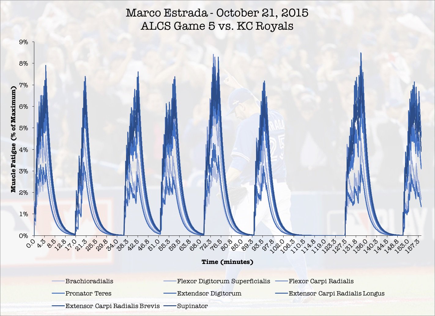
 

In game 5 of the ALCS in 2015, Marco Estrada went 7 and 2/3 innings, staving off elimination and sending the series back to Kansas City. Estrada started out fast, and never gave up a run until the 7th inning. It was a sign of things to come – absolute clutch pitching performances that buoyed the Blue Jays pitching staff in the 2016 season. Here’s how I was able to get these simulations.

Methods

The first step in this method was to get the pitch types, sequence, and time of each pitch during an outing. From the MLB’s gameday data, I was able to pull this sequence out by querying the database by pitcher and game. Here’s the MySQL Query I used for that purpose:

select pitches.sv_id, atbats.inning, atbats.outs, pitches.pitch_type, atbats.des, atbats.pitcher from atbats, pitches, games where pitches.ab_id = atbats.ab_id and atbats.game_id = games.game_id and games.game_id = ‘23910’ and atbats.pitcher = 462136 order by atbats.inning, atbats.outs ASC

This produced a result that looked like this:

mysql-query

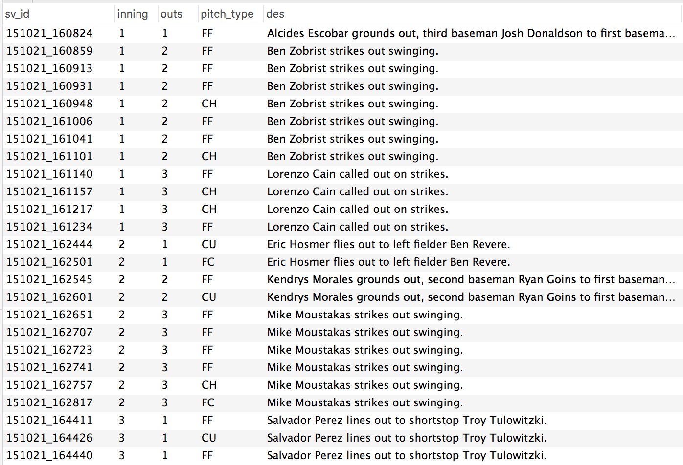
Figure 1. Sample output from the MySQL query posted in the snippet above.

Every pitch, organized by inning and sequence, for an individual pitcher in an individual game. That value on the left – the sv_id from the gameday atbats table, contained the date (YYMMDD_HHMMSS). Everything I needed to calculate the amount of time between each pitch.

From the paper on pitch clocks and fatigue, I had created a time history of muscle demands for a series of forearm muscles. These were defined as either fastball type pitches, or breaking type pitches. In the graphs, figure A are the demands for fastballs, and figure B are the demands of curve balls / breaking pitches. These time histories are from a series of studies, summarized in the pitch clock papers.

emg-demands

So, back to the Gameday database. I exported the demands from the query into Matlab. I coded each pitch as being either a fastball or a breaking ball, then attached the appropriate amount of rest after each pitch. Here’s an example from Marco Estrada’s ALCS game:

input-example

Figure 3. Pitch selection and rest time from Estrada’s game 5 of the 2015 ALCS. All pitches coded as a 1 were fastballs. All pitches coded as 2 were breaking pitches. These were used to simulate the time histories of demands for Estrada, and then determine the predicted fatigue level. 

time-history

Figure 4. Muscle demands by pitch  during a 12 pitch first inning. The first pitch of the game lead to a ground ball out. The next 7 pitches resulted in a strike out, followed by a 4 pitch strike out. You can see the larger gaps between pitches as being reflective the time between batters. 

The largest numbers in this time history represented the time between innings. What I have learned from this is, is just how fatiguing it can be for a pitcher to have a long inning, followed by a short half inning where his team goes three up three down.

At this point, I had everything I needed to predict fatigue in a pitcher. Using the EMG demands from figure 4, the three compartment fatigue model was able to generate an example of how much muscle force would be lost at a given time based on the previous history of muscle demands. For Estrada, his peak fatigue came during the 5th and 7th innings of the game. During these innings, he threw 14 and 17 pitches – the highest per inning in the game. In the 5th inning, he threw more fastballs than breaking pitches, which resulted in higher fatigue levels.

Interestingly. innings where pitchers throw more fastballs have higher fatigue levels. Greater homogeneity in pitch selection has been identified as a risk factor for UCL reconstruction by Whiteside and colleagues (2016) 4  have higher fatigue levels occur when pitchers throw more fastballs.

Conclusions

This methodology could now allow for examination of fatigue during starts where a pitcher was hurt, or from a series of starts where a pitcher became hurt. If at the start of the season, a pitcher had his EMG activation levels recorded during a bullpen session, these accurate demands could be substituted into the model for a more accurate fatigue prediction. For now – this is a fun new way to look at a pitching performance.

If you have any requests for simulations, let me know!

1.
Sonne M, Keir P. Major League Baseball pace-of-play rules and their influence on predicted muscle fatigue during simulated baseball games. J Sports Sci. 2016;34(21):2054-2062. [PubMed]
2.
Sonne M. Fatigue inferences on a 100 pitch limit – Mike Sonne. Science and Baseball. http://www.mikesonne.ca/baseball/fatigue-inferences-on-a-100-pitch-limit/. Accessed December 5, 2016.
3.
Sonne M. Giving a big FU to workload metrics in pitchers: Part 2 – Cumulative FUs – Mike Sonne. Science and Baseball. http://www.mikesonne.ca/uncategorized/giving-a-big-fu-to-workload-metrics-in-pitchers-part-2-cumulative-fus/. Accessed December 5, 2016.
4.
Whiteside D, Martini D, Lepley A, Zernicke R, Goulet G. Predictors of Ulnar Collateral Ligament Reconstruction in Major League Baseball Pitchers. Am J Sports Med. 2016;44(9):2202-2209. [PubMed]

Playoff Workloads in 2016

A lot was made of the heavy workloads that elite relievers performed in the 2016 post season. Aroldis Chapman, Andrew Miller, and Roberto Osuna had extended appearances of 2+ innings, when they had only thrown an inning at a time in the regular season. With everything on the line, teams were willing to push these elite arms to their limits. For the most part (save for one scary moment in the AL Wild Card game with Osuna), they all emerged unscathed, and probably went a long way to raising reliever salaries for future seasons.

By now, you have probably learned that my Fatigue Unit metric heavily favours relief pitchers. A study by Whiteside and colleagues (2016) 1, and my analysis of Driveline’s publically available data 2,3, have indicated that throwing on consecutive days, and throwing harder, are risk factors for Ulnar Collateral Ligament reconstruction. Relief pitchers are throwing more and more innings, and their rate of injury appears to be much greater than those of starting pitchers 4. These are the hard facts of relief pitching – see examples from Aaron Sanchez (94-95 mph as a starter, and 97-100 as a reliever).

Relief Innings pitched, and number of relief pitchers used through the 1965 to 2015 season (Keri & Neil, 2016). Relief pitchers are throwing more and more innings - and pitching in the bullpen may not be saving arms.

Relief Innings pitched, and number of relief pitchers used through the 1965 to 2015 season (Keri & Neil, 2014). Relief pitchers are throwing more and more innings – and pitching in the bullpen may not be saving arms.

Using Fatigue Units5, I wanted to look at the top workloads in the past post season, and furthermore, explore how those workloads compared to regular season workloads.

Methods

I was able to analyze the 2016 MLB regular season thanks to Michael Copeland (@jelloslinger). He pulled in pitch counts, by inning and game, for every game since the start of the 2015 season. For simplicity’s sake, I looked at the peak velocity and the average pace for all pitchers, downloaded from the Fangraphs website. Those were the data required to calculate FU’s for each pitcher. I then broke these data down by regular season games and post-season games.

Once cumulative fatigue units were calculated for each pitcher, I also calculated the average workload per game. The rest of the analysis was performed on pitchers who only pitched in both the regular season and the post season. I compared the average workload between regular season and post season performances. For an example, I also looked at how workloads changed throughout the season, and I’m going to present the data on how workloads changed throughout course of the season for a few select pitchers.

Results and Conclusions

Not surprisingly, the highest workload of the 2016 playoff season belonged to Andrew Miller and Corey Kluber. For Andrew Miller, the biggest change in his workload between the regular season and the post season, was his multi-inning appearances. In the playoffs, he averaged 0.8 FU’s per game, and in the regular season, he average 0.4 FU’s per game. His workload per game was doubled in the playoffs when compared to his regular season numbers. Andrew Miller’s playoff workload represented 25.2% of his entire regular season workload – during 10 games (compared to 70 games in the regular season).

As for Corey Kluber, his high workload was driven by short rest. Kluber pitched game 1, 4 and 7 of the World Series in 2016. In the regular season, Kluber pitched 100% of his starts on regular rest (a 5 day separation, minimum, between starts). During the playoffs, 50% of his appearances came on less than 5 days of rest. Kluber averaged 1.23 FU’s per appearance in the 2016 playoffs, compared to 0.74 FU’s per appearance in the regular season.

Going to game 7 of the  World Series, the Cubs had the greatest sum of fatigue units of all 2016 playoff teams. However, when looking at sum of fatigue units for every playoff teams, the Cubs accumulated 147% more fatigue units than the second highest team (the Toronto Blue Jays). When looking further into these findings – what drove these really high FU accumulations in the Cubs and Blue Jays, were a very high number of back to back relief appearances for both teams. The Cubs had 35% of all of their pitching appearances in the post season occur on back to back nights, a total of 26 pitcher appearances in the 2016 post season. Comparatively, Cleveland only had 11% of all of their pitching appearances occur on back to back nights.

I’m not one for hot takes, but I feel that I have to say something here. If workload has any sort of relationship to injury, Terry Francona’s management of his pitching staff, from a workload management perspective, is one of the most impressive baseball strategy events to occur in my recent memory. While the Cubs emerged the eventual World Series Champions, Joe Maddon had to repeatedly rely on the same pitchers (primarily, Aroldis Chapman) in high leverage situations, which lead to high usage during back to back games. If extreme workloads to lead to injury, the work done by Francona in the playoffs does appear to be a great template for managers in the future. If we’re being realistic though – flags fly forever, and when they haven’t flown in 108 years, it’s hard to say that there were any errors in workload management.

I still have to look further into the utility of FU’s as an injury prediction model. Currently, I believe it is a metric that more accurately represents physiological demands on the body, and more importantly, the musculature responsible for predicting the UCL.

References

1.
Whiteside D, Martini D, Lepley A, Zernicke R, Goulet G. Predictors of Ulnar Collateral Ligament Reconstruction in Major League Baseball Pitchers. Am J Sports Med. 2016;44(9):2202-2209. [PubMed]
2.
Sonne M. Pitch Velocity and UCL Stress using the Motus Sleeve: Further interpretation from Driveline data – Mike Sonne. Science and Baseball. http://www.mikesonne.ca/baseball/pitch-velocity-and-ucl-stress-using-the-motus-sleeve-further-interpretation-from-driveline-data/. Accessed November 30, 2016.
3.
O’Connell M, Boddy K. Elbow Stress, Motus Sleeve, and Velocity. Home – Driveline Baseball. https://www.drivelinebaseball.com/elbow-stress-motus-sleeve-velocity/. Published October 28, 2016. Accessed November 30, 2016.
4.
Keri J, Paine N. How Bullpens Took Over Modern Baseball. FiveThirtyEight. http://fivethirtyeight.com/features/how-bullpens-took-over-modern-baseball/. Published August 15, 2014. Accessed November 30, 2016.
5.
Sonne M. Giving a big FU to workload metrics in pitchers: Part 2 – Cumulative FUs – Mike Sonne. Science and Baseball. http://www.mikesonne.ca/uncategorized/giving-a-big-fu-to-workload-metrics-in-pitchers-part-2-cumulative-fus/. Published September 1, 2016. Accessed November 30, 2016.

Pitch Velocity and UCL Stress using the Motus Sleeve: Further interpretation from Driveline data

As previously mentioned, there really isn’t anything better than getting your hands on new data. That new data smell, the excitement of telling someone that the singular of data is datum. I was really excited to see a follow up study (O’Connell, Hart & Boddy, 2016) to the Bauerfeind study that examined the influence of pitch velocity on arm stress (O’Connell & Boddy, 2016). After reading the article, there were some really surprising findings that I wanted to look into further. More specifically – the claim this study replicated the findings of Post et al (2015), and found a non-significant relationship between elbow valgus torque, and ball velocity.

The study can be found here:

https://www.drivelinebaseball.com/elbow-stress-motus-sleeve-velocity/

But, here are some of the key findings.

  • A “very small” relationship between the stress metric, and pitch velocity of r2 = 0.21
  • “This contradicts a commonly believed hypothesis that when comparing pitchers across a population the ones who throw the hardest also experience the greatest stress. We are only looking at elbow stress, this may not hold up when looking at both elbow and shoulder stress. But this is a very interesting finding nonetheless!”

First of all, I wanted to look at simply the interpretation of these data. The r2 statistic infers how much of variable A can we infer from variable B. For example, if our r2 value is 0.5, that represents that variable B accounts for 50% of the variation in variable A. When studying human movement, Vincent and Weir (2012) proposed threshold values of r2 = 0.25 to 0.49 as low, 0.49 to 0.64 as moderate, and greater than 0.81 as strong. However, they included this caveat:

“Values lower than (0.25), if they are statistically significant, can be useful for identifying nonchance relationships among variables, but they are probably not large enough to be useful in predicting individual scores. However, in conjunction with more than one predictor variable (multiple regression)… even individually modest predictors may be useful”

– Vincent & Weir, 2012, page 117.

The values reported in their text are r values, but I have adjusted them to be r2 values.

So, let’s look at these results – a “very small” relationship, and “similar to the findings of Post et al., 2015”. Post et al (2015) found

“very small r2 values, indicated that very little of the variance in joint kinetics can be explained by ball velocity… the correlations between ball velocity and both elbow-valgus torque and shoulder external-rotation torque were not significant”

The values reported by Post et al (2015) were an r2 of 0.04, and p=0.053, or, 4% of elbow valgus torque could be explained by ball velocity, and this relationship was not statistically significant. This is where I have some concerns with the interpretations of the newest study from O’Connell and Boddy (2016). Their study reveals a statistically significant relationship between ball velocity and arm stress, in the low range of correlational strength (r2 = 0.21).  Interpreting these results in their current form, these findings indicate that 21% of arm stress can be predicted using ball velocity alone. So, ignoring any differences in mechanics between pitchers, fatigued state, or pitcher body size, we already have a model that predicts 21% of our dependent variable. As someone who has spent a good amount of time wrestling with data, attempting to prove hypotheses about muscle fatigue, I would typically kill for a relationship with this strength! The findings of the O’Connell & Boddy study do not replicate those of Post et al., 2015 – they illustrate a link between arm stress and pitch velocity – and that is without moving on to some methodological concerns.

The beauty of blogging, and posting open source data to try and further science, is that you live in a state of constant, dynamic, peer review. In many ways, this is vastly superior to the traditional publication model, where studies are reviewed by academics, then go to sit on bookshelves and are never looked at again. When open data is published, it gives others a chance to chime in on the results.

Looking at the data that went in to calculating the r2 value of 0.21 between stress and velocity, a couple of things emerge. First of all, not all pitchers have the same contribution to the means. Two pitchers only threw 6 pitches, while one threw 19 pitches. If pitch velocity only indicates 21% of the variance in arm stress, there are clearly other factors at play. If we have an unequal number of pitches between our participants, we’re leaving room for error, by having someone with greater stress contributions from other variables swaying our correlation, one way, or the other. To try and accommodate for this, I removed the two pitchers from the analysis who only threw 6 pitches. I then took the average velocity, and stress, from the top 9 velocity throws from all other pitchers, and put them into the correlation with an n=15. The correlation between velocity and stress now goes up to r2 = 0.32, or 32% of the variance in arm stress is accounted for by ball speed. Including all of the pitches individually, and only using the top 9 pitches from each pitcher (an n=97), we end up with a correlation of r2 = 0.37 between velocity and arm stress.

When your model can account for 37% of the variance between one variable and another, you are definitely on to something. This is statistically significant, and when visualized (Figure 1), it becomes quite clear that a relationship exists. In fact, this number appears to be nearly an exact replica of another study, where Hurd et al., (2012), found a relationship of r2 = 0.37 between pitch velocity and elbow adduction moment.

final-simple-model-correlation

Figure 1 Correlation between Arm Stress and Ball Velocity, for top 9 velocity throws (n = 15 pitchers, 97 pitches)

So, what about the other variables that the Motus sleeve spits out? I can’t tell you with 100% certainty what arm slot, or shoulder rotation means from these data, but I included ball speed, arm speed, arm slot, and shoulder rotation, in a multiple linear regression model to predict Stress. Once again, I used the top 9 velocity pitches from 15 pitchers to do this analysis.

To put all of the variables on the same scale, I converted them all into z-scores – this will give us standardized coefficients that we can compare against one another in our regression output.

In summary, this model produced an r2 value of 0.55, with Arm Slot and Shoulder Rotation not being the weakest predictors of arm stress, and arm speed having a negative relationship with arm stress (Figure 2).

final-model-results-multiple

Figure 2. Predicted and actual UCL stress (z scores), from input variables of ball velocity, arm slot, arm speed, and shoulder rotation.

SUMMARY OUTPUT
Regression Statistics
Multiple R 0.74
R Square 0.55
Adjusted R Square 0.53
Standard Error 0.67
Observations 97
ANOVA
df SS MS F Sig. F
Regression 4 49.78 12.44 28.06 0.00
Residual 92 40.80 0.44
Total 96 90.58
Coefficients Standard Error t Stat P-value Lower 95% Upper 95% Lower 95.0% Upper 95.0%
Intercept 0.01 0.07 0.17 0.86 -0.13 0.15 -0.13 0.15
MPHz 0.83 0.09 9.77 0.00 0.66 1.00 0.66 1.00
ArmSpeedz -0.47 0.08 -5.90 0.00 -0.62 -0.31 -0.62 -0.31
ArmSlotz 0.16 0.08 1.97 0.05 0.00 0.32 0.00 0.32
ShoulderRotationz 0.11 0.05 2.10 0.04 0.01 0.22 0.01 0.22

It is quite clear that there are other variables not being measured that will help produce a better model of arm stress, but from the main predictor of arm stress right now remains ball velocity. These data collected using the Motus Sleeve, on one of the more advanced populations of pitchers that have been researched, echoes many of the findings that Hurd et al., (2012) produced in a lab setting. It is important to understand how statistics are interpreted, and what assumptions go in to calculating results.

This study goes deeper into understanding the stress on the arm during pitching (as this is tracked from actual bullpen sessions, and not flat ground throws like in the Bauerfeind study). Other studies that have examined the risk of UCL injury in youth pitchers, have identified fatigue, stature, and cumulative pitch effects as risk factors for injury (Chalmers et al., 2015).

Conclusion

In summary, pitch velocity shows a significant relationship with arm stress, using the Motus Sleeve. If you throw harder, chances are, you will have higher levels of stress on your UCL. It is important to properly condition and be strong, so you can withstand these stresses. There are many other factors that go in to determining just how much stress is on the UCL, but these must be further studied by hard working groups like Driveline, and researchers in other facilities.

Here are the data I used for the analyses above.

References

Chalmers, P. N., Sgroi, T., Riff, A. J., Lesniak, M., Sayegh, E. T., Verma, N. N., … & Romeo, A. A. (2015). Correlates with history of injury in youth and adolescent pitchers. Arthroscopy: The Journal of Arthroscopic & Related Surgery31(7), 1349-1357.

Hurd, W. J., Jazayeri, R., Mohr, K., Limpisvasti, O., ElAttrache, N. S., & Kaufman, K. R. (2012). Pitch velocity is a predictor of medial elbow distraction forces in the uninjured high school–aged baseball pitcher. Sports Health: A Multidisciplinary Approach4(5), 415-418.

O’Connell, M., Hart, S., & Boddy, K. (2016). Elbow Stress, Motus Sleeve, and Velocity. Retrieved from https://www.drivelinebaseball.com/elbow-stress-motus-sleeve-velocity/, November 4, 2016.

O’Connell, M., & Boddy, K. (2016). Can You Reduce Pitching Elbow Stress Using a Sleeve? Retrieved from https://www.drivelinebaseball.com/can-reduce-pitching-elbow-stress-using-sleeve/, November 4, 2016.

Post, E. G., Laudner, K. G., McLoda, T. A., Wong, R., & Meister, K. (2015). Correlation of shoulder and elbow kinetics with ball velocity in collegiate baseball pitchers. Journal of athletic training50(6), 629-633.

Sonne, M.W. (2016). UCL Stress and Velocity Increases. Retrieved from http://www.mikesonne.ca/baseball/ucl-stress-and-velocity-increases/, on November 4, 2016.


Vincent, W., & Weir, J. (1999). Statistics in kinesiology. Human Kinetics. Champagne, Illinois.

Using the Stuff Metric for Scouting the Arizona Fall League

Believe it or not, the Arizona Fall League is a place where players other than Tim Tebow go, to refine their skills before making it to the bigs. When they aren’t faith healing fans who have fallen ill, AFL pitchers are throwing a repertoire of pitches that they hope will propel them to the next levels of their minor league careers. Luckily for us, MLB has put out the pitchf/x data from the past 2 seasons (with the 2016 data coming). This allows me to calculate pitcher’s Stuff from the AFL.

The Stuff metric has been closely related to a lot of performance metrics at the MLB level – but I have not had a chance to look at any minor league data, until this point. I wanted to see how Stuff in the AFL compared to MLB Stuff – and to see if this has any potential as a scouting metric in parks that have PitchF/X. Let’s compare.

Methods

I used the calculated Stuff metric from the 2016 as my MLB standard. The stuff list is the same one found on www.mikesonne.ca. I downloaded the PitchF/X outputs from Baseball Savant (for the 2014, and 2015 AFL seasons), and calculated Stuff in the same way mentioned here. To try and get some sort of consistency, I only calculated stuff for pitchers that threw 30 pitches in the AFL. Additionally, pitchers had to have thrown at least 10 innings in the MLB in 2016. For analysis, I compared the 2016 Stuff against the AFL stuff using a Pearson’s correlation coefficient.

Results

First off, from the 116 different pitchers that had PitchF/X data in the AFL, only 23 managed to fit both inclusion criteria. The average fastball velocity, offspeed velocity, change of speed, and break distances, as well as correlation coefficients can be found in table 1.

Table 1. Summary of variables from AFL and MLB.

Stuff FB Velocity Offspeed Velocity Change Movement
AFL 0.31 ± 0.91 92.54 ± 3.07 81.38 ± 4.77 0.12 ± 0.04 9.65 ± 6.06
MLB 0.73 ± 0.84 93.37 ± 3.33 81.18 ± 3.65 0.13 ± 0.03 13.74 ± 4.12
r 0.59 0.85 0.67 0.5 0.33
r2 0.35 0.72 0.44 0.25 0.11


All components of the Stuff metric correlated well between AFL and MLB measures. Velocity had the strongest relationship (r = 0.85) between the measures at the AFL and MLB. Movement had the weakest relationship (r = 0.33). Overall, AFL stuff accounted for 35% of the variance in MLB stuff. Not great, but definitely a good start. This is really a small sample size, and if we omit the data from one outling pitcher (Adam Morgan), the value goes up to 0.77.

afl-stuff

The PitchF/X system can be a bit finicky, so there’s a chance that some of the movement data discrepancies are a factor of the different parks in the AFL. Maybe these cameras weren’t as sensitive to the pitch movement, or maybe, the pitchers at this time in their development, weren’t as good at generating movement.

Here are the top 15’s for the 2014, and 2015 AFL’s

2014-afl-leaders 2015-afl-leaders

In summary – there is a decent relationship between AFL and MLB Stuff – it isn’t perfect, but this could be used as a possible way to track pitcher development, and another tool for evaluating Stuff prior to arriving in the MLB. Right now, there aren’t enough pitchers from the AFL who have made their way to the MLB to truly get an idea of how their Stuff develops – but this is an encouraging start.

Now, if we can just go back to watching more Tebow…

teblow

The 2016 Stuffies! – Rookies of the Year

Ladies and gentlemen, put on your finest tuxedo, and get “Golden Globe” drunk – it’s time for the culmination of a year’s worth of Stuff reports – The Stuffies! While the Stuffies currently have less cache than some of baseball’s more talked about awards – like the MVP, there’s no room for philosophizing about what “valuable” means. Like a Mark Shapiro-led front office, these awards are data driven. Here are the BBSWAA (Baseball Stuffies Writers’ Association of America) we’ve taken the time to breakdown Stuffy Awards into Starting and Relieving categories.  There won’t be any funny business where we pit a 60-inning reliever against a 200-inning starter.

In the trend of having awards shows with great hosts; the Billy Crystals, and Neil Patrick Harrises of the world, the Stuffies would like to welcome Nick Dika to provide his insight into the MLB’s most (and least) Stuffiest performances.

stuffy-awards

The Stuffies will consist of awards for:

Rookie of the Year Stuff – Starter

Rookie of the Year Stuff – Reliever

Best Starting Rotation Stuff

Best Bullpen Stuff

Top Reliever Stuff

Top Starter Stuff

We’ll also present the “Not-so-Stuffies” for the pitcher who, despite lacking in the Stuff department, still managed to churn out innings on the season.

Eligibility

To have the best Stuff – it isn’t about catching lightning in a bottle. You can’t just show up one day, throw the lights out, and claim you had the best Stuff in the MLB. That’s just not how the world works! To be eligible for the Stuff awards, I wanted those in the top 25% of innings pitched on the season, for both starting pitchers and relievers. This meant pitching 156 innings for Starting pitchers, and 46.1 innings for relievers. For rookies, those numbers were 63 innings for starters, and 24 innings for relievers.

The Stuff metric is unfair to knuckleball pitchers, so they were removed from the analysis.

Team Calculations

To calculate the best Stuff on starting staffs and bullpens, the innings weighted stuff was calculated. Each pitcher’s stuff was normalized to their total contribution to innings for their team, then added together to get one Stuff value for each rotation and bullpen. This produced our Stuff champions.

And without further adieu, let’s begin… the 2016 Stuffies!

Rookie Relievers

Brian Ellington

The big E as they call him down in Miami, put up great numbers in his rookie season. His sub 3 ERA matched up well with his 97mph fastball. Perhaps Jeffrey Loria will build a nasty stuff statue in centerfield at Marlins park to honour this historic performance? Despite his awesome stuff, Easy E struggled with his command at times.

Matt Bush

With the Silver Stuffy, we have Matt Bush. Matt Bush is featured prominently in the Stuffy awards – and if you watched Game 3 of the ALDS, you already know why. He has nasty, nasty Stuff. His fastball can get up into triple digits, and he separates his pitched by nearly 18″. That’s a lot of ground to cover at a high speed.


Mauricio Cabrera 

Here at the Stuffies we don’t discriminate against small market, west coast or non-contending teams when we hand out our hardware. And that’s why Mauricio Cabrera is taking home a Stuffy this season. If you don’t recognize his name you will soon. Pitching for the retooling Braves means you’ll know him as “the top reliever available at the 2017 trade deadline”

Rookie Starters

Dylan Bundy

While it’s a bit later in his career than we may have predicted, Dylan Bundy takes home a bronze Stuffy for Rookie Starter. Bundy’s combination of electric stuff and pitching for the Orioles means that he will almost undoubtedly turn into an ace when he is traded to a different team for spare parts at some point in the future. That or he will sit unused in the Bullpen while division rivals deposit baseballs in the outfield bleachers, eliminating them from the playoffs.

Kenta Maeda

Kenta Maeda has the lowest velocity of anyone on the Stuff lists, but he has elite separation between his pitches, and his change in velocity is close to the top of all of the MLB. This is a pretty impressive rookie performance for a command type pitcher.

Jon Gray

Finally, Jon Gray takes home the Gold Medal for Rookies! Grey had an elite fastball, and paired that with elite change in speed, and above average pitch separation. He had a great season for the Rockies – which amounts to a super amazing awesome season for a pitcher anywhere else. His beard is already elite, but now he’s the Stuff rookie of the year. Congrats, Jon Gray!

*** break for commercial music starts playing ***

So, a huge congratulations go out to Jon Gray and Mauricio Cabrera. You both had great rookie seasons, and showed the MLB what your Stuff was made of. Next season, maybe your team might give you a hand and you can win some games.

When the Stuffies return – let’s look at what starting rotations and bullpens had the best Stuff of the season! Stay tuned for musical performances from the Thrill of Agony, and the Wet Wingsmen.

I HAD concerns about Marcus Stroman’s workload

A lot has been made about Aaron Sanchez’s workload this season. He’s entering uncharted waters for innings pitched, throws incredibly hard, and is insanely awesome. Little has been made about the workload Marcus Stroman has endured this season – where he just crossed the 200 inning threshold. Remember when he and Sanchez were yelling about 200 innings in the off season? It’s awesome to see their hard work rewarded this season.

Given the ACL injury Stroman sustained last season, a lot of his workload occurred behind the scenes under the watchful eye of Blue Jays’ physiotherapist Nikki Huffman (at the time, from Duke University). He only pitched 27 regular season innings in 2015 with the big league team. Despite the baseball reference page saying he had a limited workload for innings, he was without a doubt, using his arm. When Stroman first came up in 2014, he was used as a reliever, before getting his chance to start. This once again, limited his innings. I wanted to use Fatigue Units to examine changes in Marcus Stroman’s workload over the course of his professional career, and see if 2016 was a giant spike that could lead to future injury.

First of all, I had to take a few liberties with the data set. For minor league data, there are no values for pace, starting vs. relief innings, or total pitches. So, I had to make some changes. I once again used a linear regression approach, and tried to find out predictors for pitch counts in a season – using MLB data. I included games, games started, innings pitched, BB/9, and K/9 as input variables – all which ended up being significant predictors. Overall, this model produced an R2 of 0.98, with a standard error of 131 pitches. It isn’t perfect, but it will do for this application. estimated-pitches

The equation for predicting pitches from MiLB data is:

Pitches = -1.72 + 2.41 * K/9 + 0.62 * BB/9 + 15.60 * Games + 81.45 * Games Started

So, we’re now one step closer to calculating FUs. For the remaining information, I used the average fastball velocity from the MLB data, and the pace from the MLB data. I assumed there was greater care given to the type of pitching appearances (for example, how Sanchez’s MiLB starts were short in duration, but still 5 days apart). I made the assumption that all innings were starter innings, and used these for the calculation of MiLB FU’s. As a reminder, I am using “Predicted FU’s” from FanGraphs data – not the actual calculated FUs, so there can be an error of up to 3.5 FU’s. For a refresher – read up here.

Marcus Stroman Workloads

stroman-ip-pitches

Without a doubt, 2016 is the highest traditional workload season that Stroman has seen. He has set career highs for pitches, and for innings. Compared to 2014 (his next highest season), 2016 represents a 23% increase in innings, and a 45% increase in the total number of pitches thrown.

Now, looking at FU’s, the story is not nearly as daunting.

fus-stroman

His highest workload season before 2016 saw Marcus accumulate and estimated 32.6 FUs, where as he sits at 33.9 FUs in 2016. This only represents a 4% increase in peak workload. This is because in 2014, Stroman pitched more innings out of the bullpen, and in 2016, he works solely as a starter. As I had previously written – typically, someone who throws out of the bullpen throws at a higher effort level than when they are a starter. This is the same for Stroman – 95mph when he worked in relief with the Jays in 2014, compared to 93.5 when he worked as a starter in the same year.

brooksbaseball-chart

Traditional workload metrics (innings pitched, and pitch counts) have long been researched, and the findings have all come back as being null – these metrics don’t help in injury prevention or prediction. Even less can be said about Fatigue Units – because there has been next to no research on this topic – other than what you have read on this website! That being said, this shows a very encouraging trend – that Stroman’s workload has been closely monitored by the Blue Jays staff, and he is not showing any signs of breaking down.

I once HAD concerns about Stroman’s workload increase, but I am comfortable in saying that those concerns have been alleviated.


The Blue Jays best Stuff

I write a lot about Stuff on this site, with the goal of quantifying Stuff for the entire MLB. However, I am unabashedly, a Toronto Blue Jays fan first – and a Detroit Tigers fan (a distant) second. Part of the fun of using the PitchF/x data on the fangraphs site, is that I can look back in time, and figure out how different pitchers compare against each other. Also, if we’re looking to find out who had the best stuff in Blue Jays history – we can draw some inferences here. Fastball velocity has increased throughout league history, so it is reasonable to say that in the past 10 years, we have likely seen the best stuff in MLB pitcher history.

Let’s look at the Jays all time stuff leaderboard.

Overall Best Stuff

I’ve been writing stuff reports on the Jays pitchers over at Baseball Prospectus this season, so the top of this list shouldn’t be too shocking.  Aaron Sanchez may have the best Stuff in the history of the Blue Jays. My favourite arm in the top 10 has to be Brandon League – I loved watching him pitch for the Jays, despite his short comings (giving up bombs at inopportune times). I was a bit surprised to see Ricky Romero up as high he was – as I always viewed him as a command type pitcher. In reality, his pitch separation was elite, and he had decent change in speed. It’s a shame his knees gave up on him.

Best Stuff Seasons

Once again, Aaron Sanchez tops the list – but Joe Biagini comes in second, with his rookie season being the second best stuff season we`ve seen in the past 10 years for the Blue Jays. The biggest surprise I`m seeing is down near the bottom of the list. BJ Ryan sits in the negative with his stuff – and all I remember is him coming out of the bullpen and annihilating hitters with his fastball. Maybe it was the fact they put up flames on the video boards, more so than he was throwing flames?? I’ve been tricked again!

Back to the FUture – Workloads since 2007

Well, now that we know what Brandon Morrow’s stuff looked like with the Jays in 2010, let’s move on to understanding pitcher workloads since 2007.

First – a foray back into my thought process for the days of rest penalty in the metric. If you look back to the second article on Cumulative FU’s, I proposed that for consecutive day appearances, the FU’s be multiplied by 5. For 2 to 4 days of rest, the FU’s were multiplied by 2. For the standard, every 5th day – there was no multiplier for the FUs.

When I looked at the predicted FU’s for all pitchers (and as you’ll see shortly), the high use relievers – 80-100 innings in a season – had the highest workloads – significantly higher workloads than starters for the most part. I thought, I may have to make an adjustment to the metric – but I wanted to look at starter vs. reliever injury rates first.

I downloaded Jon Roegele’s Tommy John Surgery (TJS) list (@MLBPlayerAnalys), and then classified pitchers as relievers (if 80% of more of their innings came from relief innings), or starters. I compared numbers from the 2007 to 2016 seasons. Only pitchers who pitched 10 innings in a season were included in the analysis.

I looked at the sum of innings pitched and the number of TJS that occurred for all pitchers, and came up with a ratio of innings per TJS, for both starters, and relievers.

There were a total of 125092 innings pitched by Relievers during this time period, and 290401.1 innings pitched by starters. During that time, 151 relief pitchers required TJS, and 141 starters required surgery. This worked out to a ratio of 848.4 innings per TJS for Relievers, and 2059.6 innings per TJS. These data should likely be vetted a bit more carefully before they’re viewed as gospel – but this is a scary number. Aren’t reducing innings and pitches during the season supposed to protect relief pitchers’ arms?

I have argued that pitchers often throw harder when they move to the bullpen, and that this extra velocity places more stress on the UCL. In that same time period (2007, to 2016), relief pitchers threw their average fastball at a velocity of 91.5 +/- 3.35 mph, and starters threw their fastball at an average speed of 90.7 +/- 2.6 mph. Maybe, just maybe – those back to back to back appearances that relievers can make are worse for their bodies than the 6 innings pitched every 5 days?

Anyway – let’s move on to the workload metrics since 2007!

Starters

Team Workloads

The 2011 Rays take the cake for total workload for starting pitchers. Lead by David Price and Big Game James Shields, the Rays starters were not only good – they worked hard in the 2011 season. Overall, the highest average workload belonged to the tigers – particularly in 2014 and 2015 seasons.

Individual Workloads

The highest workload for a starting pitcher belongs to Justin Verlander in 2011. In fact, it is alarming to see just how many times Verlander and Sabathia’s names show up in the top 25 of this list. Those guys were horses in their prime – and it’s unknown how those huge workloads contributed to both of their recent injury problems. Conversely – how much of their durability during that time was because they worked so much, and had great pitching fitness?

Relief Pitchers

Bullpen Averages

The Rockies 2012 bullpen put in the most about of work during the past ten years. This was a direct result of a really bad starting rotation – only one pitcher cleared 100 innings pitched. The relief core was totally hung out to dry on this team. Overall, the Nationals had the highest yearly workload average for their bullpen (though this is driven by the late 2000’s when they were not very good).  There is a general trend for bullpen workloads to increase in the past 10 years – with 2015 having the highest workload for relievers in that time frame.

Individual Workloads

At first glance, I have to say – these numbers looked just… wrong. Then, I looked again – and they didn’t change.
krod-2010

Francisco Rodriguez put up an INSANE workload in 2010 – 62.84 – with nearly 1800 pitches, and over 100 innings. That’s a lot of exposure to high pressure situations, back to back days, and pitches per inning. The set up men, and the swing men – those who pitch more than an inning in relief, appear to have the highest workload levels. Something else that came up this weekend – was the topic of Dellin Bettances. After giving up a walk off in his third day of work in three days, people talked about his over use with the Yankees. In the past 3 years – no one has a higher workload than Bettances.


You are welcome to question the FU’s! Hit me up at michaelsonne@gmail.com, or on Twitter @DrMikeSonne if you want to debate these findings!

Ye Old Historic Stuff Report – 10 year anniversary

marquee

Every now and then, technological discoveries result in major breakthroughs in science. Certain things that come to mind are: the invention of the microscope and the discovery of insulin. While not in the same breath, the ability for me to split fangraphs queries by team, and by year, may go down as the biggest breakthrough that I have made.

You were probably sitting around, kicking your TV and swearing at your friends while watching the Jays game today – so don’t you want to think about the happier times? Like 2006?


TROY GLAUS and LYLE OVERBAY.12.27.2005. Slugger Troy Glaus and Lyle Overbay are all smiles at the introduction press meet at the Rogers Center Founders Club on Tuesday.(Rene Johnston/ Toronto Star Photo)

TROY GLAUS and LYLE OVERBAY.12.27.2005. Slugger Troy Glaus and Lyle Overbay are all smiles at the introduction press meet at the Rogers Center Founders Club on Tuesday.(Rene Johnston/ Toronto Star Photo)

Oh god, not that…

Let’s take a look at what pitchers, and what pitching staffs have had the best stuff since 2007. Also, let’s look into what starting rotations and bullpens had the highest workloads in the last ten years.

Qualifiers

Ok, to truly qualify for these calculations, pitchers were required to appear in at least 5 games during the MLB season. To be considered a “true starter”, 80% of the innings a pitcher threw had to be in the starting rotation, and they could not have more than 9 relief innings in a season. To be considered a “true reliever”, 80% of the total innings had to be as a reliever, and the pitcher could not have more than 3 starts on the season. Are these rules unfair? LIFE IS UNFAIR.

Stuff

Starters

The best stuff of any starting staff belongs to the 2011 Royals. A fearsome staff that managed to have only one pitcher with better than a 0.500 record, this staff was built on radar guns, and probably not on pitching ability. Luke Hochevar had the best stuff on this staff – and would eventually find a home in the bullpen.

In the time period studied (2007 – 2016),  the best average Stuff belonged to the Royals (an average stuff value of 0.84), followed by the Brewers, then the Cardinals.

The best individual stuff performance belongs to mine and Eno Sarris’s adopted son, Chris Bassitt. In 2016, Bassitt was putting up historic numbers before he sustained an elbow injury and had to have Tommy John Surgery. After that – it becomes the Jake Arrieta show. Before he put things together in 2015, Arrieta has exceptional stuff in 2014, as well as 2013. Sneaking into the top of that list is 2007 Rookie Ubaldo Jiminez.

Something really interesting to note – it has been well documented that fastball velocity keeps getting higher every year – and Tommy John Surgeries are also increasing. If you look at Stuff over these 10 years, the Stuff in 2016 is the highest it has ever been. There’s been a relatively linear increase in Stuff over the years, as you can see in this graph.

historic-stuff

Relievers

The Mariners 2013 bullpen had the best stuff in the past 10 years, lead by monster of Stuff, Tom Wilhelmsen (2.03). During the last decade, the best bullpen belonged to Tigers, followed by the Mariners and White Sox. Similar to the Stuff report for Starters, Stuff has increased over that time period for reliever as well (0.29 in 2007, and 0.52 in 2016).

We’ve seen some historic Stuff this season by resident piece of trash Arolids Chapman. In second and third place, a player near and dear to my heart – Joel Zumaya. I for one, fancied myself an experienced Guitar Hero player – so I can relate to the plight of Zumaya who hurt himself playing the iconic video game.

If you need access to these data because you’re curious about more – let me know! I’d be happy to share it with anyone. If you think the metric is wrong – well, go jump off a bridge and make your own Stuff metric.

Emergency Night before Pitch Talks Stuff Report

stuff-report

It has come to my attention that, while updating the Blue Jays Stuff report over at BP Toronto, I have neglected the MLB stuff report on this site. No time like the night before Pitch Talks to fill everyone in on who has the best stuff in the MLB!

Starting Pitchers

The man remains entrenched at the top of his loft perch – Jake Arrieta has the best stuff of all starting pitchers in Major League Baseball.  In fact, the top three are quite significantly higher than anyone else – Arrieta, Syndergaard, and Strasburg are the only starters who have flirted with the mythical 2.0 mark on the Stuff report all season long. For Jays fans, I would like to present how Syndergaard sits near the top of this list, and down at #108… well, you can guess who.

The top starting staffs all reside in Chicago, with the Cubs at #1, and the White Sox at #2. This goes to show – stuff isn’t everything. The cubs are closing in on a 100 win season and the White Sox… well, they’re fighting to steer clear of the Twins at the bottom of the central.

Relief Pitchers

Chapman still sits at number 1, but Mauricio Cabrera seems hellbent on taking the reliever Stuff crown. Both of these arms have an average fastball velocity of over 100mph. That’s their AVERAGE fastball. To make it worse? They can both drop it down into the 80’s when they need to.

As for Bullpens, the Red Sox – buoyed by the electric arm of Craig Kimbrel – have risen to the top of the Stuff rankings. The Cubs are close behind, and the Jays lurk in fourth.


Are you coming to Pitch Talks? Do you have your tickets? If you order your tickets online, use the promo code “stuff” to get $5 off your ticket. See you there!

« Older posts Newer posts »

© 2024 Mike Sonne

Theme by Anders NorenUp ↑